

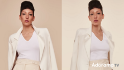
Lighting schemes should always have a purpose, whether it's to flatter a client, show the details in a product, or create a mood. In this fantasy portrait, my purpose was both to flatter the model and to create a sense of place. Let's talk about how it was done.
For quite a while, I felt inspired by the idea of a moon goddess. She would be luminous, and the moon would shine adoringly down on her. I wanted her bathed in light, but still a bit mysterious. She should be lovely, but enigmatic. Once I knew exactly what I wanted, the big question was: where would I place my lights to make this happen? In this scenario, the light position that made the most sense to me was directly overhead and slightly in front of the model with a kicker behind and slightly above. I chose this position for several reasons, but the most important were these: the scene needed to feel like nighttime, the light needed to appear to be coming from the moon, and I wanted her to glow.
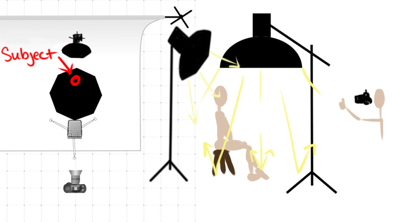
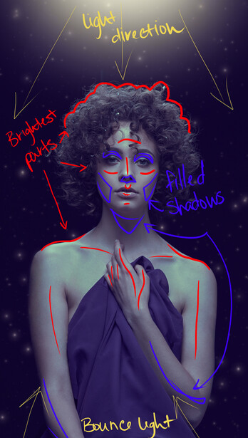
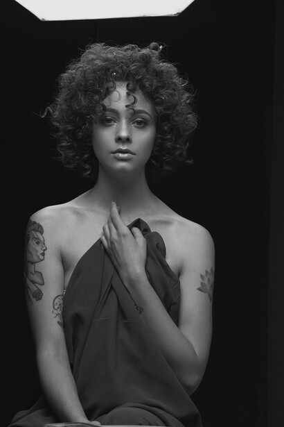
I allowed one light to do most of the heavy lifting. As you can see in the diagram, one large light source, a sixty-inch Westcott Rapid Box, was boomed directly over and slightly in front of the model. This gave me downward light direction that carved out my model's features, but since the center of the large modifier was in front of the model and she was sitting on a stool, the light bounced back up into the shadows and gave me enough fill to keep everything open. The second, smaller light was used as a hair light and added just a bit of rim light to her exposed shoulders, ensuring the model would pop off the dark backdrop.
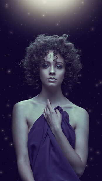
This two light overhead setup gave me exactly the look I was hoping for: a glowing moon goddess bathing in celestial light. The image was finished by adding some color contrast to the highlights and a few distant stars to complete the sense of place.
Have you used a similar light setup? What did you think of it?

3 Comments
Not just bounce off the floor- but a large source positioned in front of the model has a lot of lighting surface visible to what a small direct overhead source would cause to be in shadow. Essentially the far edge of the modifier isn't overhead anymore- it's in front of the model. It's the same concept as when one uses a large octa/softbox portioned to the side of the model and fully in front shooting across (not at) the model. If you can see light from the modifier from a certain position then it will illuminate whatever is there as well. A bit of trickier concept to grasp at first...
There was a similar piece on the Profoto website by a Chinese photographer called Alexvi that I thought was pretty cool.
He bounced the light up and shot through a peep hole with the subject looking down.
https://profoto.com/uk/profoto-stories/alexvi-reveals-how-he-created-a-…
This was pretty cool! I imagine that the floor must have been white or a light enough color to reflect that much light back up to fill the shadows.