
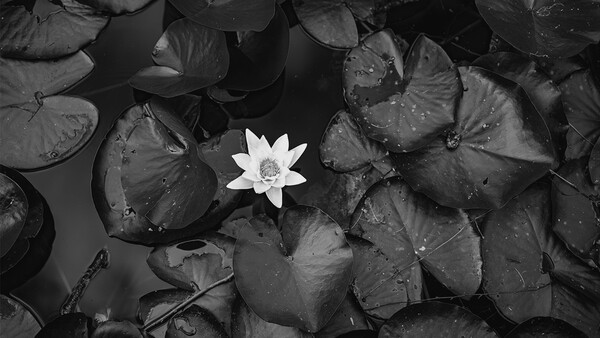
Black and white photography promises seriousness without risk, coherence without effort, and intention without proof. In an era where color is technically trivial and visually unforgiving, monochrome offers shelter. It removes variables, postpones judgment, and replaces unresolved structure with borrowed authority. It is like dimming the lights in a messy room: the objects do not move, but the problems stop being visible. If an image cannot survive color, was monochrome ever a choice?
For years, black and white photography has been framed as a matter of preference. Color versus monochrome meant realism versus emotion and description versus atmosphere. This vocabulary is comfortable because it keeps the discussion safely inside taste. Taste is a soft place to hide, like arguing about music volume instead of admitting the speakers are broken. It allows photographers to declare intention without ever exposing the method. What disappears inside this framing is not nuance, but accountability. What gets obscured is a basic issue of method: the prior exclusion of color from the image itself.
A recurring pattern emerges when looking closely at contemporary monochrome work. The issue is rarely visual failure. Many of these images are competent, sometimes even attractive. The problem lies elsewhere. Nothing justifies the monochrome here beyond habit, rhetoric, or post-hoc explanation. There is no clear moment where color became impossible—no point where chromatic information contradicted the internal task of the image. There is no scene where color actively breaks the image, no red light that ruins the face, no green cast that collapses the mood. Black and white appears not as a condition of seeing, but as a corrective decision applied after the fact. This is not a stylistic preference. It is a delayed decision posing as an intention. That distinction matters far more than most discussions are willing to admit.
Modern cameras do not struggle with color. Exposure latitude is wide. White balance is predictable. Color reproduction has become banal in its reliability. This changes the status of black and white entirely. What once functioned as a technical necessity now functions as an intervention. Color today fails loudly through mixed LEDs, sickly skin tones, plastic highlights, and harsh neon reflections. When a constraint is no longer imposed by the medium, choosing it becomes a declaration of responsibility. When a limitation disappears, selecting it becomes an ethical and methodological act, not an aesthetic one. That shift is rarely acknowledged, yet it sits at the center of the current misuse of monochrome.
Most justifications for black and white photography appear diverse on the surface. In practice, they collapse into a small number of mechanisms. Different phrases, same operation. Once these mechanisms are separated and examined, the logic becomes difficult to ignore. What looks like a debate about taste is, in fact, a pattern of avoidance. The issue is not preference. It marks the moment responsibility is taken or quietly abandoned.
Perceptual Simplification
The most common mechanism is perceptual relief. Black and white feels better because it is easier to process. This ease is repeatedly mistaken for depth. Like turning down the volume in a room full of shouting, silence feels meaningful even when nothing has been resolved. The same excuses resurface every time. Black and white emphasizes form. It makes the composition clearer. Color distracts from the subject. The image becomes more graphic. Light and shadow feel stronger. The frame looks cleaner. There is less visual noise. Each of these statements describes the same outcome: the viewer has less information to negotiate.
Nothing new has been added to the image. No structure has been constructed. No decision has been sharpened. An entire channel of information has simply been removed. The viewer’s cognitive workload decreases, and that decrease is experienced as quality. What is praised as clarity is often nothing more than relief from complexity.
Form does not emerge when color disappears. Form is produced by light placement, geometry, spatial relationships, and distance. Color cannot erase physical structure. A bad shadow stays bad whether it is blue, green, or gray. If form only becomes legible after chromatic information is deleted, the failure lies in how light and space were organized during capture. Black and white does not correct that failure. It hides it by narrowing the terms of perception.
This is why the phrase “it reads better in black and white” is diagnostic rather than complimentary. Translated honestly, it means the image required simplification in order to survive. Variables were removed instead of resolved. The image feels calmer because complexity has been amputated, not because visual logic has improved.
Perceptual simplification works because it exploits the nervous system. Reduced complexity feels coherent. Coherence feels intentional. Intentionality is read as meaning. This chain is automatic, and monochrome activates it efficiently. That efficiency is precisely what makes it useful as camouflage. The image demands less from the photographer and asks less from the viewer. Ease is misread as depth.
Compensation for Unresolved Capture
If perceptual simplification lowers the bar for the viewer, the second mechanism lowers it for the photographer. Here, black and white functions as compensation. The explanations shift slightly, but the logic remains intact. The color temperature was difficult. The light was mixed. Colors conflicted. The background was too busy. The palette felt chaotic. The yellow lamp poisoned the skin, the green exit sign bled into the wall, the red jacket pulled the frame apart. In color, the frame fell apart. The atmosphere was ruined by color. The light was bad, but black and white saved it. The old saying surfaces again: if the light is bad, go black and white.
In each case, the problem is acknowledged but not solved. It is disabled. Uncontrolled color is not an aesthetic issue. It is a compositional failure. Color becomes chaotic when it has not been organized at the level of lighting, palette, timing, or framing. Removing color does not resolve that failure. It removes the evidence.
This is where the concept of chromatic noise becomes unavoidable. What many photographers describe as “color” is often unmanaged chromatic data: mixed temperatures, accidental saturation spikes, unconsidered background hues. Plastic blues, dirty oranges, fluorescent greens fighting inside the same frame. Instead of being treated as part of the structure, color is allowed to happen. When it becomes overwhelming, it is labeled distracting and removed.
Black and white becomes a trash bin for color that the photographer did not know how to control. Neon signs, blotchy skin, cheap LEDs, ugly reflections all get thrown into the same container. What is framed as refinement is often just deletion. The problem is rebranded as a stylistic choice. The underlying failure remains untouched. This mechanism is particularly seductive because the result often looks better. The image stabilizes. The chaos quiets down. But improvement of appearance is not proof of method. Post-capture correction can rescue almost anything. Rescue does not equal legitimacy. If lighting only functions once chromatic information is deleted, the lighting has failed as physics, not triumphed as art.
False Universalization and Borrowed Seriousness
When an image fails as physics, it often seeks refuge in history.
The third mechanism operates at the cultural level. Here, black and white is used to borrow weight. The language shifts again. Black and white is timeless. It looks classic. It references tradition. It feels more serious. Color feels too modern. The image should not be tied to a specific era. The goal is universality. The frame should feel important. It is a costume borrowed from another century, worn to avoid standing naked in the present.
What these justifications share is an anxiety about specificity. Time, place, and context are treated as threats. Color is removed to avoid dealing with them. The plastic bag, the smartphone glow, the year stamped into the light are quietly erased. Black and white carries a heavy cultural association with twentieth-century documentary imagery—wars, crises, archives, and historical trauma. That gravity is quietly extracted and applied to images that have not earned it. Monochrome becomes a filter of importance. The image inherits seriousness without producing substance, relying on the viewer to complete the illusion through recognition rather than meaning.
What is removed in the process is accountability. Specific color anchors an image to a moment. It situates it in reality. Removing those anchors creates abstraction, which is then misread as depth. Context is erased so that the image does not have to withstand it. This is how emptiness survives criticism by disguising itself as universality. The photograph looks historical not because it says something about history, but because it refuses to admit when it was made. The photograph looks like it belongs to a lineage, even when it contributes nothing to it.

Conclusion
Black and white no longer functions as an atmosphere. It functions as exposure. Contemporary monochrome often operates as a safe house for those unwilling to face the complexity of the real world. In color, you are exposed. Errors in balance, material, skin, and space remain visible. In black and white, everything becomes graphic. Everything looks intentional.
Photography has not changed its nature. It remains the registration of light. Color belongs to that process when it is mastered. When it is not, deleting it does not solve the problem. It postpones it.
Black and white is not a style. It is not a mood. It is either a strict protocol or a convenient mask. It is the difference between fixing a structure and simply covering a collapse with a tarp. If you need monochrome to survive scrutiny, you did not choose it. You can no longer persuade the viewer; you can only testify to your own absence from the process.




Join the Fstoppers community for free
-
Post comments and join in the discussions
-
Browse the site ad-free
-
Share your work and get featured in the community
-
Compete in the photo contests for fun and prizes
71 Comments
Good questions, Simon. I've often wondered whether it would be better for privacy, safety and security to have a secret/anonymous online identity. People who get angry with me in the comments (and they have presented themselves in the past) can easily track me through my name and website posted in my profile. So I have second thoughts all the time about commenting under my real name. I suppose I've come to the conclusion that I'd rather be perceived as a real person than an artificial or fake one, which outweigh the risks. The world could certainly use a lot more genuine relationships.
As far as posting images in a portfolio, I see no particular risk in doing that. Indeed, I place a lot of what people say in the context of their photography and portfolio. Not that someone is not entitled to an opinion without it, and bad photographers often have worthwhile opinions, but I'm always wondering about someone's work when they start launching opinions trying to convince me of one thing or another. After all, this is a photography site. The argument that I need the latest mirrorless camera is better supported when I can see visual evidence that my images are inferior to someone else's with the newest gear. Pictures say a lot more than just words.
I removed my profile information years ago. There is more ego into showing one's best work than articulating comments in my opinion. Now a work portfolio is about economic survival, that's different.
If you have your images published regularly on web sites, billboards magazine cover, etc, there is a point when the interest in showing your work drops. Not that you are better, but the need to prove drops and you focus on what your client wants. May be that's discipline but that's survival and keeps you from getting requests for work you don't actually do. Now someone who can neither produce work or constructive comments, I would say yes it's fishy.
You also mention the place being what it is, a photography web site. The danger with this is to miss that many articles are sponsored. Some are marked, some are not and if the accompanying photos are attractive you can easily miss the warning mark. Those are not photography they are about someone's financial survival. But that connection yes is how you build a sense of trust.
Question: Are you saying I do not show knowledge based on my profile? Because you kind of do at this point.
I am not questioning your knowledge or intelligence. You make a valid point that articulating a thought with words might be more effective for communicating an idea than a portfolio of pictures. And I appreciate good writing because it's rare that people bother to write with any consideration of spelling, grammar and punctuation. Indeed, I find it ironic that photographers stress the value of storytelling in their images, but couldn't write a complete sentence properly if their life depended on it.
Knowledge and credibility, however, are two different things. I have no better example to offer than this very article. Alvin, in my opinion, is a very intelligent person. His writing can be a little hard to follow but there's great depth to his articles. But when I look at his portfolio, I see a style of photography that is not only void of black and white photography, but focused on ICM images where the conceptual nature of his work is prioritized over the literal or technical merits. And that tells me he and I are on different pages when it comes to our approach to photography. Which further tells me that whatever he has to say as it relates to my photographic work is tinted. Not to say that his words are wrong and mine are right, but that his words are wrong for me. Alvin is not, from my perspective, a credible analyst of black and white photography. That's why I say context, as defined by a portfolio, is so important for worthwhile communication to take place, otherwise it's no more than an academic argument. Which, by the way, is how I've labeled many of these discussions with him in previous articles.
Beyond that, I have a sense of curiosity about whom I'm discussing these issues. Don't you? I've looked back at some of your previous comments and found that you're older, for what that's worth. I'm older too, which means past the daily grind of a job, raising kids and struggling to pay the mortgage, but still able to feed or dress myself without the care of assisted living. In other words... 71 years old with the time to screw around commenting on Fstoppers articles. I also found that you have a background in CMYK. I did too. For 40 years I ran my own print brokering business in which graphic design and photography were fundamental tasks. I adopted the Apple Mac in 1987 and converted everything from analog to digital from that point forward. All that is history. Presently I make photographs and sell what I can through interior designers between Denver and Salt Lake City. Not because I have to, but because nothing gives me more joy and purpose than photography. Simply by looking at my portfolio, you can imagine that I'd be quick to argue with Alvin about the premise from which he speaks of black and white photography. No, a portfolio is not essential, nor is it a replacement for effective writing, but it tells me a lot about the person behind the words... and I like to know that. A portfolio honors your readers.
A most disturbing opinion. You seem to have anointed yourself as THE authority on photography and have passed judgement on b&w photography as anathema.
b&w photography isn't about avoiding color or lacking the skill to manage their technical challenges of color photography. b&w is about mold and feeling - it evokes emotion, soul, feeling. It is not intended to be an exact copy of the scene being photographed. It is an interpretation of the scene.
I have seen impressive work from numerous b&w photographers and never have I felt it was somehow invalid because the images lack color.
Photography is an art and there are NO rules for art, and that's the beauty of it. It's a means of self-expression and, IMO, people can and should express their individual views of the world through art.
You don't like shooting b&w? Fine. Don't do it,but don't preach to the crowd that b&w photography is lazy, uneducated, or lazy.
Because of your article, I'm going to go out and shoot some b&w now.
Exactly! My default position is always black and white. Going back to the days when we had to choose when we made the image, black and white film or color transparency film. With large cameras carrying both black and white and color film meant added weight in a back pack, a luxury most of us could not afford to deal with. In the digital age too many people write off black and white, and I could make the same argument for black and white as this guy makes for color only. Black and white, done properly, takes more mental calculation, more purposeful action than color work, especially if you are working with large format film.
Alex, you hit a nerve with this one. It’s so easy to treat a monochrome toggle as a 'fix-it' button for a messy frame.
I’ve always looked at it from the opposite direction. In my own work and when I’m working with clients here in Amsterdam, we talk about 'tonal discipline' as a way to reveal the structure of a scene, not hide the lack of one.
In my opinion, the decision to go monochrome should happen during the 'Orient' phase—before the shutter even clicks. If the color is just noise that’s distracting from the 'bones' of the story then stripping it away is an act of clarity. But like you said, if there’s no story and no structure to begin with, B&W won’t save it; it just gives you a gray, boring image instead of a colorful, boring one.
A good reminder that monochrome should be an intentional choice, not a post-production apology.
Thank you for reading the article carefully. I appreciate the distinction you’re making.
One more comment here and then I am done. A good black and white image can be much more difficult to perform than a color one because you can use nice bright colors, in the words of Paul Simon in his Kodachrome song, to spruce up an other wise dull image. A black and white photographer, on the other hand, usually has to figure out what they want to do on the back end of the image before they do the exposure. Using film, as I do, I have to figure out an exposure solution, and a developing solution, before I make the exposure so that I have deep rich shadows with detail, and sparkling clean highlights with a smooth range of tones in between, and then a processing procedure to get the end they had in mind. So I contend that a true black and white photographer actually has to take more responsibility for their work, therefore the premise is more than flawed, it is based on a completely false premise and based in complete nonsensical ignorance.
I agree with you Nathan. I shoot both colour and back and white, and black and white is visually harder to do well. With no pretty colours to bring a composition to life and often carry it, we have to pay more attention to contrast of light, textures, tones, and emotion. If a composition isn't strong, black and white exposes that.
I tend to shoot more black and white these days, because it's more of a challenge to do well, than shooting colour. And when it's done well, the powerful emotive timeless qualities we can achieve and communicate cannot be equalled by colour photography.
Of course, this is just my opinion, and we're all entitled to our opinions. It was wrong of me to come on so strong with an earlier comment, about Alvin's opinion of black and white being "complete bollocks". I strongly disagree with him, but should have reigned in how I expressed myself.
Your reaction was predictable, but it also suggests you responded faster than you read. That’s a normal defensive response. I never wrote that black and white photography is inherently bad. It can be used as a mask, but that does not negate a conscious and professional approach. That distinction is precisely what the article addresses.
If the reader's reaction was so predictable to you, then possibly the fault of the miscommunication lies with the writer, not the reader. In fact, the overwhelming majority of readers appear to have reacted the same way. Are you saying that somewhere among your detailed analysis of all its faults and limitations, the reader is supposed to recognize that there's a valuable lesson for improving his black and white images, or a path for a professional result? It's really hard to see the constructive merits of something when you're spending the whole time tearing it down. The title at the top of your article itself declares your position. It appears as if it's intended to inflame or antagonize from the start. How can the reader not take that personally, and place the words of your article in that context?
Did you ever once propose black and white as a conscious approach because of a positive statement rather than negative? No, Alvin, your readers had to make that point. If there was a distinction in your article between good and bad black and white photography, one with intention and legitimate fine-art results, the other without; you failed miserably in clarifying that point. There was no distinction made in that respect, especially in any sort of clear or precise manner.
It simply means the argument touched something sensitive — and not necessarily comfortable.
You are arguing exactly what I argue in the article — that black and white requires responsibility. Yet you accuse me of ignorance. Perhaps it would help to read the text more carefully.
It was not directed at you. I was commenting on the article in general. The way these go now tracks back to a previous comment, not the article in general. The article in general is very offensive to those of us who work mostly in black and white.
I understand it can feel offensive if you work primarily in black and white. I’m not judging the medium or the people who use it. I’m analyzing a pattern of behavior. The point is simple: many photographers have started using black and white as an “art-sauce” to hide mistakes rather than to deliberately focus attention. And this is worth discussing.
In the case of film, black and white did not have elite monopoly. It shared this with positive color emulsions.
Negative color film allowed for sloppiness and later correction during the print process.
Positive film had and has still much less latitude. The process of exposure wasn’t for everyone.
Now Kodachrome used R-14, later k-14 processing and the other film type used E6 processing. Both those imposed strict discipline at many levels.
It wasn’t like loading a C41 type roll with huge latitude. Storage of the film was very important, provenance, temperature, recent manufacturing were highly at play. The reason for it: preserving what came out manufacturing was key to what processing would reveal. Exposure was critical, but you could play with under exposition, push, pull, even alter the first bath temperature. Kodachrome was not that flexible because of the process itself but made beautiful images for projection. Pros with extensive knowledge used E6 and planned all this before starting to shoot. They would do this often days or weeks before. They had to plan that shoot ahead but then weather the day of the shoot could alter the expectation. Still delivery was expected by clients so they would adjust their plan accordingly. Studio was easier to plan because f the control environment.
So why was there so much going on with E6 chemistry and why most people have never heard of it? Positives are intended for projection or cmyk printing for publications and ads, extremely rarely as direct print. Projection was always limited and that left scanning as the main outcome, utilizing high end drum scanners for the most part.
When you alter the processing in E6 the intent is to lock the silver processing. That’s similar to conserving specific values from the larger than printable bit depth of a RAW file. This happens in the first bath, the black and white part of the positive film. When that’s locked, the scanning device is more limited with options. They are clipped intentionally for the case of quality commercial use. As a result, only the contrast the photographer wanted in the first place is preserved, available. When it comes to proofs, laminated cmyk, Iris or even digital printer, the work shows and the photographer valorize himself. The press print is irrelevant and the responsibility of the print house. The color proof demonstrated the photographer competence. Planning was always precise, intentional and was charged with extreme level of responsibility as it was both very expensive to the client and the source of income for the photographer.
Saying that color film allowed for sloppiness... only to a small degree. There was a bit more latitude than other types of film, but there was always a sweet spot where the image was the best. For my studio work it was always to rate the film at about 1/2 the box speed. The problem with so called push/pulling in processing C-41 films is that there will be color crossover as deviations in time/temp/replenishment etc happen. At a certain point it became impossible to print a clean white without messing up the other colors in the image.
Correct, C41 had no reason to be pushed or pulled because instead of a black and white and color developers it had one single bath for both. Therefore your colors would automatically be affected. We had one C41 deep and dunk at a lab that could do this but I never saw it in action for clients - pushing that is. It should have been converted for black and white processing because C41 wasn't our market. However when Ilford came out with the XP2 emulsion we experimented pushing it on that machine and it was splendid, lots of contrast.
And you are correct to call me out. It couldn't be the film or chemistry, it was the people. Negative clientele and positive clientele were two separate worlds. One too often hoping you could fix, the other for the most assuming their responsibility. That probably has to do with my poor view on almost anything C41 related.
Edward Weston, "On Photography" 1953:
"But those who say that color will eventually replace black-and-white are talking nonsense. The two do not compete with each other. They are different means to different ends."
This is a very good quote. Some images don't work so effectively in black and white, just as some images don't work so effectively in colour.
The skill is in knowing when to shoot what.
Alas, Weston died in 1958 so he was never able to see the full impact of color photography. It would be fascinating to hear him comment on this article today if his ghost could speak. Ansel Adams, who lived longer to 1984, was faced with a more imminent reality on color, and photographed a fair amount of his commercial work in color. Undoubtedly he felt quite a bit of conflict there.
In 1969 he said “…were I starting again, I am sure I would be deeply concerned with color. The medium will create its own esthetic, its own standards of craft and application. The artist, in the end, always controls the medium.”
Interesting article…
https://www.smithsonianmag.com/arts-culture/ansel-adams-in-color-145315…