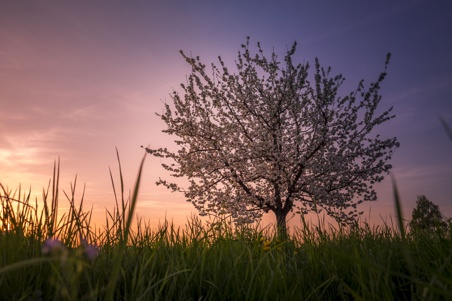
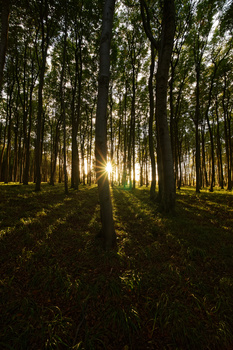
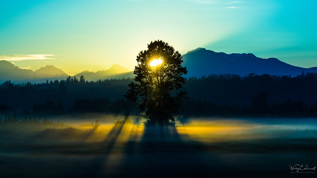
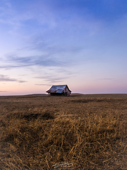
I shot this one at the beginning of blue hour, I'm actually quite happy how it turned out. Looking for feedback, what can be done better?
Contest Submissions
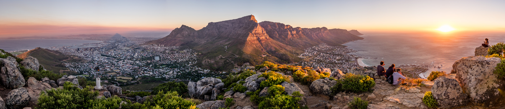
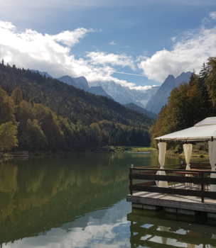
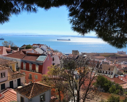
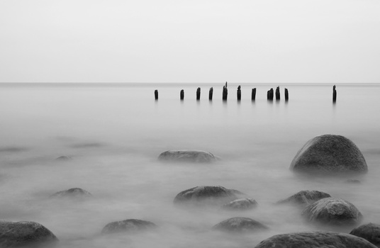
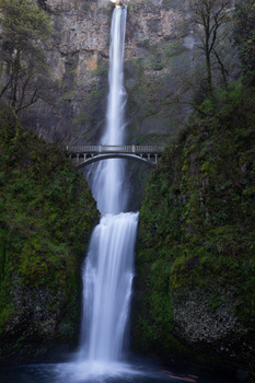
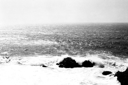
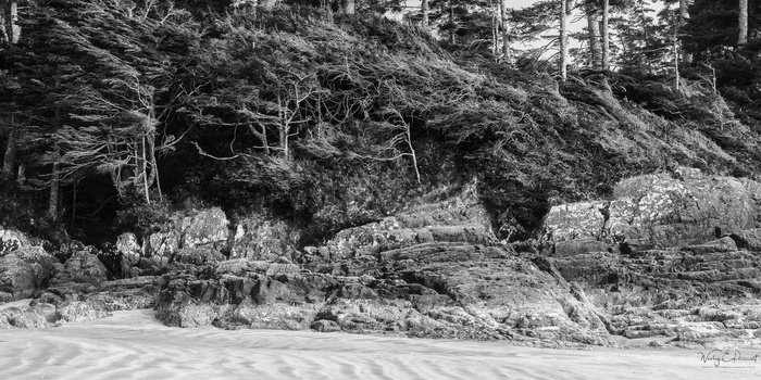
Click on the thumbnails below to comment and rate each image.
Click here to learn about the Fstoppers rating system and what each star value means.


5 Comments
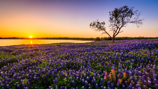
Hi Philipp! I'll start with what I like the most - colors and a subject. I really like those last rays of sun casting lots of warm tones into the sky, juxtapositioned with colder colors of the grass and a sky in the upper-right corner. Also the subject is very interesting - lonely tree blossoming when the spring kicked in full. Those two work very well together IMO, and you managed to capture them beautifully. The tonality is also quite nice - you have lots of shadows (but not a lot of blacks), quite a lot in dark mid-tones, and some highlights - all this creating soft and pleasing contrast, that enhances the serenity of the sunset.
The things I don't like that much are: composition-wise - I wish the tree had more separation from the grass. Right now the blurry (out of focus) grass blades) are "touching" your main subject within the frame. I just wish those two blades weren't overlaping, to create more separation and "breathing space". Also - I wish the tree was standing straight (maybe it isn't in nature - but here it creates an unease with it's angle to the horizontal grass). Usually - verticals and horizontals are perceived static. As diagonals are perceived dynamic. This shot is very peaceful to me, thus straight line of tree trunk would work better for me in this case. This could happen in field due to a lens distortion, but can be also easily changed during post.
As for post-processing: I can see a darkening gradient in the upper-right corner - that's obvious giveaway. If what you go for was a natural look, I would back the strength of it little bit or use softer gradient (eg. start drawing it slightly outside the frame and finish in the same spot as you did).
Hope you find some of those tips useful. And - overall - I really love the picture. You have nice and simple composition, very good color harmony, and great processing. Tweak the small things and the photo will be stellar! :)
Wow!! Thanks Andrzej, so many nice words about my picture :D
I didn't thought too much about the grass as I've taken this picuture, the reason why I got so low, was because in the far distance there was a forest, and I wanted to create the illusion, that this tree is lonesome, but next time I'll try to move around a little bit more, so that my main subject isn't touched by out of focu elements...
You're also right about the gradient, it might be a little be too hard.
I also didn't notice that the tree is not completely straight.
Anyway, thank you very much for your input, I will try to think about those things next time when I get the chance to take some pictures again...unfortunately at the moment Austria (where I'm from) has a few days of bad and rainy wheather ahead :(
BR,
Philipp
Philipp, you've already got many things right, so there are only some minor tweaks to do here. :) Try it next time and I'm sure you'll get superb shot! Hope to see more of your pictures soon! :)
(Here in Poland we have some stormy weather right now, but mostly during the night - during the daytime it doesn't get that much interesting, so it's a bit of a stall to me too. ;) )
I think Andrzej covered anything I'd say too. I just wanted to comment saying this is the best photo I've seen that you've posted in the contest Philipp.
Thanks Alex, to be honest, I suck at photography, but that's the reason I try to collect feedback :D By the way this is my personal favorite landscape shoot I've ever taken...so at the moment I don't have anything better! XD