
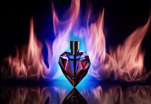


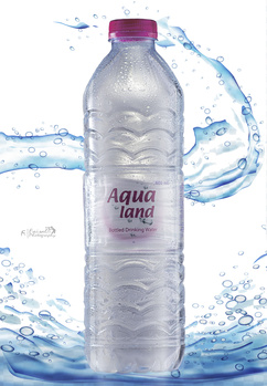


This is the second time I try at product photography, ever! First time was almost 10 years ago and it turned out awful. That's one more reason for me to be proud of this shot. CC is allways welcome. How can I keep improving?
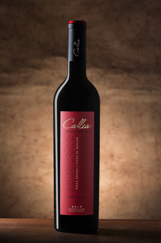
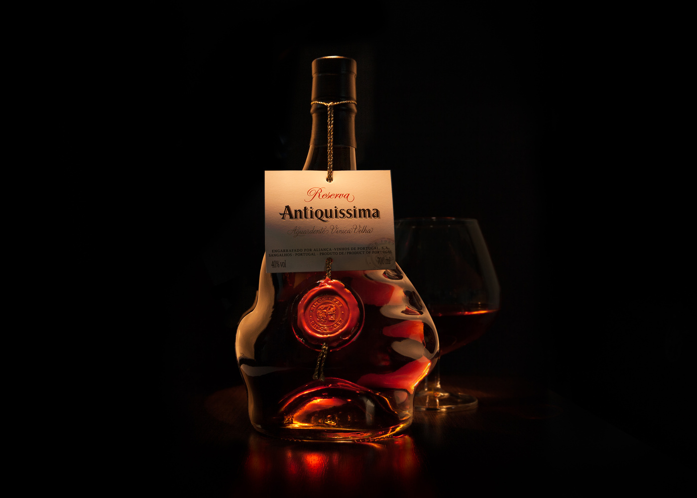
The product is a distilled Aguardente (burning water) from Portugal. Can't wait to open it!
Click on the thumbnails below to comment and rate each image.
Click here to learn about the Fstoppers rating system and what each star value means.
6 Comments
Hi Marcio! Nice shoot with lots of atmosphere. The shape of the bottle seems so strange that I think you could have "outlined" it more, to make it more understandable
I totally agree with you! My rim shots were "toast"so I couldn't include them in the composite. And with 1h30 on the deadline to the contest I didn't have time to remake it. But I'll pick up on your advice and try "dodge" the outline to see how it looks. Thanks!
The glass in the back turned out real nice and subtle so as not to distract from the main subject. Lighting on the labels is perfect, other than that I agree with Olivier. But with that shape, I sure do understand how the rim shots would hard not to have turn out "toast." wonderful image....
Thank you for the comments, Guy! My aim was to set the mood, but trying not so subtract from that beautifully designed and crafted bottle. Maybe it's hard to get from the photo, but the dents are actually the shape of a hand, almost inviting you to grab and have a sip.
needs work, I like the shot and the light is amazing(mood) but i can see on my monitor your background cutout and brushstrokes , the bottle outline above the label is to soft. and again i see a burn brush on the glass (right outside 1cm above the liquid) the glass is not clean (or the reflection of the bottle is making / doing that , and missing the çrightside edgelight . sharpening the bottom text on the label . the bottle has a beautiful frond reflection on the table! but on the back left side is like a total different shot and dos not belong there , darken is or lose it.
English is not my native language , so sorry for my choice of words. for me it is a super picture and in my personal insight I think my above points make your picture even better / more beautiful the it already is.
Yours sincerely,
robin.
Hi Marcio! I am a first time responder. I can almost feel the feel of the burning water. But agree with other comments about making the the outline pop a bit.