

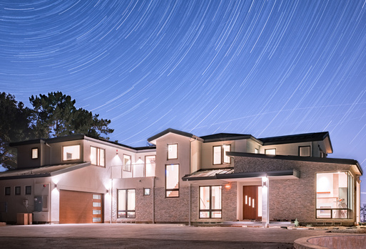
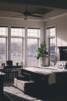


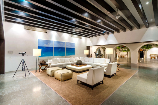
Waited a couple months contacting this client offering a free shoot for them to get my foot in the door and some portfolio shots. They finally got back to me last week and paid me to shoot this for them as it was entered in a Children's Hospital Dream Lottery. Win Win! Im new to the Fstoppers community and a big Mike Kelley fan as well as Barry Mackenzie. This is my first critique submission so hopefully I don't get roasted too bad lol. Shot this with one Godox AD200.
Click on the thumbnails below to comment and rate each image.
Click here to learn about the Fstoppers rating system and what each star value means.
12 Comments
Another good 1-point. Though I may have enhanced the fire replacement just a bit more to make it feel alive.
Ya, plus I need to get some better fire replacement images, wasn't happy with this one. I'm so mad at myself for not rubbing down the chairs in the foreground and lowering the pillows on the chairs too, and I should have removed the glass candle holder on the edge of frame. But thank you once again for the feedback, always appreciated Steven. Cheers!
I just use the fire render inside PS. Does a decent enough job with the right blending mode.
Thanks, I've never used that. Will have to check it out.
Maybe use the pen tool and select the fireplaces and use a curves layer to increase the color in the fireplace.
Will do, good tip!
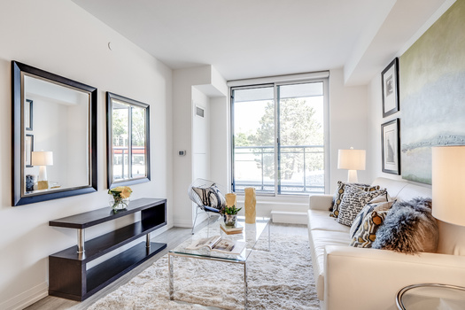
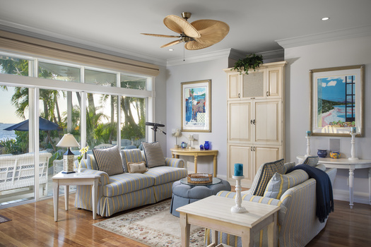
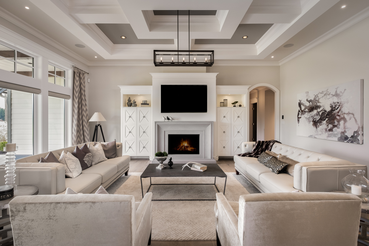
This is a very straight forward room to try to make interesting. Your chose of composition says to me that whatever is going on outside is either not important to the space or possibly detracts from it. Sometimes what we leave out can be just as revealing as what we include.
The technicals are all there.
The few "styling" details I would love to play with in this space are....
1. As with most real estate clients, space is such a focus, it would be interesting to pull the two foreground chairs back further into the camera. Just showing the arm rests and a tiny bit of cushion would be enough to let the viewer know they are part of the decor but would not block so much of the space. This just to make the room feel a bit bigger and not so crowded.
2. Maybe a few too many pillows. They tend to make the couches a bit busy and don't add to the stark elegance of the space.
3. The tv is such a dark 'black hole' and really draws the eye to it. Maybe a dose of darkish grey gradient with some subtle noise or pseudo reflection from the outside would help to make it fit the room and not dominate the image as much.
4. Subtle touch on all the lighting is quite pleasing. Always the question of lights on or off as part of the feel to a room is a challenge. Usually if you are going to have the lights on they should all be on. The lamp or the left may be on but does not read as such. So it feels like an oversight or mistake.
Jay this is a very solid image and one that I would be proud to show any client.
Good work!
Hey Julian, wattuuuuup! This Shoot actually had many shots provided to the client with the view included, which was AMAZING, so I was trying to mess around with just the interior on this one. I will respond to your numbered comments in turn ;). Spoiler alert...I agree with them all.
1. Don't get me started on all my mistakes with the chairs! Lol. I actually pulled them back almost 2 feet. It doesn't look like I did but trust me. But ya, should have gone further...it looked so far in real life I guess it compromised my decision.
2. I got nothin. You're right.
3. The TV makes me so angry. I'm still learning PS and I can't seem to get my gradient to work on it. I'm missing some steps or keyboard commands or something. Gotta go back and find that technique and learn it because I also want to play with that technique with some other stuff.
4. Ya, I totally missed the lamp. It should also be a bit more to the right, and that curtain should be spread out a bit more.
Thanks for the feedback Julian.
I'm gonna go cry now and question everything I've done with my life ;(
Haha :)
"I'm gonna go cry now and question everything I've done with my life ;("
Yea, I do that at least once a day. Usually just before my first cup of coffee.
The time you have to really worry about is when you look at one of your own images and think... Dam. I'm good!
Be afraid! Be very Afraid!
When that happens you know you've entered the Lee Morris Zone. ;-D
Hi Jay, Since you asked for feedback in the main comments, i looked for your images to see if there was anything i could add. This is not my genre so if these thoughts are off base, please excuse me. They are given with good intentions.
I think your technique looks very well executed. The image is well exposed and nothing catches my eye from this standpoint. Well done!
There are a few things i do see that may or may not be issues.
The TV is a problem for me. It is so dominant and a black empty space in the middle of such a nuetral space. I wonder if shooting at a different angle would help. This one almost feels like the image's most important feature is the TV. It is hard to look away from it as the rest of the room is so neutral.
Along this same lines, the neutrality of the room leaves a lack of a path for the eye to move through the image. I don't know if it is a no no in this type of work but a few small objects with color placed in the areas you want the viewer to look might create a viewing path through the room. I'm not suggesting bright, off theme color but rather something subtle but not brown. Just a thought.
Like the comment above, the backs of the chairs need to be off the foreground edge. They create a eye-stop right in the front of the image. The one on the left even looks marked or stained. It has to go.
Lastly, the image looks like you are trying to do a very centered composition but you are about one step to the right of center. Look at the bottom right corner of the TV and the right side of the chandelier to see this.
Best wishes! I do hope this is helpful.
Thanks Ruth. Of course its helpful, and always appreciated:) Those chairs and that tv are what I like to call painful mistakes that I will have to live with for the rest of my life haha. Hopefully mistakes I will fix in future shots.
Cheers!
Very nice.