

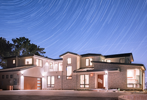


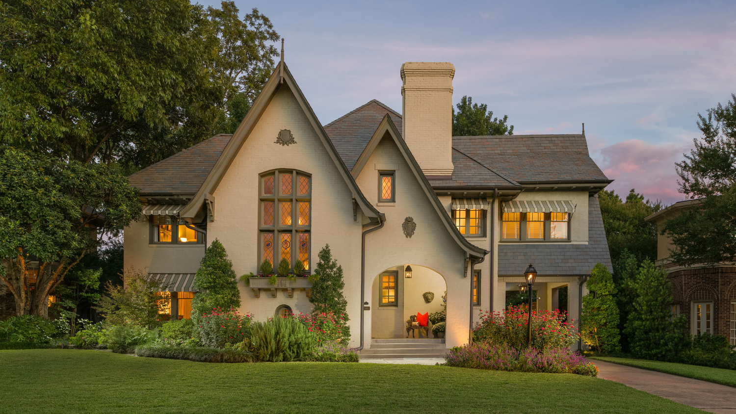
Amazing 1920s home that had to have the floors completely rebuilt to bring it back to life. I love seeing old homes brought back to life again.
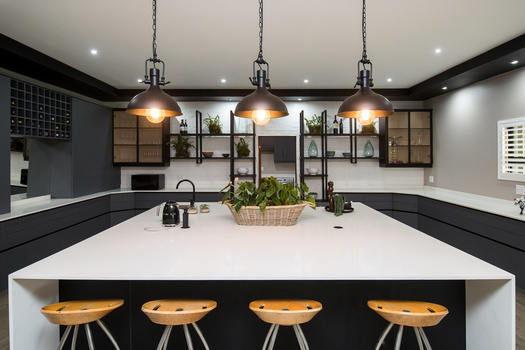
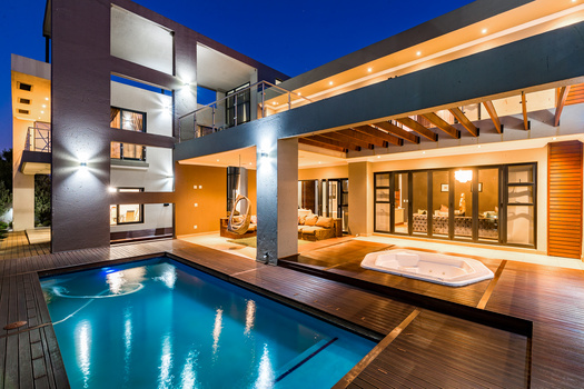
Click on the thumbnails below to comment and rate each image.
Click here to learn about the Fstoppers rating system and what each star value means.
4 Comments
First of all, I checked out your profile and you sir are talented! I am not at your level.
Now let me pick on you a bit, sorry lol
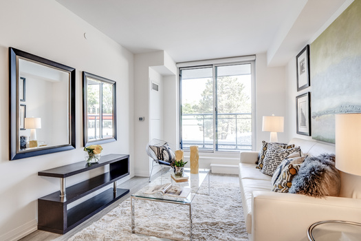
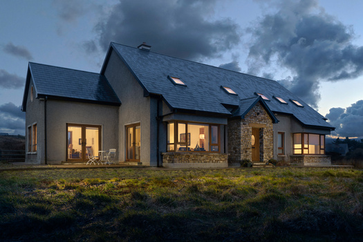
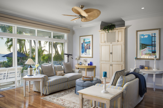
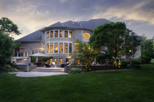
Your horizontal roof lines at the very top are converging in a "v" shape towards the middle, so it looks to be collapsing a bit in the centre. Your vertical lines are leaning right, some worse than others. and your rounded doorway even more so..
I hate sounding negative and sounding like I'm a know it all, but just giving some honest feedback, hopefully helpful. Still giving a 3 star because your skills are OBVIOUSLY on point!! But, just missed on this one.
I will mention that I always prefer to see the grass getting darker as it gets further from the house during a twilight shot, but I admit that's just a personal preference.
Very nice profile portfolio sir, people should definitely check it out.
Hello Jay,
Just to jump in to agree with you that Reagan does have some serous chops.
Also in defense of this image, the verticals are spot on where the building is actually straight but as is the case with many older homes or homes that are not well built, not all lines are in fact perfectly vertical/horizontal. That seems to be the case with this home. Especially the arched entrance and the roof of the right side gable. The lines go all over the place on this structure. :-D
Thanks for commenting Jay.
Julian, when you're right you're right. Good call.
Fantastic! I love everything about this image! it is really charming, the lighting is really nice (personally maybe I would bring in the whites of the lights a bit more), and I think a Realtor would really love this image. The coloring is subtle, the composition is well balanced and the house looks warm and inviting.