No problem! It's well deserved. I'm glad I entered this. I've already found some great photographers like you and Trevor Kennedy. I feel like I'm at a spot in my real estate photography where I need to start evolving beyond what I'm doing and seeing others' work has given me some good inspiration. Thanks for watching my stuff!
Check out Kat Alves, Barry Mackenzie, and Tony Colangelo. Tony & Barry both have tutorials I want to buy but haven't pulled the trigger yet. The portfolios of those 3 are some of the best I've ever seen. The tip of the spear for interior photographers in my humble opinion. And obviously Mike Kelley of course.
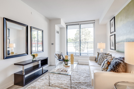
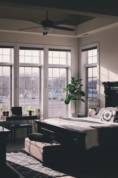
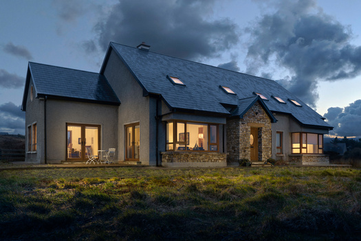
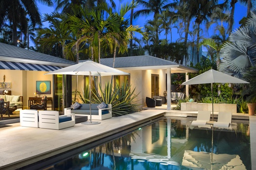
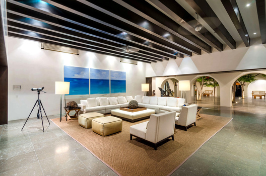
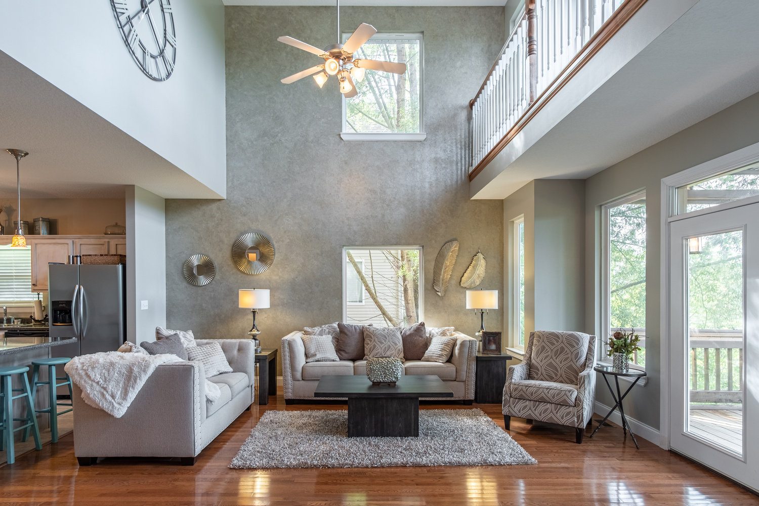
beautiful! I read below that the rug is skew and its such a shame! I think you could easily straighten it out in photoshop though. The lighting is so beautiful and i love that we can look out of all the windows. I am again a bit conflicted about it being in landscape and would have lived to see it in portrait to emphasize the height of the ceiling and to incorporate the entire clock, but i really like that you can look out of the window to see the decking and that the space leads into the kitchen.


11 Comments
This had 4 written all over it....
and then I saw the rug :(
Solid image though Korey, or should I say, solid image KentuckyMan30 ;)
Haha! Thanks, Jay!
Just checked out some of your photos and I'm loving your work! I HAVE to start learning proper flash techniques. Top notch stuff, Jay!
Wow, thanks man that's very kind of you. I'm one of your many subscribers, I've been a fan of yours for a while.
No problem! It's well deserved. I'm glad I entered this. I've already found some great photographers like you and Trevor Kennedy. I feel like I'm at a spot in my real estate photography where I need to start evolving beyond what I'm doing and seeing others' work has given me some good inspiration. Thanks for watching my stuff!
Check out Kat Alves, Barry Mackenzie, and Tony Colangelo. Tony & Barry both have tutorials I want to buy but haven't pulled the trigger yet. The portfolios of those 3 are some of the best I've ever seen. The tip of the spear for interior photographers in my humble opinion. And obviously Mike Kelley of course.
katalves.com
barrymackphoto.com
tcphotography.ca
mpkelley.com
I almost forgot Garey Gomez. Yes that is proper spelling.
gareygomez.com
Garey Gomez is probably my favorite at the moment! I really love his work. Thanks for the suggestions!
I like it! Very subtle and clean!
beautiful! I read below that the rug is skew and its such a shame! I think you could easily straighten it out in photoshop though. The lighting is so beautiful and i love that we can look out of all the windows. I am again a bit conflicted about it being in landscape and would have lived to see it in portrait to emphasize the height of the ceiling and to incorporate the entire clock, but i really like that you can look out of the window to see the decking and that the space leads into the kitchen.
Thank you, Natasha!