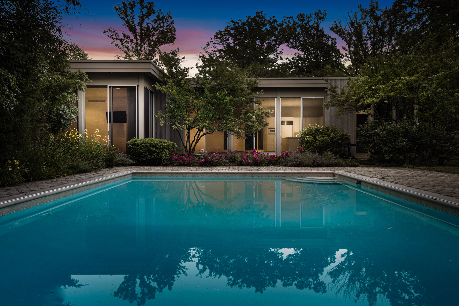
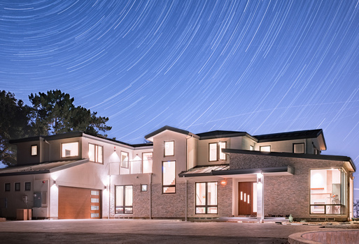
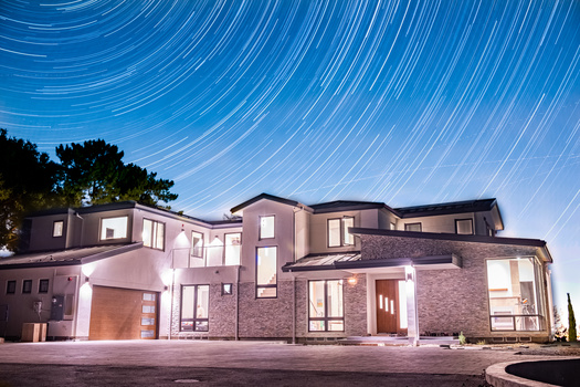
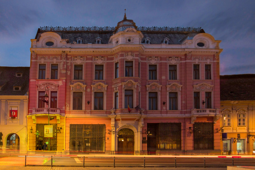
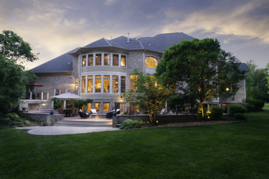
Twilight shot for homeowner/agent
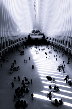
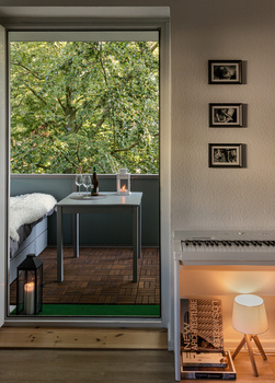
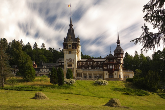
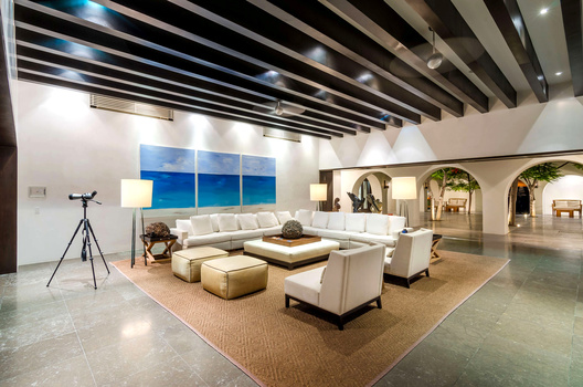
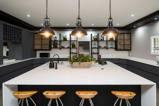
Contest Submissions
Click on the thumbnails below to comment and rate each image.
Click here to learn about the Fstoppers rating system and what each star value means.
Click on the thumbnails below to comment and rate each image.
Click here to learn about the Fstoppers rating system and what each star value means.


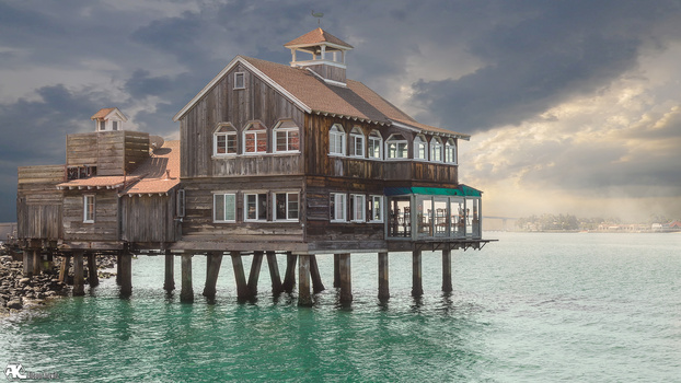


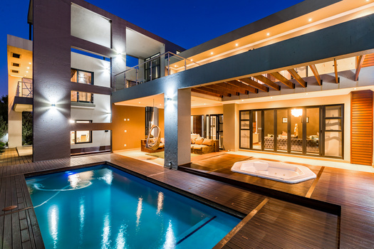
2 Comments
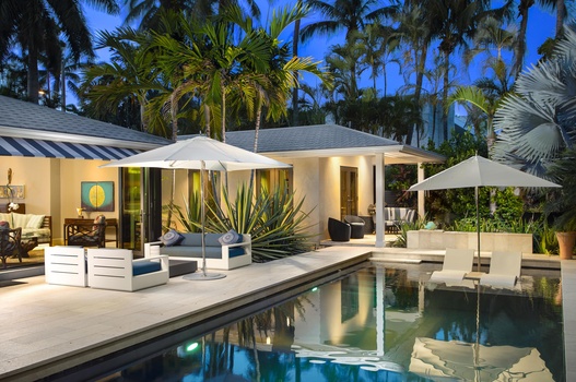
Probably just a stylistic thing on my part, but I wish that it was a bit punchier. Obviously it becomes cartoonish if you take it too far, but looking at this image makes me feel like it would the colors would probably have been a bit more vibrant and the blacks a bit deeper if I was standing there. I think it's a solid photo overall, though, and like I said it's probably just a stylistic difference.
I must admit, I enjoy the really soft contrast, it suites the image. ONLY thing I would have done, would maybe be ripple the water a little bit to soften the reflection. very solid image though, nicely done