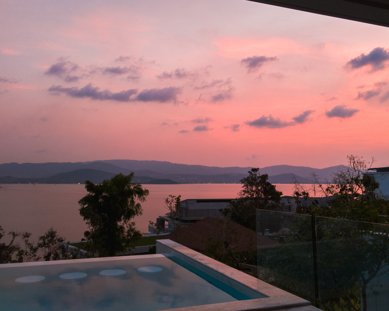
Contest Submissions
Click on the thumbnails below to comment and rate each image.
Click here to learn about the Fstoppers rating system and what each star value means.
Click on the thumbnails below to comment and rate each image.
Click here to learn about the Fstoppers rating system and what each star value means.


1 Comment
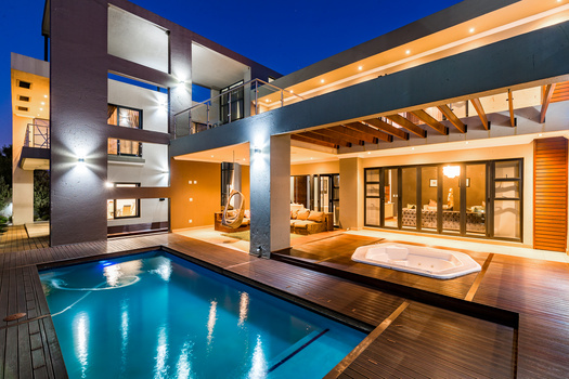
The composition feels muddled. I'm guessing that you were trying to show the view, but I think you needed some more of the house in the foreground to get that across. The angle of the shot also creates an odd feeling because you have what looks to be a balcony of some sort (or maybe a wall?) coming into the frame in the top right corner at an angle and these transparent panes coming into the frame at an angle on the bottom right. Makes me wonder what I'm looking at.