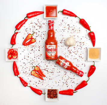
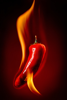
I like the concept a lot. It's fun and on-brand with some of the Frank's campaigns I've seen.
Shame that with packaging limitations, there is no way to get the "hour" hand to be represented by a wider container and the "minute hand" in a longer, thinner bottle.
Only other thought would be to have the peppers represent the time markers in which case, there would only be two between the 12,3,6,9. Not sure how this would actually look though because I like the balance in your shot.
Thanks for sharing your thoughts on this. I love the brand's irreverent sense of humor! I probably could have done some work in Photoshop to change the hands but at the time I shot this (a few years ago) my PS skills were minimal.
There are two other variants I did on this - one where I sliced the peppers into numbers at the time markers and another with a black background.


2 Comments
I like the concept a lot. It's fun and on-brand with some of the Frank's campaigns I've seen.
Shame that with packaging limitations, there is no way to get the "hour" hand to be represented by a wider container and the "minute hand" in a longer, thinner bottle.
Only other thought would be to have the peppers represent the time markers in which case, there would only be two between the 12,3,6,9. Not sure how this would actually look though because I like the balance in your shot.
Thanks for sharing your thoughts on this. I love the brand's irreverent sense of humor! I probably could have done some work in Photoshop to change the hands but at the time I shot this (a few years ago) my PS skills were minimal.
There are two other variants I did on this - one where I sliced the peppers into numbers at the time markers and another with a black background.
Glad you like it.