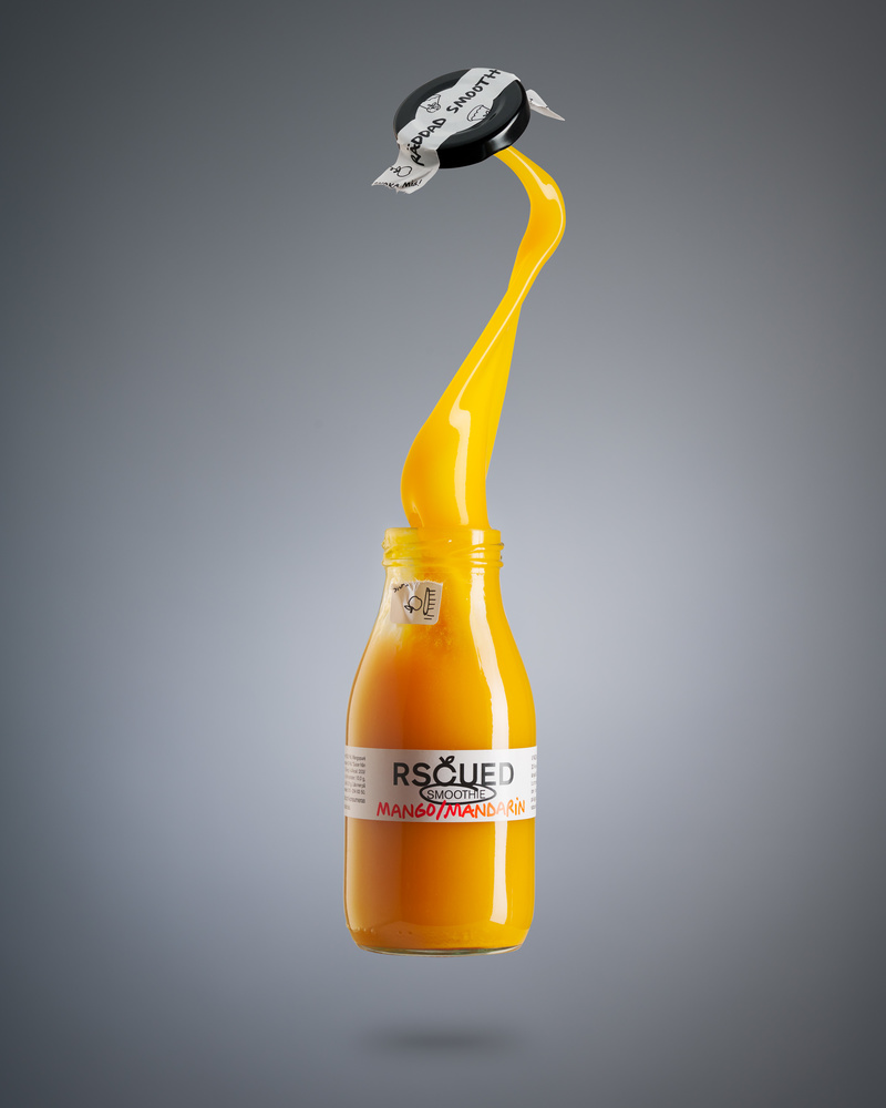
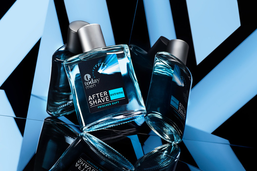
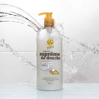
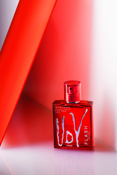
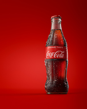
A composite out of three images bottle, handheld splash out of the bottle, and the cap. All shot in same light setup, lit with 3 strobes – one for the background, one for the gradient left side and one strip box to the right for the right side. The lid had an extra white bounce from the left, to give it some extra light.
Contest Submissions
Click on the thumbnails below to comment and rate each image.
Click here to learn about the Fstoppers rating system and what each star value means.


5 Comments
For anyone voting "needs work to be able to fit into a portfolio" feel free to add your professional opinion as to why and what's needed. :)
Hi David. I voted needs work only because I feel the left side of the label is a bit dark. The "RS" is kind of lost and since that's part of the name of the product it shouldn't get lost. Other than that I think it is well done.
Oh, that was harsh, haha. I would agree if it was starting to get unreadable, as it stands now I find it adds a nice dynamic. ☺️🙏
All I could say would be personal preferences, so I don't think I really have anything to add. If you twisted my arm, that piece of lid seal hanging on the bottle bothers me, but I get it why you left it. I didn't vote it as needing work anyway...
Well, it bothered me as well, was going back and forth about doing something about… 😅