If no one takes notice or takes time to engage more deeply with an image, what does it matter?? Getting control over the viewer’s eyes can be a big game-changer for your fine art photography.
In my latest video about how to get control over the eyes of a viewer in photography, I gave you a detailed overview of the three phases a typical viewer walks through when he gets into touch with an image. It shows quite well that it is not done by placing a subject in the third and considering a leading line. We need to master all three phases of controlling the viewer’s eyes.
Why Should Anyone Look at Your Photos?
Our time is valuable, more than ever. This is why we don’t want to waste it on things that don’t appeal to us. When we are scrolling through social networks like Instagram or Facebook, for instance or when we are just looking around in a room and we identify an image for just a fraction of a second, we will unconsciously weigh if it is worth engaging more deeply with that image or not.
The first phase of getting control over the viewer’s eyes is all about grabbing their attention, getting them interested. Therefore, we need an element in our image that is either outstanding, unusual, or anything the viewer could feel connected to. We need something that has an impact on the viewer. But this doesn’t necessarily need to be a rainbow or a light ray. Even a very high visual weight in a simple composition can draw attention to the image.
The first phase is all about grabbing the viewer’s attention and getting two or three seconds of their valuable time, so that they decides to go over to phase two.

Making Your Viewer’s Speechless
There is nothing worse than a viewer who is looking at one of your images, saying immediately: “nice capture.” I’m sure they want to be kind. But in phase two, we want to bring them to understand the story in the image; we want to make them speechless.
The impact is needed to grab the viewer’s attention. But the disadvantage with impactful images often is that they “burn down” quickly. When the viewer gets the feeling, that they have seen the spectacular rainbow now, so that they can go over to the next image or do anything else, we are losing the viewer. To avoid this, we have to lead them around the composition. We can use different methods like leading lines, triangles, repeating shapes, and patterns. The second phase is all about the flow of the image. Simply said, this defines in which order the viewer looks at the different elements of the composition.
The image below was taken on a quite foggy day at a lake. As the log in the foreground is the biggest visual weight in this image, we are attracted to it. Then, we tend to look to the next part with visual weight, which is the contrasty left upper part, followed by the right area. The flow is supported by the reflection line of the mountain as well as by the shoreline in the distance.
The goal of phase two is to deserve two or three more seconds of the viewer’s attention. We want them finally to go over to phase three.
Chaining The Viewer Inside Your Frame
Now, we know that we have to grab to viewer’s attention and that we have to lead them around in the composition. However, we want them also to stay as long as possible inside the image. They should get interested in details so that they decide maybe even to come back to the image again later.
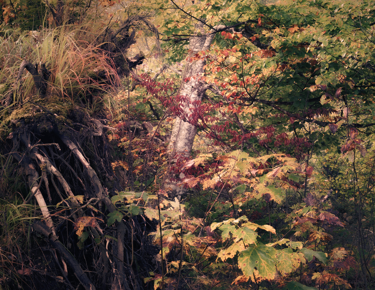
Phase three is all about engaging the viewer. And here, we have one more conflict with the first phase: impact is good for grabbing the viewer’s attention, though. This is why photographers tend to simplify their compositions, which is a good idea because it helps to get rid of distracting elements, and it can lead to more impact. But the simpler a composition gets, the fewer elements to engage the viewer. This is why for phase three, a more complex composition is even an advantage, as it offers more hidden elements to be found by the viewer. But if it gets too complex, we will not grab the viewer’s attention in phase one. We need a conflict that gets solved by the right balance between simplicity and complexity.
We should also not ignore that there is a difference in which circumstances a viewer looks at an image. The image above has sold quite well as a big fine art print, but it did poorly on Instagram and Facebook. The reason is simply that complex images on social networks very seldom bring viewers into phase two, as they don’t grab enough attention in our fast-moving world. But sitting on a sofa in a living room, maybe enjoying a glass of wine, leads to a different situation. Too simple compositions don’t contain enough hidden elements to enjoy an image for minutes. The image above is extremely complex, but it engages the viewer due to different elements and a flow that goes around the image, with lots of resting points, which holds them finally inside the frame. The viewer has a reason to come back to the image later, to go on the journey again and again.
Many more details and more tips about how to control the eyes of the viewer are revealed in the video above.


