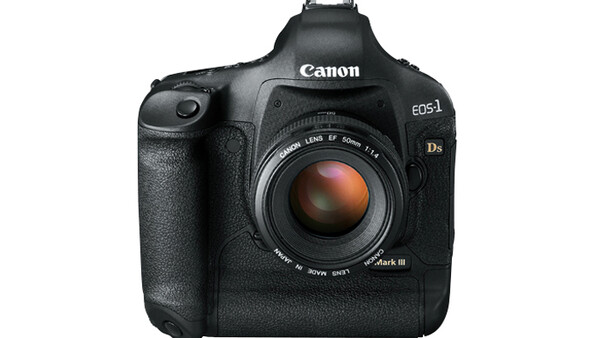
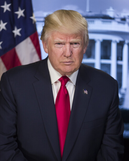
Well, so much for always needing the latest and greatest gear. Even the president's official portrait was shot on a decade-old camera.
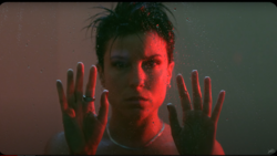
What you see below is President Trump's official portrait as it appears on the White House website:
For comparison, here's President Obama's second portrait, taken in 2012:
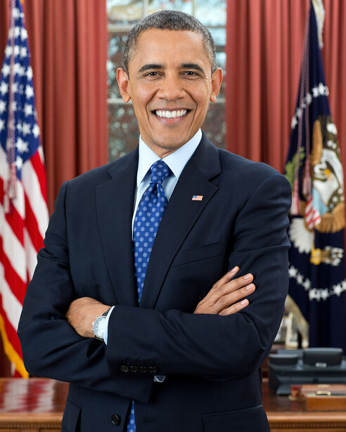
It's interesting to compare the two portraits, both from a perspective of what they convey and simply on the basis of the equipment they were shot on. What are your thoughts?
Related Articles
Join the Fstoppers community for free
-
Post comments and join in the discussions
-
Browse the site ad-free
-
Share your work and get featured in the community
-
Compete in the photo contests for fun and prizes
53 Comments
interesting comparison
Most certainly wonderful portraits can be taken with old gear... wish 1) he would have been more relaxed and at ease (after the unfair, mean-spirited TIME cover, Trump prob doesn't trust any photographers), 2) more fill light would have been used (you can't reallysee the man's eyes). I'm sure he's hard to photograph and likely has the patience requiring a 93-second sitting. Not inspiring and I regret stating that b/c I don't mean to be critical of the photographer... it's just... meh. Likewise, Obama's first portrait looks like a happy boy birthday party shoot... Hats off to anyone who photographs a president!!
No way around it.. its just an awful portrait regardless of the camera.
Agreed. You'd think they'd try a little harder for the official photo of the President.
There is clearly a light above him firing down. You can see the shadow under his chin; it's just high enough not to show up as a catchlight in his eyes.
Was just about to say the same. There might even be a third light to the left judging by the 3 shadows of the nose. Looks like constant lights too by the shutter speed.
Definitely 3 light sources for sure. And I think you're right about the constant lights as well. I think this could well be shot with the existing lights and a (really) poorly placed flash.
Good catch.
Look in Trumps right eye. You can see the strobe reflector which is low camera left to fill shadows and create the texture and detail in his skin. These were most likely all studio strobes. The longer exposure is used to balance the projected White House image on the background.
I think both Pictures are Top notch..Technically
. Obama is however far better Lit and he is far more relaxed ..
Trump seems unable to smile look relaxed..and maybe
I suspect too that the photographer and Obama seem better connected
The Kit comparison is valid but it is possible to Take a Top Notch Pic with a 70-200 with any Decent Camera and get great results
Assuming Trump's photo was shot on strobes, the photog exceeded the sync speed for the 1Ds III (1/250th), which could account for the exposure drop-off and flag discoloration on the left side of the frame. That is, unless the photog was using high-speed-sync features that one doesn't normally find on studio lighting gear. Generally, shooting past sync speed with studio lighting gear would be regarded as a mistake.
Quite a few studio strobes have HSS these days. Not uncommon at all.
The type of studio strobes likely used by official photog? Still uncommon. Sure, it's in the Pro-10 pack, and a handful of others, but the majority of studio lighting gear (Profoto/Elinchrom/Bron/Dyna/Speedotron) lacks it.
Furthermore, shooting at 1/320 (1/3 stop past sync speed) sure reads like an error, not an intentional move. Shooting at 1/2000th outdoors? Sure. But not one wheel click past the sync speed, when shooting in a controlled environment. That's a mistake.
Yeah totally agree with that, it's clearly not a strobe, more like video lighting. Was just commenting on the HSS aspect of your comment. Profoto and Elinchrom both offer HSS. I had HSS on my old Dynalite strobes.
All that being said, you're right. Based on the image itself and the settings, this was clearly not strobes, but not because HSS isn't readily available on professional lighting.
Elinchrom features HSS on their ELB400 line and is easily someone like an official photog would have. Same for the Profoto, which has HSS and is even more portable.
But HSS sync on studio strobes generally only uses the top three power levels, so at ISO 640, the image would have been completely blown out.
Regarding the comment that the Time Trump cover is "unfair and mean-spirited," the magazine is not campaign literature. The portrait is not a public relations image. The image was conceived to match the tone of the article that accompanied it and the words and conduct of the subject during his campaign. Mr. Trump displays a stack of the magazine on his desk in his New York office.
Rex - I was referring to the "horns" when noting "mean-spirited." And your comment reminds me of Trump's apparent belief a la Roy Cohn that any publicity, good or bad, is indeed good publicity. Thanks for commenting as I believe I took my feelings regarding the press and applied to the image versus the placement of the horn and, in general, how Time views any non-progressive pol. Thanks again.
In the FStoppers article on that cover, it was also noted that Bill Clinton also appears with the "horns." There is no evidence that the cover designers intended to use the logo as "horns" and it's unlikely that the photographer was involved in logo placement decision.
Thanks, Kirk. I'll go check that out. Thought I'd share this point. I used to get Time magazine and actually kept 10-12 issues from "back in the day." I just pulled them out... One is Clinton as Man of the Year - and indeed there are horns. But the portrait is beautifully lit and the image is very flattering and favorable. The horns, in this case, appear almost playful as his smile (as he had a factual track record of "playing" at that point). You look at the image and it's all inescapable - but then you see his style and smile and you think, "yeah, he's a bit of a devil but then he can't help himself as he's charming and commanding and, well, women go after him." Then there is a cover with Newt Gingrich. The coloration is rather sickly. The lighting, contrast and sharpness show EVERY PORE - and the photographer snapped while he was looking at the camera impassive, probably knowing that Time (given that Newt was conservative) was looking for some unflattering image. Go check it out - there's no way Time didn't know what it was doing with Newt. They didn't send an amateur to take a bad photo. It's that principle (that the editorial content deliberately reflects an agenda) that, I think, colors not just my perspective of an image but their deliberate selection.
If you google the history of Time and the horns debacle, it's explained that there simply isn't much real estate to place a photo on the cover- Obama got them- even the Pope. Quite a lot of people actually.
1Ds Mark III - old camera
1/320 s - unnecessarily fast for portrait (and over flash sync, if flash was used)
145mm - a bit too long for portrait (flat face)
f/2.8 - not the sharper spot
ISO 640 - unnecessary noise
Could be continuous light. And he/she try to balance background with foreground this is could explain high iso. And old camera not = bad camera..
The ISO and the shutter speed make little sense to me. It makes me question what kind of set up would require that. It seems like someone was having to adapt on the fly and had little control over the environment.
The lights are a problem because of the strange and unsettling shadows on his face. They also emphasize the wrinkles on his shirt.
Kind of makes me think that someone didn't take the presidential portrait seriously enough to allot time and effort. It could have been the client or the photographer.
I think it was probably a video set and someone with a camera grabbed a shot of POTUS and the VP.
What an awful portrait. And that's not the fault of the camera, or the settings. The lighting is just horrible, but most of all the posture and the facial expression of Trump, it's just wrong. A portrait is about the person, so despite the technical aspects of a picture, it could still be a descent portrait. This is just wrong on both sides.
Agreed. It's a terrible portrait mostly because of the attitude and facial expression of the subject. The settings are the least of the problems. Then again if a portrait is about the person and it's an awful portrait, well.... maybe he's an awful person.
"A portrait is about the person..."
You just said it. I think the photographer got the core of the person in the shot. It's actually a very good portrait, spot on.
Kind of reminds me--in that regard--of Arnold Newmann's portrait of Alfred Krupp.
Keep in mind of the subject you're working with- while Obama was more than likely a breeze to work with, you can only imagine what it was like directing Trump (or rather, trying and settling on the look *he* wanted to give you). That's what comes across in that photo.
The 145 choice seems odd unless the flattening effect was intended to bring up the Capitol dome, flag? Or do something to his face. But the eyes surely are too dark..overall if the intent is to convey aggression, I guess it succeeds ..
I think the 145mm was so the picture of the Whitehouse, which appears to be on a large digital screen, would look larger and fill the void.
The VP's "portrait" was shot at 130mm. This was clearly a random photo grab. Don't know why they didn't put any effort into getting a real portrait made.
At least the background in the VP portrait was straight. If you look at the POTUS portrait, they used the outer edge of the right hand column to straighten the portrait.... Only problem is that the column is tapered from bottom to top, so the whole barckround is off.
I have made this mistake before (assuming something is vertical when it is not), but it does make me question why someone didn't take the time to make sure it was right.
The thing I notice about the Trump shot is how COOL it is. The background is pretty much blue. Also he looks pissed lol.
it looks like they've tried to remove some of the orange out of Trumps skin in turn causing his tie to go slightly pink and his hair to go much lighter.
Went with the lowest bidder? My Nikon D3X still does amazing portraits. Its really about the lens anyways, but I am guessing there was very little time given to the photographer to actually get the shot. Maybe a lighting adjustment was not an option? I am more curious if he hires a staff photog. Def wont be Souza quality but will be interesting to see.
Maybe it was shot during a break in a video shoot, hence the hi ISO and not top notch lighting and somewhat odd color balance... Many video shooters I have shot with are concerned with the quantity of light rather than quality.
PS- His hair goes every which way... :)
I think you're right. Definitely looks like a video shoot.
do this photographers get paid to shoot the president (no pun intended) or do they do it for exposure? :P
Uninteresting images, both of them and it's the photographers fault not the equipments.
For those on twitter... David Hobby hit it 100% on the nose.
The media did a real hack job on my presidential portrait (Trevor Noah trump voice)
One light firing upwards with a bounce card on it to through some light forwards.
It definitely seems like a rush job. I can picture them passing by the video setup, someone talking to Trump and saying that they need to get a portrait up on the website. He says, "Well let's just do it under these lights and get it over with." Photographer shrugs and makes the best of it.
It looks a bit funny to me that the pin with the US flag is all blurry, but the tie does not seem as blurry as the pin...
The Trump shot looks like a snapshot from a news set. The white balance on the backdrop is worse than a JC Penny photo studio. At least the Obama shot you get it that he's in the oval office though the pose could be more presidential but this was his second portrait and he looks relaxed.
He looks like he is about to read the news.
Trump looks like he is going to murder everyone in the room. If the photographer wants to convey that Trump looks like a mean, vicious and heartless person, job well done.
Obama on the other hand looks open and warm.
I wouldn't be surprised if his nephew or other family member shot it. Not because of nepotism obviously, but because they're really fantastic, the best photographer you've ever seen, absolutely beautiful work, a real bigly professional, they're going to be yuge in the industry, and believe me because I said it folks.