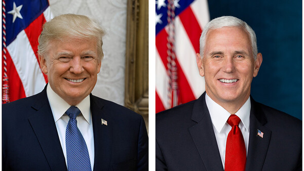
In a showdown of competing presidential (and vice-presidential) photographers, the White House released new official portraits of President Donald Trump and Vice President Mike Pence on Tuesday. The two portraits were shot by two different photographers, and it’s evident in the style of each photo. The question is, which photographer did it better?
President Trump’s photo was taken by Official White House Photographer Shealah Craighead, a veteran political photojournalist who was First Lady Laura Bush’s official photographer as well. While Pence’s photo was taken by D. Myles Cullen, a Defense Department photographer.
EXIF data reveals some telling details (you can find the full resolution file of Pence’s photo from the White House here and Trump’s here). Data has been stripped from the President’s photo, but in Pence’s photo you can see that Cullen was using a Canon 5D Mark III and Canon EF 70-200mm f/2.8L IS II USM lens set at 123mm. You can also see that the caption information refers to him as “Micheal Pence,” somewhat of an embarrassing spelling mistake to leave in a file directly on the White House site.
Both photos feature an American flag in the background, though Pence is on a blue background while Trump is pictured against what appears to be the wall of the Oval Office (which CNN notes is possibly why the photo was delayed as the Oval Office was being redone).
Trump’s photo also includes the edge of a picture frame, something most basic photography teachers would say detracts from the image, but perhaps it was something that had a specific meaning to the President.
Lighting is also different as well. Pence’s photo appearing to be more of a studio-style portrait while Trump’s appears to be more naturally lit. Although without EXIF data, it’s hard to tell.
Trump is also smiling in this photo, a marked change from the scowl in his first official photo.
Which photographer made the better portrait? Sound off in the comments.
[via CNN]


Join the Fstoppers community for free
-
Post comments and join in the discussions
-
Browse the site ad-free
-
Share your work and get featured in the community
-
Compete in the photo contests for fun and prizes
39 Comments
Pence's portrait photographer by a mile. His work is a textbook example. Nice catchlight. Directionally well lit. You can't even see Trump's eyes. Really, this was an official portrait of Trump? You mean to tell me no one even bothered to straighten his tie?
Yes, Pence’s Portrait has bokeh and better lighting, but Trump’s Portrait has lower chin and more shoulder. I’d still pick Spence as the better photo.
Pence's is better but not great. There's no natural reason for the VP's face to be so much lighter than the background. The photographer should have increased the background exposure and backed off the flash a bit. The depth of field was sufficiently shallow to provide separation and this would also provide a tiny bit more separation between his coat and the wall. Also, I'm not a fan of two catchlights. I don't have enough time to critique Trump's portrait.
I like how the Trump photo makes him look like Satan in disguise, with that shit-eating smirk.
I would choose pence image by far but never like to see two catchlights in the eye.
I think the Pence image is lit better, is sharper, and shows a nice use of color, particularly with the background. My only real critique is the flag edge intersecting his head; that bothers me a bit, though I get the intention.
If you zoom in it almost looks like pence was clipped out. I wouldn't understand why but there is a slight shadow across the entirety of him, it is subtle.
You up-voted a comment that said Trump looks like Satan. It's kind of difficult to take anything you write seriously. But yeah...I noticed it too. :-)
Are you the vote Police Sam? Or maybe you are Satan? its anyones guess.
As a matter of fact, I am but in this case, it was a failed attempt at humor. :-)
If you think I could be Satan, you're in for a big surprise! ;-)
I think the Trump shot is better but not by much. The Pence shot has a little bit too much contrast, especially on the jacket for my taste. The light on the Trump shot looks more natural. Not a fan of the frame creeping into the background though. Seems I'm in the minority on this.
?
Pence photo is very usual as thousands of photos of this kind. It cannot be bad, because it was made according to all the photographic rules. Trump's photo has emotion. IT is more catchy, perfect for memes. People will remember it for a long time. And this is the reason why it is good.
Umm.. what? I think people will remember Trump's photo for a long time because of how bad it actually is. Seriously, it looks like an iPhone snapshot. Note, I didn't say iPhone portrait because that would entail some semblance of preparation. I'm not sure what emotion it is that you're reading, but it looks like the average fake smile people give when someone on the other side of the camera says, "SAY CHEESE!".
You're right about Pence's photo being constructed using basic photographic rules and that's exactly why it's better than the Trump portrait. It has all of these mundane things like directional lighting, catch lights, in the eyes, a non-distracting background that doesn't have a random piece of a photo frame and stuff like that. You know, the types of things we generally associate with good portraiture of this nature and the type of stuff that students are taught in basic photography courses.
Mind you, that's not to say that Pence's portrait is fantastic, but seriously... The fact that this is even a point of debate on a photography website astounds me.
i think the VP pic is better. better lit, better crop. and what's up with the presidents background ? crappy and it's not straight. that picture frame is horrible. the VP blue is so much cleaner. you would think that someone who shoots for the white house would know how to compose a photo.
Clearly, VP’s portrait is FAR better. It’s a classic style portrait done by a portrait photographer. Trump’s photo is terrible and not even up to standard. But really expected the Official White House photographer would do a better job. Not in this case - flat lighting, poor composition and shows a comlete lack of preproduction and postproduction work. The American flag both in the background(wrinkles) and on his jacket(reflection) look so terrible, the tie, the photo frame...It’s like someone with a camera walked into the room with an on-camera flash(for bouncing) and said “Mr Trump, cheeze...!” That’s probably what she did. WH needs an art director. ; )
On a flip note, it might be a reflection on how busy President Trump is and he didn’t even get any quality time for photography?
Neither is any prize considering the status of the subjects.
Trump's seems to be a result of "Take my picture now, I'm on my way to the golf course" Then he stood under a skylight and had someone rush over a flag.
The image is flat and lifeless but at least he isn't scowling like Mussolini.
First impression, better picture: VP.
On the other hand... making an angry orange look human... better Job: POTUS
Pence:
to me the original looks heavily oversharpened although it is only less than 60% of the original filesize (5D MK3). My guess is there was a front focus which has been compensated through strong sharpening. At first I thought it was shot at high iso (3200), looks pretty noisy for iso 100.
I probably wouldn't have delivered this to my client.
Trump:
I find this photo a complete joke at least when used as official white house photo. The framing, the background, the orange color, the "dead" eyes and this strange kind of looking down... not professional at all, I find.
At the end the Pence photo is my favorite even if it's not perfect.
EDIT: my former comment about the wrong date of the trump photo seems to be nonsense, as the histroy snipped above just shows the XMP-History. Sorry for being too fast, my bad.
btw, the trump photo has a spelling mistake as well:
"Please note that this photo is being sent to you for personal us"
Pence. The composition on Trump's is a disaster and I can count at least 5 things that are distracting, the first of which is that his head isn't even centered in the image, he's pushed left.
Both are good , no one of them is great.
I like the photo of the VP best. The lighting just "feels" professional. In contrast, Trumps picture feels like an interchangable news photo. Great for some random news stories, not as official picture.
Trump's face is either angry pout or "i don't know how to smile cause I never do", Pence looks like he has experience laughing and can choose a photographer. Trump can't even pick a photographer that knows to leave a crooked frame out of THE OFFICIAL PRESIDENTIAL PORTRAIT, also looks like a submission for "shot on iPhone"
For the purpose it is intended to serve, the Pence portrait is better. I don't necessarily fault the photographer who took the Trump portrait--the results are likely the consequences of dealing with the subject.
Seriously, neither one,,,They look like Walmarts employee of the month pictures...if you remove the USA flag from both, then they remind me of standard ID pictures for a greencard application...
They both have a lot of flaws and personally my taste for either individual put aside (don't really like either of them) the Pence photo is more 'stately' than the Trump photo. The tonality in the Trump photo is horrid, the picture frame gives my 'editing ocd' fits and it just seems way too casual to be the 'official presidental photo'...perhap trying to make him look more amenable?
The Pence photo is a 'bit' bright but at least that provides clarity, the Trump photo looks like it was shot only using the overhead lights in the room.
At least Pence's smile seems somewhat genuine (not likely), whereas Trump's is clearly practiced (doesn't reach his eyes)....oh and both their ties are crooked.
PS> the flag coming out of the top of their head...uugh. The red/white/blue rope on the flag...sigh.
iPhone vs. Canon?
Pence wins! Frumpass' portrait has a very distracting chunk of photo frame in the shot. Did his youngest son snap the picture?
Think as this: which one would you put as your FB profile picture? Details? Contrast, shadows, not straight tie. People DOESN'T CARE about this. It's all about overall look.
Not even a contest.
Why is there even a discussion over this? Pence's portrait is far superior. Trump's looks like it was a snapshot taken from a larger group portrait, with no consideration of the background or details, such as his tie or lapel pin. Yes, Pence's face is a bit bright, but at least you can see his eyes and there's separation between his hair and the white stripes of the flag. It's not exciting, but it's simple, classy and does the job it's meant to. There's no reason to bring politics into this, because it's not a political discussion. Just try to look at them objectively for the sake of constructive criticism.
I live in the DC area, and I'm confident I could do a better job than the person that shot Trump's portrait. Hire me, White House.
Are you guys serious? Is this even a debate. Trumps photo looks like it was done with a flash on camera bounced straight into the ceiling. The crop and the background is nasty. The lighting is flat as hell. I used to shoot events. I used to use the same lighting. Id expect something better from a white house photographer. Or probably the photographer doesn't like Trump.
Pence by a long shot.
Where is Peter Hurley when you need him?
Both failed. Toothy grins. Look like senior images.
for god sake, stop talking about politics. this is a photography related website
I thought there was supposed to be only one catchlight in each eye. Pence's portrait has two in each eye. Where is Yousuf Karsh when we need him?
Pence a classic portrait, Trump portrait looks more like one of those spur of the moment photos.
However I'm not saying it's not a good portrait, just that it's not something I would want to blow up to 24x30.