
Time recently announced that it had named Donald Trump its Person of the Year. That's unsurprising when you remember that the title goes to the person who "for better or for worse... has done the most to influence the events of the year." However, the cover photo is peculiar in several ways — enough so to raise the question of if it is an intentional reference to one of history's most evil and infamous figures. The Internet seems to be split on if that's the case.
Note: Let me preempt this article by saying I am entirely setting aside my personal political leanings here; what you're about to read is an objective photographic analysis and a stark reminder of the power of photography.
The Donald Trump Cover
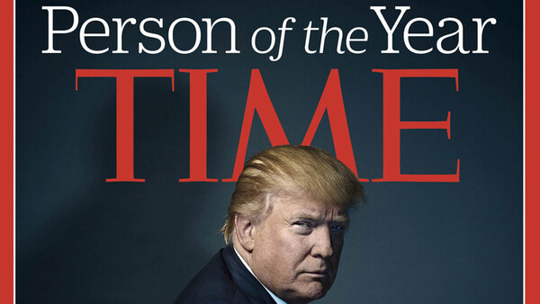
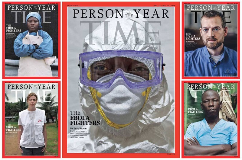
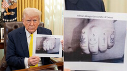
Let's start with the 2016 Time Person of the Year Cover, which features Donald Trump. This cover first generated controversy when some asserted that the "M" in "TIME" was deliberately placed to form devil's horns on Trump's head. Time was quick to point out that this was coincidental, particularly given that many past cover shots have resulted in a similar situation, including those for multiple popes, presidents, and celebrities, among others. However, a new theory emerged: Time was deliberately referencing Hitler. Let's first establish a baseline by evaluating the Trump cover and placing it in context with the most recent Person of the Year covers that came before it.
And then, there's the lighting. What's the most powerful part of a person? Their face. In it, we can read everything we could ever want to know about them. But half of his face is in shadow, and the other half is somewhat neutral, giving away neither personality nor motive, but suggesting a duality in identity, a light and a dark, a public and a hidden. As Zach Sutton notes in his analysis of the image, there's a shadow in an odd direction behind him. If anything, I would say the peculiar angle of the projected shadow figure is entirely intentional, as if it followed the direction of the key light, it would not appear in the frame. That shadow was placed there; it's arguably referential.
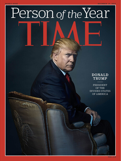
So, if we accept that it doesn't exactly convey power, what is it that this portrait is showing the viewer? The chair is turned away. Incidentally, it reveals the fleur de lis prominently embroidered on the Louis XV chair (if my limited knowledge of French antiques is correct), a rather bizarre choice for an American portrait and perhaps a subtle tip of the hat to a monarch who showed little interest in politics and led France to the doorstep of the French Revolution. It may seem like a stretch, but I ask you to consider the size of the fleur de lis and the rakish angle required to display it.
And what of Trump himself? If you gave me a photographic Rorschach test of sorts and asked me to free-associate adjectives for a man turned away but leaning toward the camera, hunched over, half-hidden in shadow, I would tell you: scheming, sinister. The turned away body indicates the presence of something in the shadows, of an interruption by the camera, of a certain voyeurism. Perhaps intentionally, that side is so in the shadows that it's almost black. The outward leaning indicates a leering of sorts, a displeasure coupled with a hidden power, as opposed to the overt power of a standing, head-on closeup.
Before we discuss the corresponding Hitler cover, however, let's place Trump's cover in context, as I think its relatively anomalous nature is relevant in discussing the intentions behind it.
Comparison
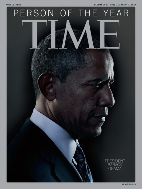
If we look at the most recent Person of the Year covers, the difference becomes stark. President Obama's 2012 cover very much mimics the famous portrait of JFK; it's much closer and features him prominently in the frame without additional props. Because of his proximity, there is less of a hidden element, a characteristic further underscored by the fact that his far side is actually lighter. To me, this conveys a man both troubled by circumstances and profoundly deep in thought. The choice of a side profile conveys less of a power dynamic and underscores the uncertainty he faced entering his second term. Personally, I think that regardless of how you read his facial expression, this portrait is singular in identity, and in that sense, it stands distinct from the duality in the Trump portrait, the implication of a hidden side.
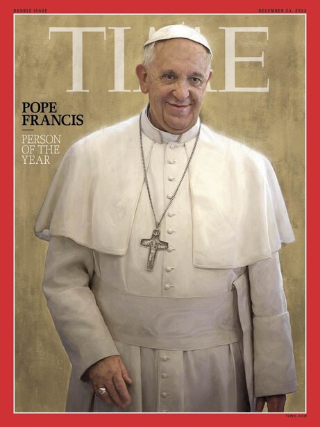
The 2013 portrait of Pope Francis is perhaps the most easily read. It's inviting and accessible, unencumbered by an overly engineered pose, which contributes to its ability to portray a man seen as "the people's pope." Though a very technically apt digital painting, it intentionally reads less as a manufactured product of the studio and more as a frozen moment in time, a man of service in his element. I personally think his slight lean and the choice to crop out half his left hand are strokes of artistic and editing genius, respectively. They contribute to the "found" nature of the portrait.
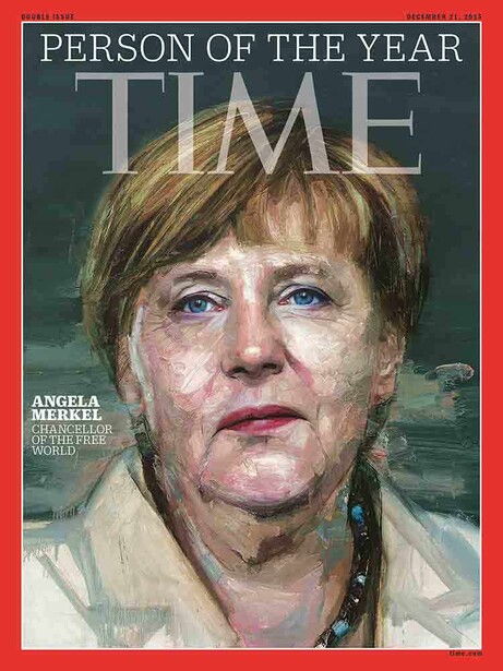
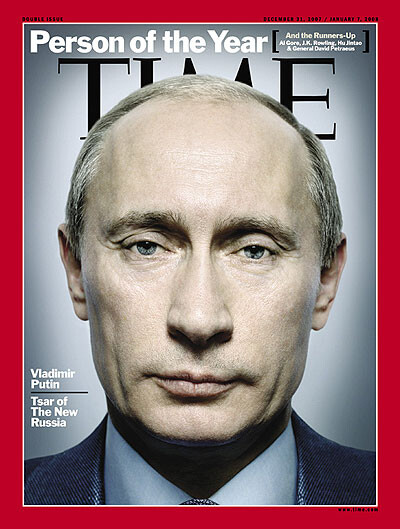
Note that Time characterized Merkel as someone "standing firm against tyranny... [with] steadfast moral leadership" and Putin as having "performed an extraordinary feat of leadership in imposing stability on a nation that has rarely known it," but "at significant cost to the principles and ideas that free nations prize." Putin's portrait exudes absolute power of the individual; Merkel's exudes a distillation of power of the people. Returning to the Trump comparison, however, again note that despite the differences between the Merkel and Putin portraits, both have a singular and readily apparent identity; there is no implication of duality in them. Even the text that accompanies the three portraits underscores this idea. Merkel is "Chancellor of the free world" — singular. Putin is "Tsar of the new Russia" — singular. Trump is "president of the Divided States of America" — duality.
Hitler
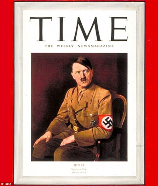
One thing to note: this is not Hitler's 1938 Person of the Year cover, but rather a 1941 cover. His 1938 cover showed him playing an organ with bodies hanging above with the cover line "from the unholy organist, a hymn of hate." If we accept that Time is in fact referencing Hitler with this year's cover, the more abstracted symbolism of the 1938 cover might not translate in today's environment of consumption as well. Furthermore, I can't imagine that a direct reference to that cover would ever be allowed by Trump's PR team; so rather, if we think political strategy for a moment, referencing a more obscure (relatively speaking) and less abstracted cover avoids both of the aforementioned issues.
Now, look at the photographic properties of the portraits: their posing, their aesthetics, their symbolism. Like the Trump portrait, Hitler has receded into the frame. This lends it the same slightly voyeuristic look — less a pose than a secret look. That identity is underscored again by the sideways glance off camera — the thoughts and scheming that the camera was not privy to before this moment. The chair is a similar style. There's the same diffuse, sinister shadow on the wall (and if indeed Time was replicating this shot, it explains why they went to the lengths they did to place a shadow in a position that didn't really match the lighting of the shot). The same idea of duality is here as well, not so much in the face as in the sudden interruption of an otherwise continuous background (on the right) by a distinct blackness along with the shadow cast by Hitler himself.
Of course, the key difference here is that Hitler is facing forward and Trump backward. This can be read several ways. Time is an American magazine; thus, a portrait of a German leader would show him facing outward with his atrocities behind him (duality) in his homeland, whereas Trump is an American leader, thereby leading the country into whatever abyss awaits it from the driver's seat. It could be read that we do not yet know the full extent of the consequences of a Trump presidency. It could be read that a deception has taken place, that the face presented to the American masses is not that that will hold the office. Returning to the fleur de lis, it's worth noting that Hitler conquered France in 1940, a year before this cover appeared. Read from that what you will.
The Internet is very split over whether this is the case or not. I spoke to several industry associates, and surprisingly, no one was lukewarm; they either saw the resemblance in the extreme or saw nothing at all. Whether it is there or not, it's a startling reminder that photography can hold incredible expressive power and can provide commentary in a succinct and tangible way when words have long since become dulled by overusage.


Join the Fstoppers community for free
-
Post comments and join in the discussions
-
Browse the site ad-free
-
Share your work and get featured in the community
-
Compete in the photo contests for fun and prizes
59 Comments
You went into a lot more detail than I would have ever done (you're an excellent analyst), but I think you're right. I can't believe a magazine which paid so much attention to such subtle details would do anything coincidentally. I do however agree, regardless anyone's political opinions, about their reference to the "divided states." It's really sad that we can't seem to come together after elections are over. The "right" never gave Obama any rest and I don't see any unity in Trump's future either.
Thanks, Patrick! I truly appreciate the kind words. That's kind of my take too; it just seems like too many coincidences at a very high level of craftsmanship where most (if not all) decisions are intentional.
As you know, I call 'em like I see 'em. :-)
I must say I'm at a complete loss as to why they didn't use the alt shot from that photo session. Seems so much more appropriate to me...
Well that is the kind of tasteless garbage I'd expect from someone on the left! The irony of what can be said and posted from a political perspective that is supposed to be the poster child of tolerance is truly amazing. I doubt that any post like this with Mrs. Clinton's likeness would have ever seen the light of day.
The analysis of the portrait, while under the auspices of a politically neutral perspective unfolds as anything but. No I don't think it's a particularly good portrait, or portrayal, but the depth of this analysis and it's direction, is anything but non-partisan.
I have been commissioned to capture President's and Supreme Court Justices over the years, so I know the drill and the thought that goes into such a sitting. The brooding, dark feel of the entire composition is exactly what the photographer and Time wanted to portray, to President Elect Trump's detriment. Had the motivating factors not been what they obviously were, a composition of hopefulness portraying the "Make America Great!" theme might have presented a very different feel, but that wasn't the agenda was it?
Jim, I would be very curious to see some of your portraits of presidents and hear your take on the process and what you were trying to convey.
Well, well, well, upset are we now, Mr Wilson? Hmmmm...
I would like to now divert your attention to the collage of posters I have grouped together at the bottom of this reply to you sir. These are but the TINIEST of samplings of posters created by the right, or, as they fancy calling themselves these days, the Alt-Right, of President Obama that have been created over the last 8 years. Kindly take take a moment to study these images in-depth.
Now, what was it that you were saying?...
Well that's exactly the kind of tasteless garbage I'd expect from someone from the AltRight.
There - now you've both had a mud pie in the face.
Perhaps in future we can try having discussions, instead of seeking to be so abusive to one another? And assuming motives that you want to believe lay behind that photo, without any evidence at all, other than your political views.
The Pope appears to have "horns" as does Putin. In a Petapixel article of the same topic, Hillary was featured twice on the cover with "horns".
Correct. Time addressed this, as I mentioned above.
I think you put more thought into this analysis than the Times itself. What would be the reason for this in first place? If they referred to famous portrait, it would make more sense, but who remembers Times cover from 1941?
Controversial messages are more effective if done subtly. If your audience detects your message it may not be well received. Far better to lead them to your goal and let them "discover" it. I dunno...it worked for Socrates. :-)
It's important to remember that "Time" doesn't do anything. They hired Nadav Kander to photograph this image and I assume that he had total control. So if there is any foul play here, it's all on him and not Time. But to me, the only similarity is that they are both sitting in a chair, nothing more. And I actually really like the image. I think it's the best image of Trump I've ever seen.
I'd be very curious to hear from Kander about this.
I think the idea of the photographer on this level having "total control" isn't how it works - it's a collaboration, not "Hey make it look cool." There might be an opportunity after he has "their" shot to try something experimental, but these things are pretty well concepted beforehand between the photographer and magazine creative team.
Perhaps you're right but I've heard Greg Heisler speak about shooting Time covers and he has never acted like Time ever told him what to do. The "two face" shot below is a good example of that.
But maybe he did run it by Time In advance and he left that out of the story.
Clearly it depends on the publication, editor and photographer - I definitely have a couple of clients who say, "Make it look cool" - but not for covers, and at this level, I think it's a team effort.
I think its a good bit of both - PE's usually have a pretty solid idea of the direction they want to go, but photographers are usually given some freedom to interoperate that, or shoot their idea alongside the magazines direction.
Yeah I should also mention I really like the image from a lot of standpoints...I don't think Kander had total control of a shoot like this, I'm sure Time's creative director or whatever was looking at all options for the final pick, and these guys don't just grab a good one they are looking at various expressions and poses from all images taken. I doubt Time was totally hands off with this.
you don't see ANY similarities aside from the chair Lee?
This thought reminds me of this portrait of George H W Bush done by Gregory Heisler. Without cracking open the 50 Portraits book, I recall Greg's intentions with this image were positive, but it got construed as him going for a 'two-faced' kind of angle and resulted in him being banned from the White House for the remainder of the term.
Perhaps Kander will speak on this in due course (i.e. 20 years from now!).
I'm definitely not the biggest Trump fan but I really like the photo, texture, lighting, and composition. It's definitely a great portrait.
Really outstanding analysis. I also agree I don't think the horns were placed intentionally, but I do think they were at the very least inspired by the Hitler cover. The body angle and composition chosen conveys the voyeur feel for sure, for me the body language also conveys a sense of being reprimanded by him almost, like if I was his aide and spoke against him in a meeting and he turned and looked and glared at me for it. For me the expression itself reads like "don't question me" this isn't a "presidential" shot at all. The chair also feels like a wall to me too, like "I'm here you are there" sort of thing.
Obviously like any art I think the idea for this was to let us formulate these thoughts and opinions and take from it what we want, it's hard to know that the photographer and creative director had all these nuances in mind, but I love that we are all dissecting it, and discussing it that is a good thing. I think those of us who shoot portraits everyday are (or at least should) be a good study of people. For me personally, when I watch Trump speak or whatever I don't get the sense of honesty, that I do from Obama (even personal beliefs aside). That's based off reading expression and body language, which is something I tend to judge people on more than their words.
Bottom line the "mood" of this image is intentionally dark, and that says a lot right there. This wouldn't make you want to work with this person. Also if you take the coloring, is very cold, even the subtle blue fill from the right lighting his hands; feels cold, the light on him is pale, and desolate, just the color contrast in the lighting is divided. The harsh lighting as well, no soft shadows which I also noticed towards the last few months of campaigning it seemed like every press conference or room Trump was in was heavily down lit, and in general kind of dark, it was weird. It is a very interesting cover choice for sure, again really nicely analyzed
I'd like to watch you and Alex discuss other photos...but not mine! ;-)
hahahahaha come on! it'll be fun you can do any of mine!
I did several of yours while watching the Cinematic Headshot videos. They were all great! :-)
We'll all three do it!
Thanks so much, Dylan! I really appreciate your kind words. I just don't see the horns being intentional either; it's happened too much in the past, and they've been located in a place that naturally predisposes that to happening for a while now.
Your analysis is really great; you highlighted some nuances and their impact that really enlightened my take on this. And you're right, I don't know that the photographer and creative director had these things in mind when creating the shot, but my mathematical side always asks "how many coincidences are just coincidences?"
But even so, I think we can all agree that the mood of the image is indeed dark and intentionally so. Even if that's all it amounts to — a dark cover — it indeed says quite a lot.
Is this one of those 'fake' news stories I've been hearing about? Trump and Hitler sitting in a chair.Yup, you cracked Time Magazine's 'code'.
...
The shadow is intentional (and done in camera. You can see it in the BTS video), but perhaps it's not as sinister as I previously supposed. If you look at the body of work of the photographer, Kander frequently places shadows behind his subjects. Take a look at his portrait work at: http://www.nadavkander.com/portraits/portraits/single#52 and you'll see many examples of his shadow play. As to the framing of the shot, the use of the chair, etc., only the art directors know the answers there...
Interesting. My mistake. Shadow does not look natural to the lighting at all to me. Seems like a strong enough light to produce that shadow at low camera right would have filled in the dark side of his face and neck. But it's right there in the video, like you say.
that's exact my thoughts. i try to find out since two days how it's done.
i know he used a gridded beautydish as key light. then he used a smaller light to get this shadow behind. But why is his right side still so dark? how can you achieve this? also was there a blue gel on the smaller light?
My guess is that it's a gridded reflector with a barn door, but you can't see the light.
here you can see a BTS picture: https://timedotcom.files.wordpress.com/2016/12/time-behind-the-scenes-d…
http://time.com/time-person-of-the-year-2016-donald-trump/?iid=buttonre… You can see the shadow at about 2:26 in the video.
I really like the image, it interests me and I think despite the fact it's not a close up headshot Trump has such a presence that you are still drawn to him.
I am more concerned how the image of Angela Merkel was ever approved. Talk about making someone look older and sick looking.
I agree with others that the analysis is perhaps a little too detailed, but it did make me stop and look a lot harder at the image.
For me, the one thing that immediately jumps out is that Trump is not alone, there's someone else off-camera to the right with whom Trump was having a discussion (hence the positioning of the chair). The viewer has interrupted this, causing Trump to turn with eyes narrowed in annoyance.
Just who the other person is remains a mystery, but you can be sure of one thing - a deal is being struck, either business or political.
I see a seat of power facing away from the viewer, but a man of power turning to face the viewer. What do I read into this? Nothing other than the man in the seat sees behind him where some other men might not bother to look that way.
I also see him doing the "squinch". :-)
Waht I enjoy the most about this picture isthe huuuge shadow he casts. Present yet subtle enough that his face distract you from it. Kinda like his shadowy team of PR and crazy friends...
great article. clearly thought out. and i'm not surprised- time magazine seemingly want to remain controversial.
I couldn't give two shits about time covers after that Palmer Lucky (Oculus) cover. I really don't think they put that much thought into the cover at all...
I love your thoughts and analysis of this - All that said, what an incredible, and ballsy photo to make. Just wow. One of my new favorite portraits.
As a German, I feel it a bit far fetched to compare the portraits of Trump and Hitler: Hitler was in power for 8 years when the mentioned cover was published (and many consequences of his government were already visible).
BUT, concerning the photo of Trump as "person of the year" (I guess he deserved the title as not very many expected him to win), i get an ambivalent impression of the photo. I.e., trying to show that nobody really knows how things will continue / develop.
IMHO, this is a great achievement of the photographer, which makes me think that it is a great portrait. Of course, history may prove anybody wrong, but this photo surely gives the feeling of uncertainty of the current times...
Sometimes people also do stuff because it's cool looking. Without any other hidden thought.
All interpretations are resulting from post creation analysis and therefore coincidental.
I don't whether or not this is the case here but I would just remind everybody that sometimes analysing things is irrelevant. (The catch is that we often need to analyse to discover that it could be irrelevant).
When you really think about it, if the photographer didn't have any intention to convey a hidden message, the similarity between Trump's and Hitler's cover photos/art is even more startling. If you had Hitler turn 180 degrees, and look over his shoulder, it would be a dead ringer!
Really enjoyed this article. It shows some of the art and psychology in portrait photography. This kind of thing is so much more interesting to me than fashion or 'celeb' portraits.
Everyday people don't read time. Most don't know Hitler was the Time Person of the Year if they even know there is such a thing as the Time Person of the Year. This is largely an exercise of bourgeousie navel gazing.
The author is a gifted writer, however. That is clear.
I like how the "help" is wearing booties, everyone except for a woman in the BG. I bet Reince has to don the booties when he's in the tower.