
Time recently announced that it had named Donald Trump its Person of the Year. That's unsurprising when you remember that the title goes to the person who "for better or for worse... has done the most to influence the events of the year." However, the cover photo is peculiar in several ways — enough so to raise the question of if it is an intentional reference to one of history's most evil and infamous figures. The Internet seems to be split on if that's the case.
Note: Let me preempt this article by saying I am entirely setting aside my personal political leanings here; what you're about to read is an objective photographic analysis and a stark reminder of the power of photography.
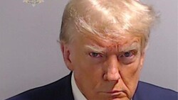
The Donald Trump Cover
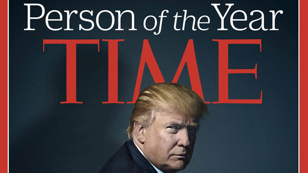
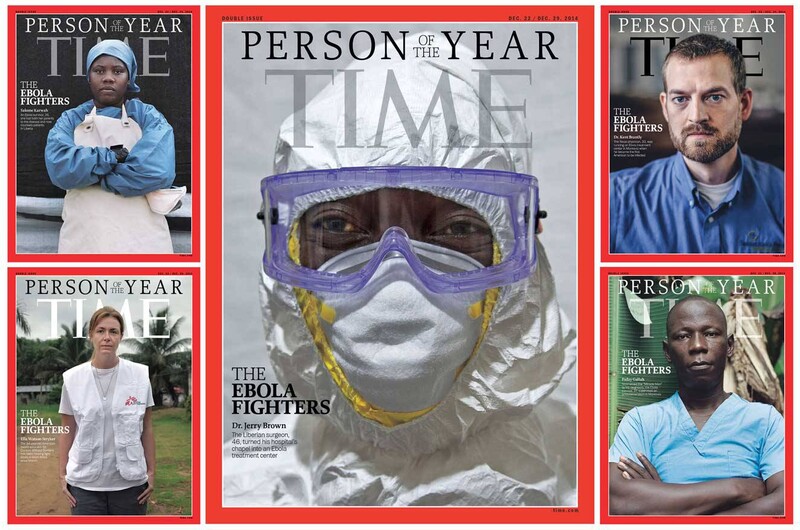
Let's start with the 2016 Time Person of the Year Cover, which features Donald Trump. This cover first generated controversy when some asserted that the "M" in "TIME" was deliberately placed to form devil's horns on Trump's head. Time was quick to point out that this was coincidental, particularly given that many past cover shots have resulted in a similar situation, including those for multiple popes, presidents, and celebrities, among others. However, a new theory emerged: Time was deliberately referencing Hitler. Let's first establish a baseline by evaluating the Trump cover and placing it in context with the most recent Person of the Year covers that came before it.
And then, there's the lighting. What's the most powerful part of a person? Their face. In it, we can read everything we could ever want to know about them. But half of his face is in shadow, and the other half is somewhat neutral, giving away neither personality nor motive, but suggesting a duality in identity, a light and a dark, a public and a hidden. As Zach Sutton notes in his analysis of the image, there's a shadow in an odd direction behind him. If anything, I would say the peculiar angle of the projected shadow figure is entirely intentional, as if it followed the direction of the key light, it would not appear in the frame. That shadow was placed there; it's arguably referential.
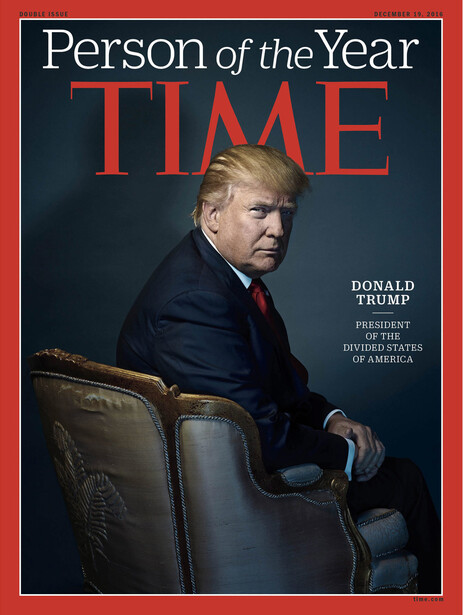
So, if we accept that it doesn't exactly convey power, what is it that this portrait is showing the viewer? The chair is turned away. Incidentally, it reveals the fleur de lis prominently embroidered on the Louis XV chair (if my limited knowledge of French antiques is correct), a rather bizarre choice for an American portrait and perhaps a subtle tip of the hat to a monarch who showed little interest in politics and led France to the doorstep of the French Revolution. It may seem like a stretch, but I ask you to consider the size of the fleur de lis and the rakish angle required to display it.
And what of Trump himself? If you gave me a photographic Rorschach test of sorts and asked me to free-associate adjectives for a man turned away but leaning toward the camera, hunched over, half-hidden in shadow, I would tell you: scheming, sinister. The turned away body indicates the presence of something in the shadows, of an interruption by the camera, of a certain voyeurism. Perhaps intentionally, that side is so in the shadows that it's almost black. The outward leaning indicates a leering of sorts, a displeasure coupled with a hidden power, as opposed to the overt power of a standing, head-on closeup.
Before we discuss the corresponding Hitler cover, however, let's place Trump's cover in context, as I think its relatively anomalous nature is relevant in discussing the intentions behind it.
Comparison
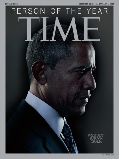
If we look at the most recent Person of the Year covers, the difference becomes stark. President Obama's 2012 cover very much mimics the famous portrait of JFK; it's much closer and features him prominently in the frame without additional props. Because of his proximity, there is less of a hidden element, a characteristic further underscored by the fact that his far side is actually lighter. To me, this conveys a man both troubled by circumstances and profoundly deep in thought. The choice of a side profile conveys less of a power dynamic and underscores the uncertainty he faced entering his second term. Personally, I think that regardless of how you read his facial expression, this portrait is singular in identity, and in that sense, it stands distinct from the duality in the Trump portrait, the implication of a hidden side.
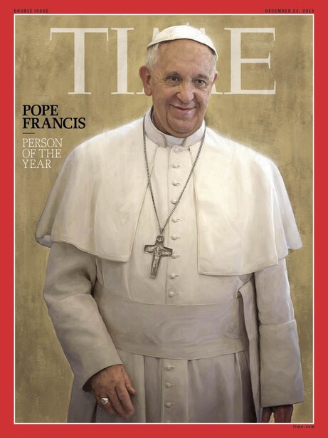
The 2013 portrait of Pope Francis is perhaps the most easily read. It's inviting and accessible, unencumbered by an overly engineered pose, which contributes to its ability to portray a man seen as "the people's pope." Though a very technically apt digital painting, it intentionally reads less as a manufactured product of the studio and more as a frozen moment in time, a man of service in his element. I personally think his slight lean and the choice to crop out half his left hand are strokes of artistic and editing genius, respectively. They contribute to the "found" nature of the portrait.
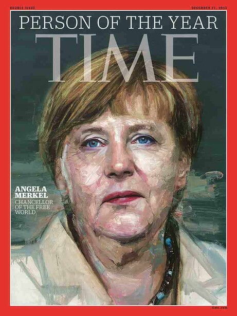
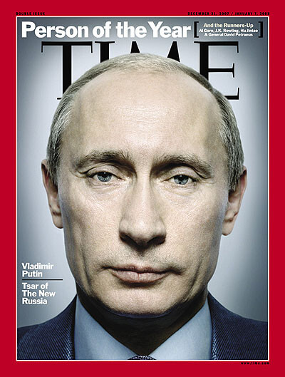
Note that Time characterized Merkel as someone "standing firm against tyranny... [with] steadfast moral leadership" and Putin as having "performed an extraordinary feat of leadership in imposing stability on a nation that has rarely known it," but "at significant cost to the principles and ideas that free nations prize." Putin's portrait exudes absolute power of the individual; Merkel's exudes a distillation of power of the people. Returning to the Trump comparison, however, again note that despite the differences between the Merkel and Putin portraits, both have a singular and readily apparent identity; there is no implication of duality in them. Even the text that accompanies the three portraits underscores this idea. Merkel is "Chancellor of the free world" — singular. Putin is "Tsar of the new Russia" — singular. Trump is "president of the Divided States of America" — duality.
Hitler
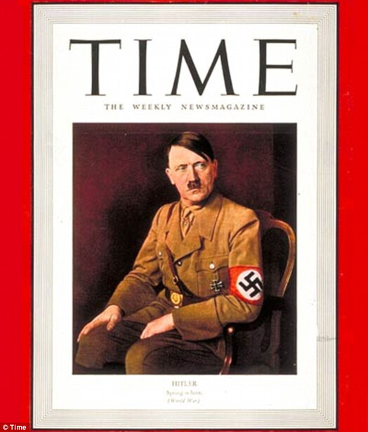
One thing to note: this is not Hitler's 1938 Person of the Year cover, but rather a 1941 cover. His 1938 cover showed him playing an organ with bodies hanging above with the cover line "from the unholy organist, a hymn of hate." If we accept that Time is in fact referencing Hitler with this year's cover, the more abstracted symbolism of the 1938 cover might not translate in today's environment of consumption as well. Furthermore, I can't imagine that a direct reference to that cover would ever be allowed by Trump's PR team; so rather, if we think political strategy for a moment, referencing a more obscure (relatively speaking) and less abstracted cover avoids both of the aforementioned issues.
Now, look at the photographic properties of the portraits: their posing, their aesthetics, their symbolism. Like the Trump portrait, Hitler has receded into the frame. This lends it the same slightly voyeuristic look — less a pose than a secret look. That identity is underscored again by the sideways glance off camera — the thoughts and scheming that the camera was not privy to before this moment. The chair is a similar style. There's the same diffuse, sinister shadow on the wall (and if indeed Time was replicating this shot, it explains why they went to the lengths they did to place a shadow in a position that didn't really match the lighting of the shot). The same idea of duality is here as well, not so much in the face as in the sudden interruption of an otherwise continuous background (on the right) by a distinct blackness along with the shadow cast by Hitler himself.
Of course, the key difference here is that Hitler is facing forward and Trump backward. This can be read several ways. Time is an American magazine; thus, a portrait of a German leader would show him facing outward with his atrocities behind him (duality) in his homeland, whereas Trump is an American leader, thereby leading the country into whatever abyss awaits it from the driver's seat. It could be read that we do not yet know the full extent of the consequences of a Trump presidency. It could be read that a deception has taken place, that the face presented to the American masses is not that that will hold the office. Returning to the fleur de lis, it's worth noting that Hitler conquered France in 1940, a year before this cover appeared. Read from that what you will.
The Internet is very split over whether this is the case or not. I spoke to several industry associates, and surprisingly, no one was lukewarm; they either saw the resemblance in the extreme or saw nothing at all. Whether it is there or not, it's a startling reminder that photography can hold incredible expressive power and can provide commentary in a succinct and tangible way when words have long since become dulled by overusage.

Join the Fstoppers community for free
-
Post comments and join in the discussions
-
Browse the site ad-free
-
Share your work and get featured in the community
-
Compete in the photo contests for fun and prizes
59 Comments
I can't guess at whether Nadav Kander was intentionally referencing the Hitler image, but it's unquestionable that the intention of the image was to show what it shows on it's face, without comparison to historic photos: intensity, the grand chair, and the ominous body position and intense shadows on his face. He's emerging from the shadows. The blue fill light on the chair is unwelcoming and cool. The point (seems to have been) to show that he's contentious and not universally seen in a positive light is what I see on the surface.
Certainly several portrait options were shot, and great thought went into creating all of them. I would imagine a key goal of the cover image was to compliment the words Time chose to describe the man and his campaign. I was surprised by the shadow on the background but I'm begining to like it. I wasn't a fan of President Obama's portrait shot by the same photographer. Too dark for my taste considering the man and his campaign.
Great analysis of the cover Alex! I thoroughly enjoyed the read. It goes to show that a picture truly is worth a thousand words and that those words/thoughts can be heavily persuaded by both the artist that took the portrait and the beliefs/opinions of the individual that looks at the picture. Well done!
To say Time had "no control" is, with due respect, laughable. They hired a guy to take the images - no doubt he was vetted and no doubt there was some discussion about art direction, intended 'impact", etc. In the end, Time picked the cover, not the photographer nor Trump.
Everything about Time magazine is about messaging. I personally don't care about the politics of this viewership one way or another, but Time is basically an organization that has a subtle and not sometimes not so subtle left-wing agenda - or at the very least sympathetic to it's causes, here and there. On point, that doesn't bother me as we all tend to read and watch news and media outlets that favor our own ideals. You know what you are going to get from Time much the same as you would from a right-wing rag or blog.
As far as the image goes, I like it. I try not to read to deep into it simply because what ever we can hypothesize the photographer was trying to accomplish to the good or bad, we each can read what we want largely based on our personal bias. The days of the media pedaling influence like it was 1968 are long gone. As a Trump supporter, I don't see the devil horns, or diminutive stature because his back is to us, or the Hitler like comparison because he was in a chair. I see Trump as Trump. Of course, I might have done a full on or 3/4 pose of him smiling with his hands grabbing his lapels or something, but to each his own.
What I will remember from this cover is that again Time couldn't help themselves by giving out an accolade and then stabbing the guy in the back with a snarky comment. It seems immature for a grown-up media outlet but they happily published Heisler's "two-faced" image of Bush Sr. so it shouldn't be a surprise to anyone. They would have done well by just saying "Man of the Year" and let the readers decide for themselves..which we all pretty much have anyway.
One commenter took issue with Time Magazine for stabbing the subject in the back with their words after bestowing accolades with the cover shot. The Time editor made it clear Person of the Year is not always considered to be an accolade. I believe the mood created by the portrait fits the subject, his campaign, election results, and tone of the magazine cover story. You can bet Time put a great deal of thought and discussion into the words and pictures.
OR...as the actress said to the bishop "oooh what big horns you have..."
In 2009, I spent a week with Nadav Kander, the photographer of the Time cover, at the Santa Fe workshops. I had the opportunity to see the man at work and learn about his approach to his work. After seeing the Hitler photo, there's no question in my mind that Nadav referenced that image with his Trump portrait. I don't have any personal knowledge of his process for this shoot, however having seen him work, I can make some guesses.
Nadav is an incredibly well versed student of photography and art. His knowledge of photography is encyclopedic. He can reference photographers working in art and commerce from all over the world. Few photographers have his understanding and knowledge of the medium. He's intimately familiar with portraits of powerful men shot by Karsh, Newman, Avedon etc.
He is also extremely thoughtful and prepared as he approaches each shoot. He concepts and researches each project well before he picks up his camera. No doubt when he was given the assignment, he had his team do all kinds of research on Trump and imagery of powerful and controversial leaders like Stalin, Castro, Hitler, Mussolini, Putin. He'd have looked at every man of the year cover ever shot.
Nadav is also intense when he works. It is his space you are entering into. He does not tolerate anyone breaking his process. Obviously Trump is a more powerful man than Kander, but Kander would have engaged him as an equal and a man not to be trifled with. He's a tall, powerfully built man. His physicality commands respect. There would have been no "oh lets play around here" or getting pushed around by Trump.
Not surprisingly, Nadav is aware of every detail in the photo. The incorrectly placed shadow was no accident. He's extremely skilled in post production. Many of his commercial images involve copious amounts of compositing and digital retouching. (Edited to add that in seeing the BTS video and looking at the image, a light was placed low and to the left to provide a slight amount of fill in the shadow areas. It's that light that cast the shadow.)
Bottom line, Nadav is too knowledgeable and too intentional in his approach to not have known about this Hitler image. He saw the opportunity to create a parallel and he took it.
I'll close this response with a portrait that I shot of him on a back road in Santa Fe and another of him at work in the studio.
With such a detailed analysis I'm amazed you didn't notice/comment on the torn back of the chair Trump is in. Does this signify an editorial comment by Time on the frayed state of our nation? Is the photographer showing how things are bad behind the scenes? Inquiring minds want....
Having worked at TIME Magazines photo department for many years all I can say is the TIME horns are intentional in this case. It was always discussed not to layout the cover to make the individual have horns.