
Suggestions for improvement
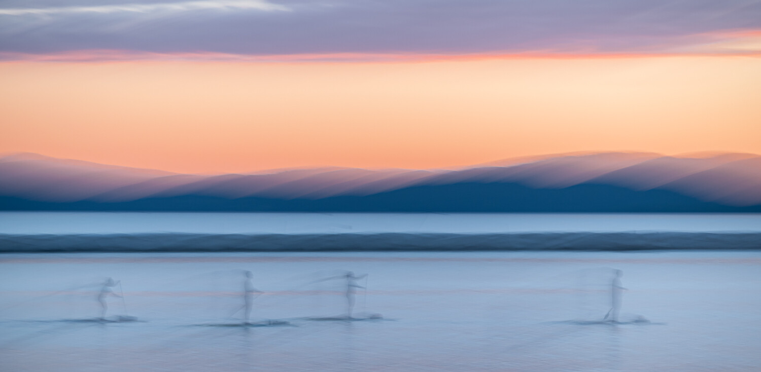
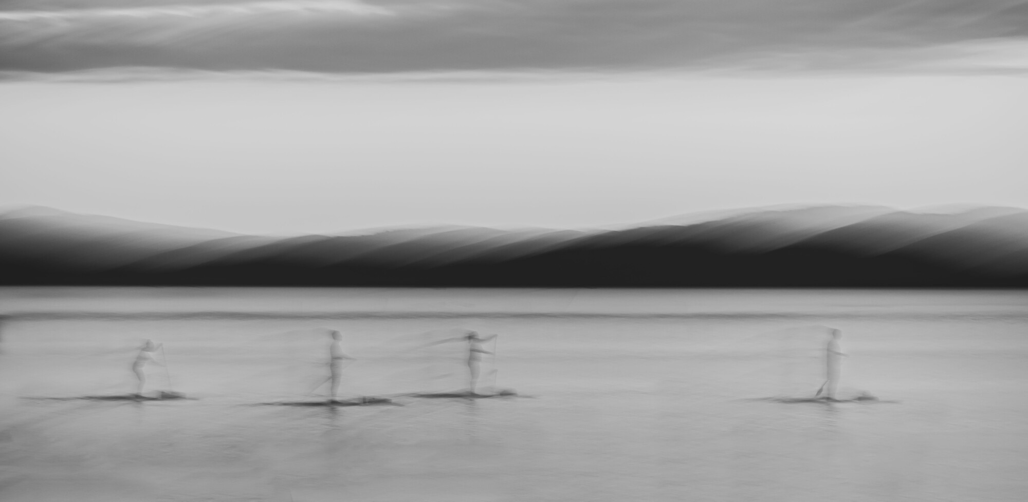
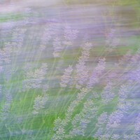
This is an image that I feel holds potential but have been unable to edit to any sort of satisfaction.
Comments on good/bad aspects of the image encouraged, and I's really love to hear any suggestions on how/if the image might be improved.
All comments will be treated with equal respect and appreciation, whether they be from novices or seasoned ICM veterans - your voice matters!
Let your creative hair down and let me know what you feel.
Thanks in advance.





6 Comments
I like the image. My thought is that there should be a "splash" of color on the first image. Red maybe.
On the second image a bright light, maybe the sun or moon.
Just my thoughts. Thanks for posting
Thanks for the feedback Craig, I'll have to give this further thought.
Is this cropped? I would like to see not as wide and more of the top and the bottom of the frame. It feels too compressed to me.
Thanks Amy, I'll plan to revisit sometime.
Nice. I like the color image. Just a little hue or temperatur fine.tuning.
Thanks Titus!