Critique of Daytime Shots from PCT Hike
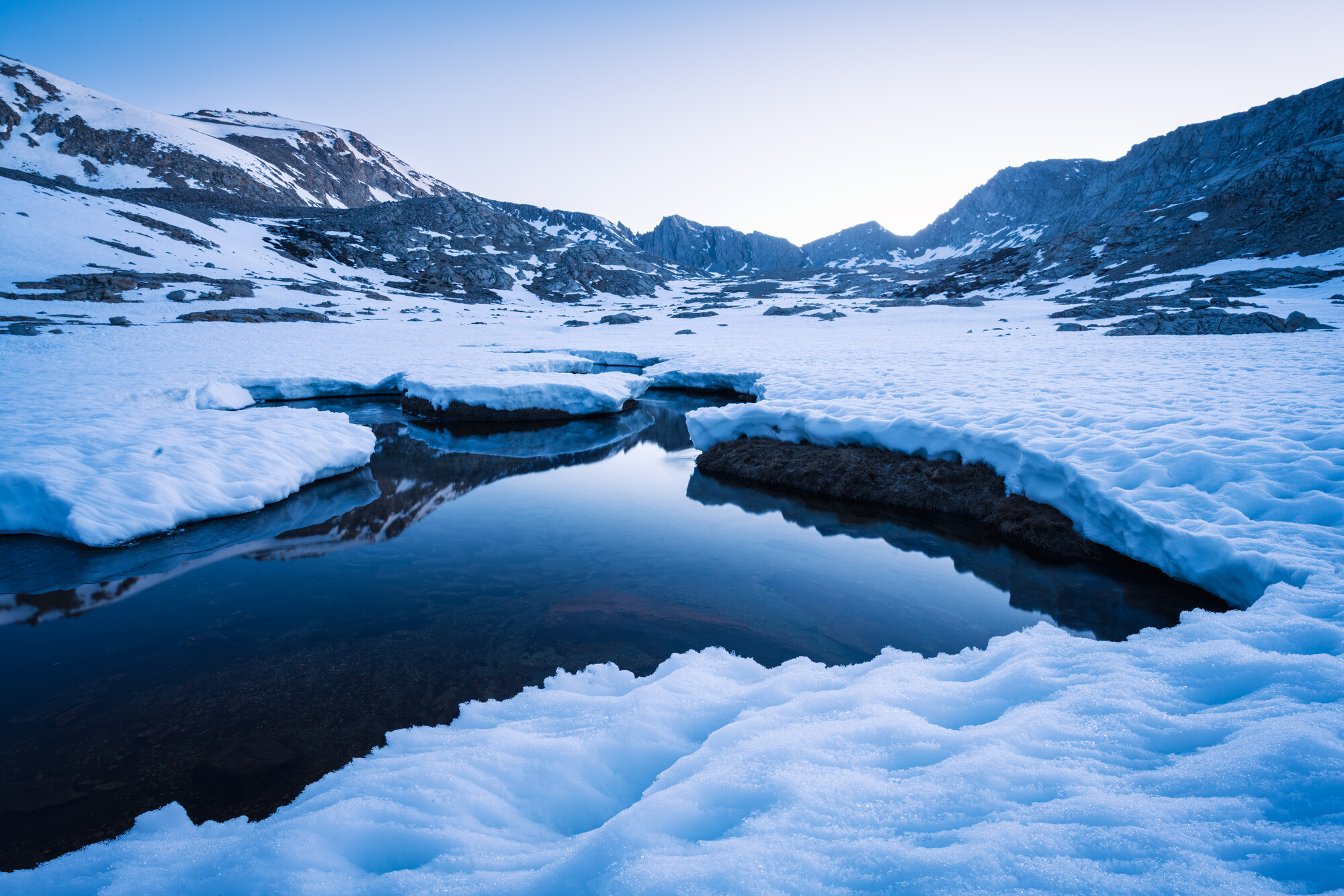
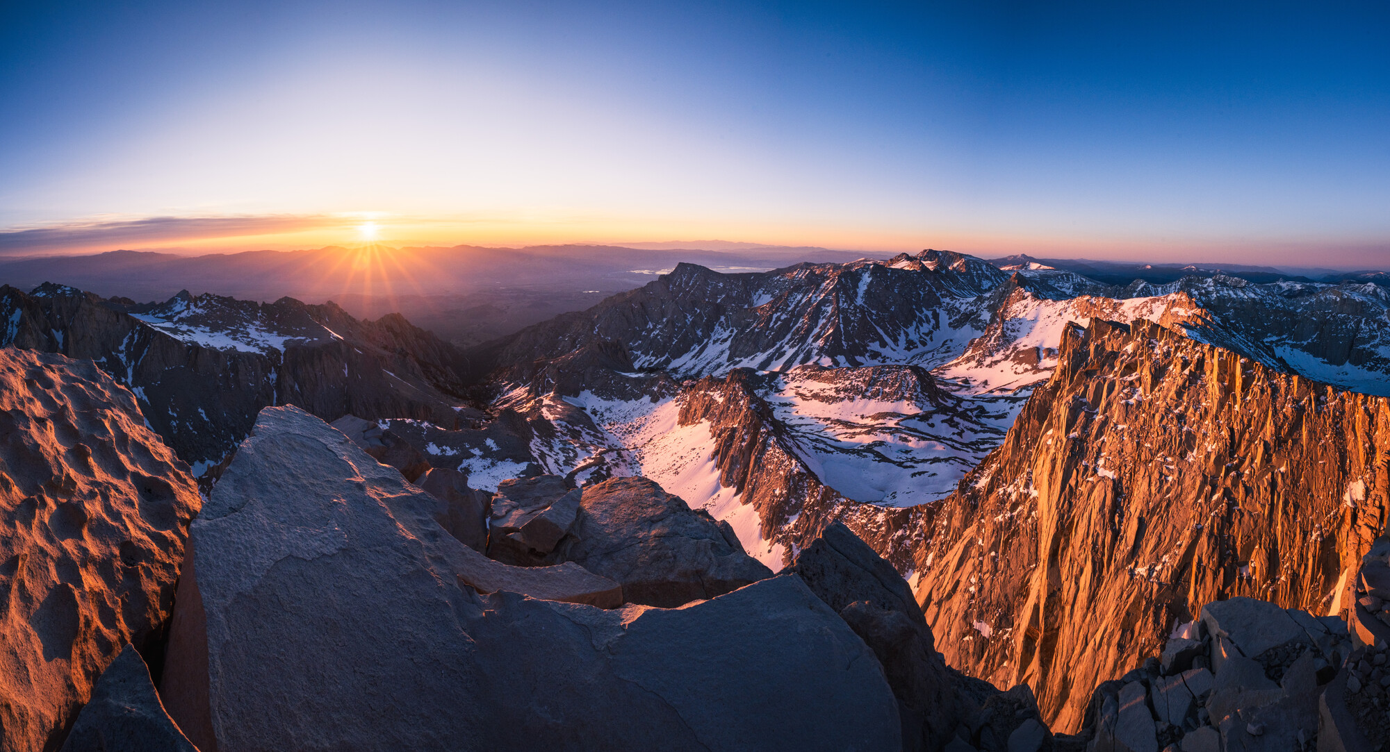
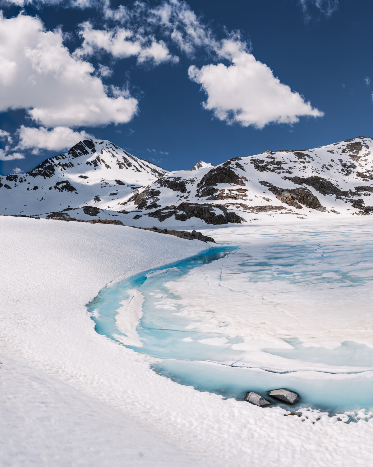
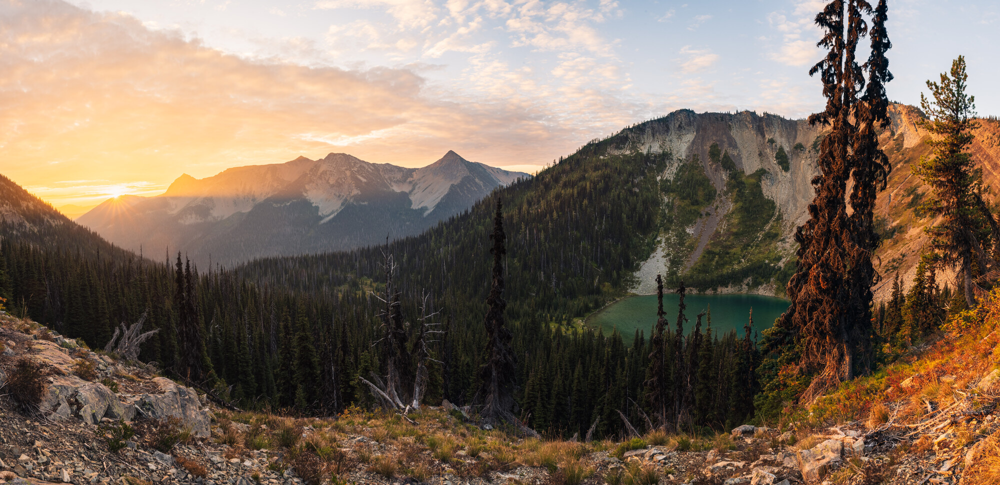
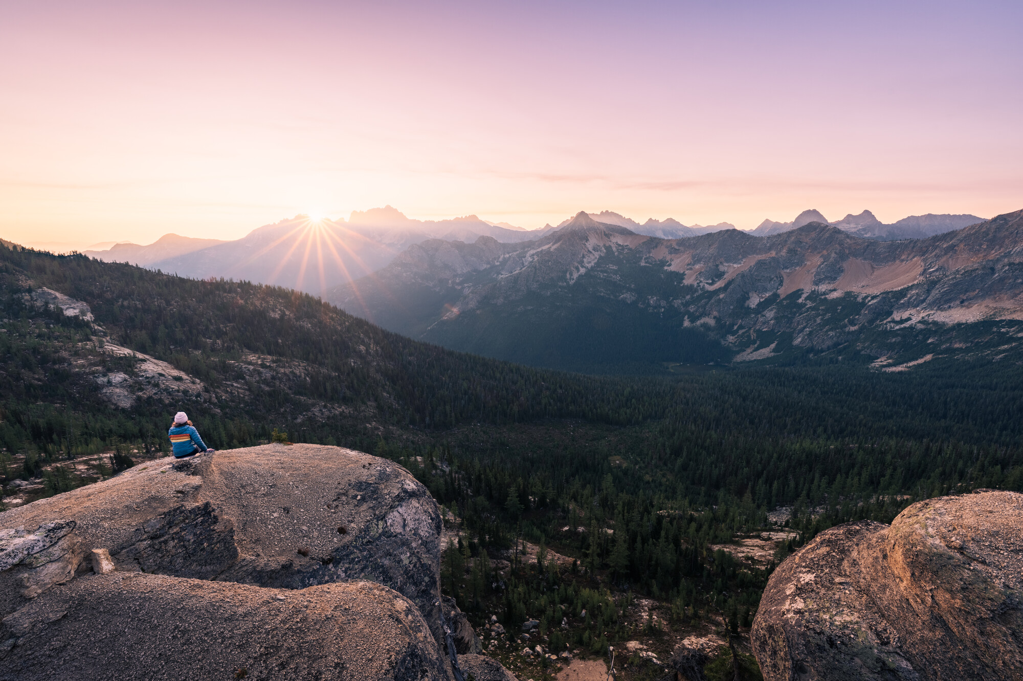
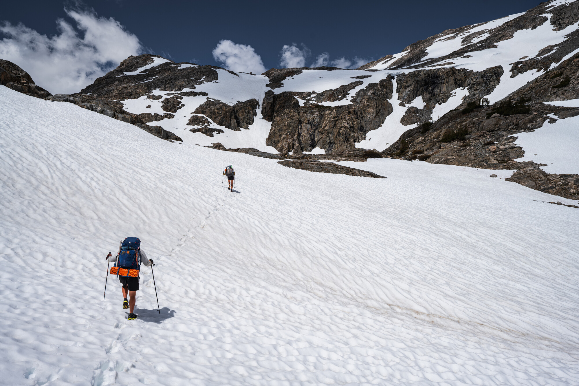
Recently hiked the Pacific Crest Trail with a Z7II with a 14-24mm lens and tripod. My hiker friends enjoyed the shots, but looking for some feedback from folks with a more critical eye. These are 10 shots from sunsets, sunrises, and daylight along the trail. Going to make a separate post with some night shots. Let me know what you think, and thanks in advance!


5 Comments
It will take a lot of time to do a proper critique of these for you. Do you have a couple that you would prefer a critique of?
Yeah, fair. I figured people would pick 1 or 2 that they had something to say about, but realize throwing 10 images up probably makes people less likely to pick through them and comment because it seems like more work.
In general, hoping to hear if there are any that people think are particularly strong or particularly weak compared to the others.
Getting into specifics:
#2–curious what other photographers think about it. Other people who I’ve shown these to seem to pick that one out, but I don’t think it’s particularly strong.
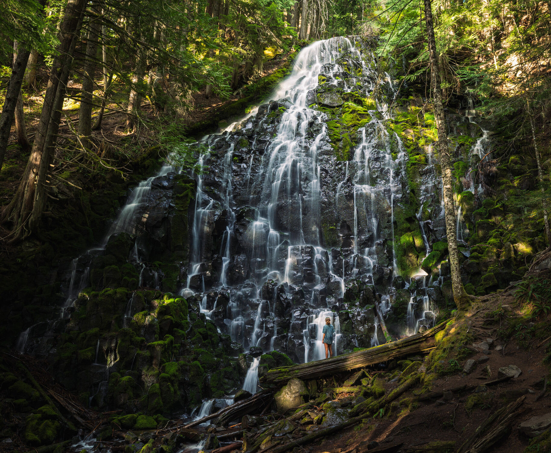
#6–does the person come through enough, or is she too small and lost in the waterfall?
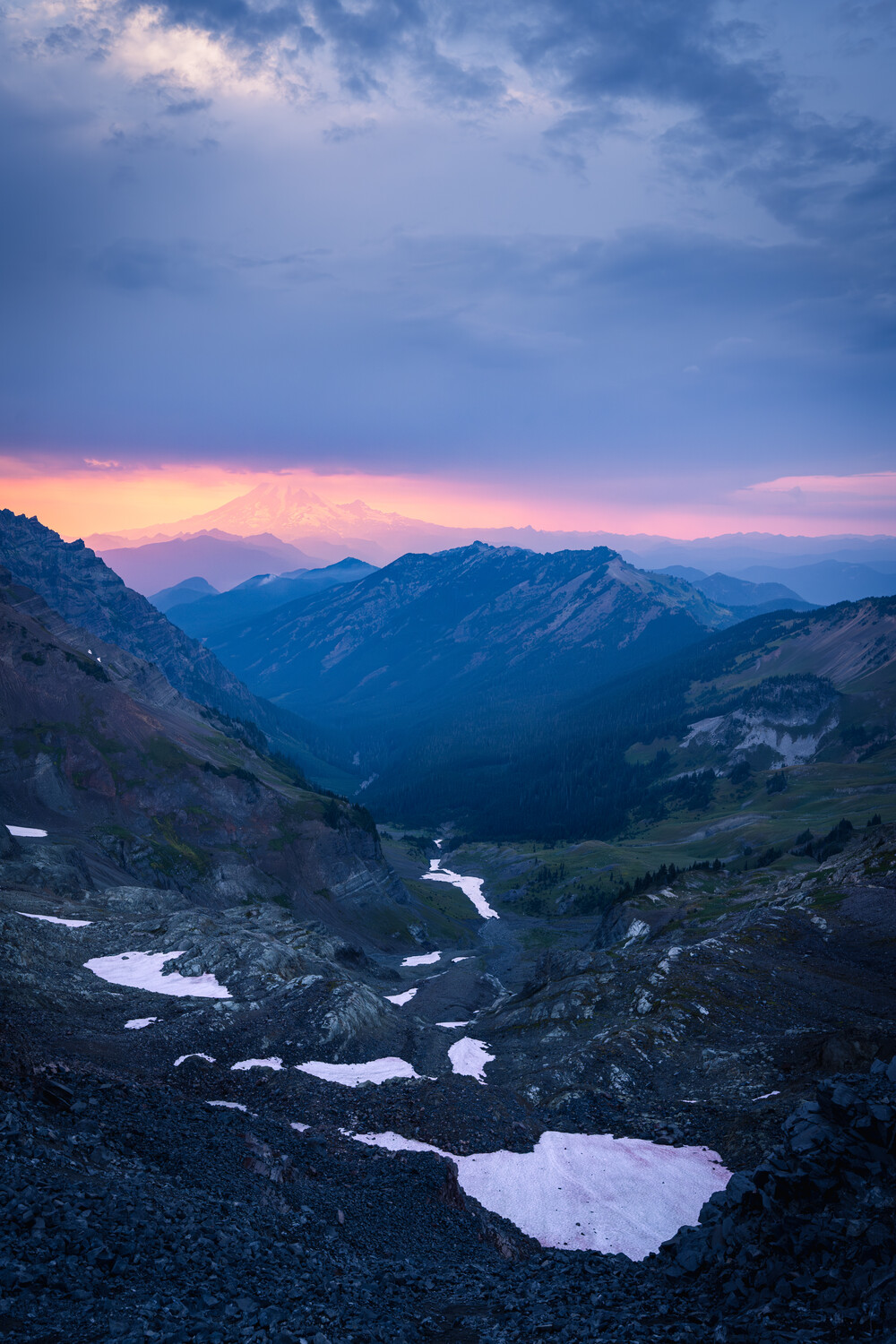
#7–does the mountain come through enough to make this image work, or is it too hazy? Would you crop past the light area of sky at the top/do you find it distracting?
#10–is this one interesting enough to overcome sub-optimal mid-day light?
Thanks for taking the time to comment!
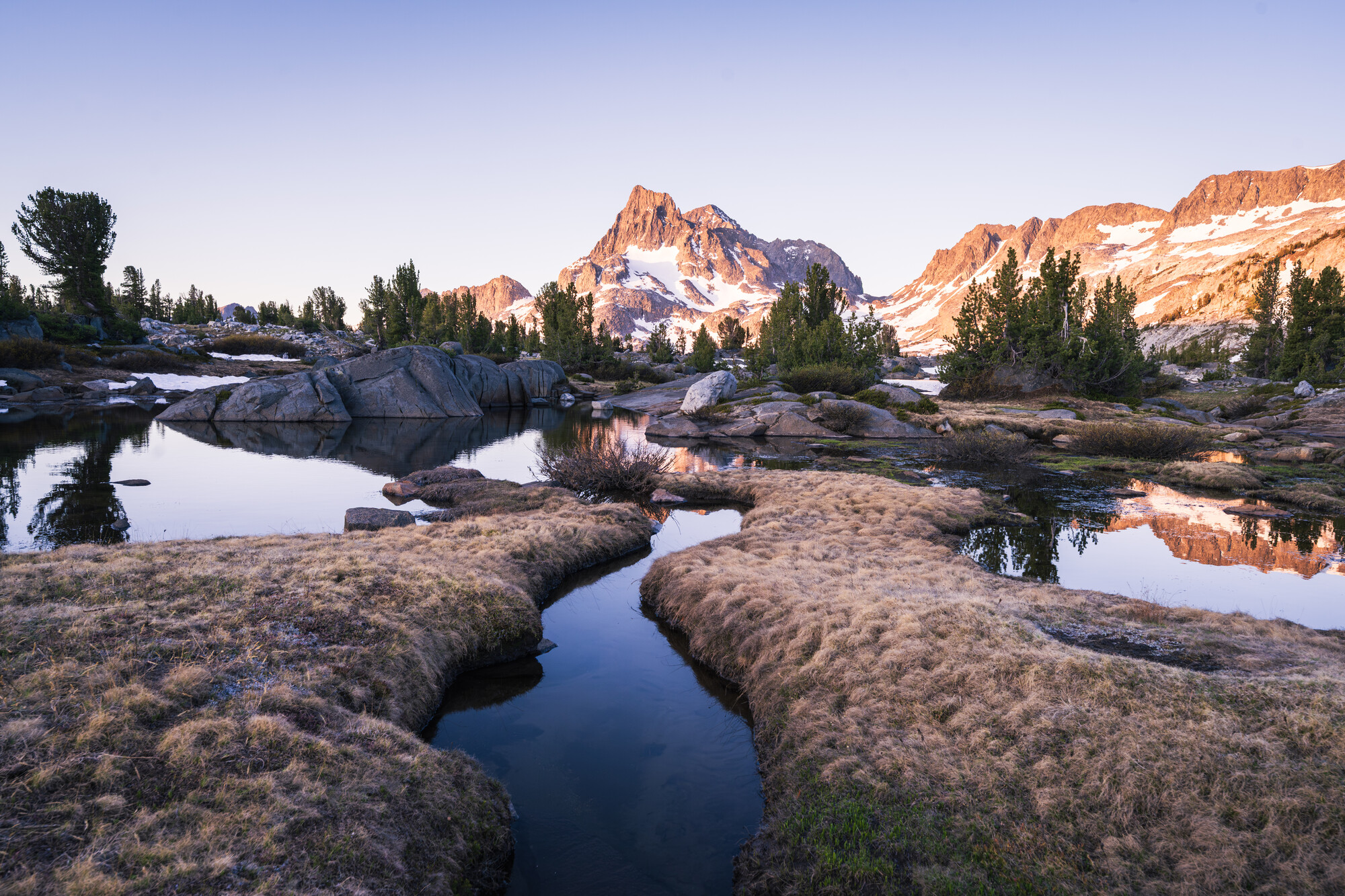
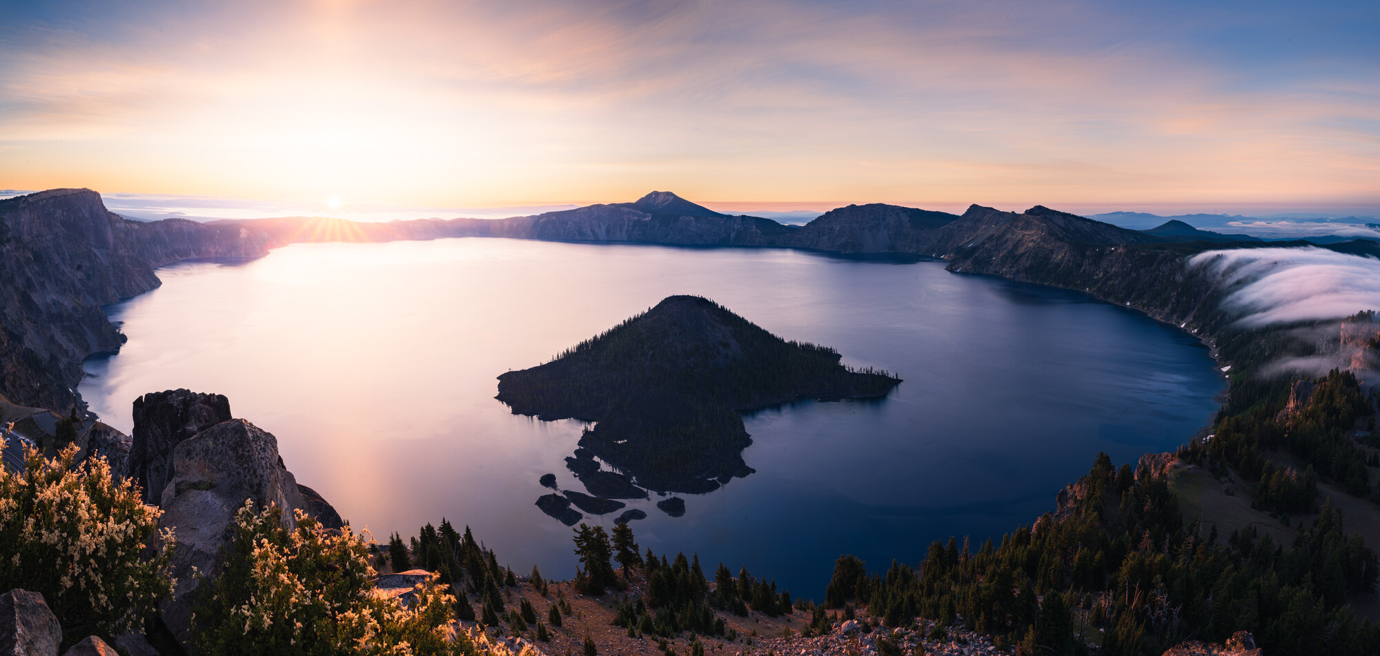
Okay, my first pick would be #1 for this reason. It is strong compositionally and it moves out of being a family vacation or an adventure record image into the area of being a piece of art that I would like to see on my wall, matted and framed. The snow and ice are a bit blue to my eye but that is strictly a matter of personal taste. If it were mine I would want to move the shadows areas along the creek up a bit to get more luminosity from them. I have a feeling that cutting some of the blue would liven the image up some. Again, that is strictly a matter of personal taste. Also bearing in mind that my normal M/O is using black and white film so I have a tendency to evaluate everything with that in mind. On the 3rd one down I would really like to see a cropped version where it is cropped at the crotch of the mountains on the horizon and maybe a bit on the left to emphasize the very gorgeous blue green movement where the ice meets the snow. Again, that would move it out of the "pretty picture" realm and become more interpretive. If you have more space on the right side in the original i would use it. IMHO, it is the most gorgeous of all the palettes shown here. #4 is next. You are really emphasizing form here and contrasting texture with the absolute mirror of the water against the rough texture of the rocks. I would perhaps crop some of the sky out to move the horizon line up in the frame. #8 has possibilities. I would kick up the contrast in the mountain portion only. The person in the waterfall image is so small I hadn't noticed. So that's my evaluation.
BTW, I would regard critiques in general as mostly not valid. Many people will chime in and few actually have credentials to do a critique on anything. I would always look at the persons portfolio before giving regard to the critique. Unless the persons portfolio makes you wish you had done the images I wouldn't give it much credence.
That's all super helpful (and point taken on taking all critiques with a grain of salt), thanks for taking the time! #1 is my favorite too and has been the background on my tv for the past couple months. I actually often desaturate blues in general on some of my landscapes, but decided to lean into it on that shot both as a blue hour shot and looking to evoke a feeling of a cold icy environment. I'll play with it a bit more and see where I land.
I took a stab at the crop I think you were describing for #3. It's the furthest left frame of a pano, so I have plenty of room on the right to work with (more than this, but wanted to keep focus on the nice S curve). It almost works for me, but gives the impression of looking down a bit--I think it would have worked better if I'd taken it from a lower angle, but curious to get your take.
#8 is interesting--I'd sort of chalked that one up to "pretty picture" territory since I felt like it was missing something interesting in the foreground and the two trees on the right that go all the way through the frame bother me a bit and draw my eye too much. But I'll play around with that one more too and see if I find a version I like.
Again, very helpful to get another perspective on some of these and get a sense of what other people might see that I don't--both positive and negative,
Oh wow, this is a gem of an image. Perfect color balance. Perfect balance of light and dark. Just gorgeous. I disagree completely about your view point though. I think your view point is almost perfect. That image is just gorgeous.