
When we shoot photographs, we may or may not want to increase the appearance of depth in the image. Many more tools than depth of field are available to us. Here are some things we can do to add or decrease perspective.
Photography is changing a three-dimensional scene into a two-dimensional image. Often, we want to give a feeling of depth in that 2D world and show that some subjects are closer to us than others. At other times, we may want to flatten the scene, making the subject appear closer to the background. There are different techniques we can use to achieve these.
A Very Brief History of Perspective
The ancient Egyptians hadn’t sussed perspective. Instead, their paintings were flat. They developed a technique of showing humans in a twisted form, with the subject's body facing towards the viewer and the face and feet pointing to the side, displaying as much of the figure as possible. There was no depth to their pictures at all, and it was a style that lasted for over 3,000 years.
Then, in 300 BC, Euclid noted that more distant objects subtend a smaller angle. In other words, if you have an object nearby, the angle formed from your eye between the top of the object to the bottom is greater than if the object were farther away. The ancient Greeks produced art depicting scenes with objects that appeared to recede from the picture plane. By Roman times, artists were including Euclidean, or natural, perspective in their work. However, it didn’t look quite right.

This Roman fresco shows perspective, but there is something amiss with it. Subjects appear disproportionate and receding lines seem to be at the wrong angle. Overall, the painting appears flat. (No copyright.)
The problem with Euclidean perspective was solved by Italian Renaissance architect Filippo Brunelleschi (1377-1446). He showed how objects and lines changed shape when seen from different distances and angles. He developed the idea of vanishing points. This is known as linear perspective.
Of course, this is a very Western view of history, and the ancient Chinese had devised a system of perspective, known in the West as axonometry, around 1,500 years before Brunelleschi.
Using Perspective in Photography
Just as it is in drawing and graphics, perspective is an important consideration in photography. There are things we can do to both physically change and give the illusion of greater or less perspective, adding or removing depth from an image.
Firstly, there is the effect of the lens. Telephoto lenses decrease the angle of view, flattening perspective; distant objects appear closer and larger compared with the foreground subjects. We’ve all seen images where planes appear to be flying just above rooftops or with a huge sun or moon sitting on the horizon.
When used carelessly, people can appear to be flat too, looking like cardboard cut-outs, and even faces can be flattened by the long lenses. Unless you have a nose like Cyrano de Bergerac, this isn’t particularly flattering.

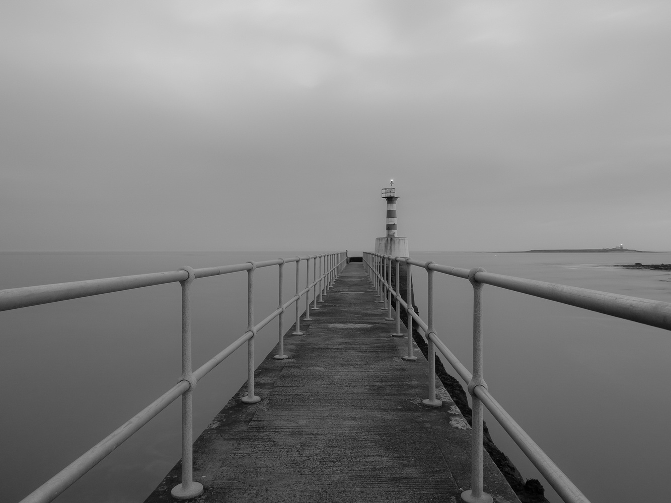
At 300mm, the lighthouse that is over a mile away appears large in the image.
The reverse is true of wide angle lenses. Foreground items appear much larger in the frame than distant ones. Getting close to foreground objects accentuates that. Therefore, taking close-up photos of people with wide angle lenses is not a good idea as the nose will be enlarged and the back of the head shrunk. The ubiquitous cute photos of kittens and puppies with big noses and eyes are shot this way; close-ups with wide angle lenses are not a good look for humans, however.
The same lighthouse is on the island on the right of the frame. Shot at 7mm not far from the earlier photo, it appears far more distant.
Consequently, for portraits, if shooting with a 35mm sensor or film, we usually consider 70mm to 135mm focal lengths being ideal, depending upon the composition and proximity to the subject. For crop frame sensors, the focal lengths will be reduced. For example, with Micro Four Thirds, the focal lengths are halved to create the same angle to the top and bottom of the subject from the sensor.
Camera height can change perspective too. Parallel lines, like the sides of a path, appear to converge to a vanishing point. With a low-set camera, that convergence angle is obtuse. Coupled with the horizon appearing closer, this makes the image appear less deep than one where the camera is set higher.
Compare the following two images: the first is a worm's eye view while the second was shot at knee height. The angle of the fences converging is sharper in the second, higher image, and the vanishing point is more distant. Consequently, the latter appears to have far more depth.


If the camera were placed very high, then the lines converge to a vanishing point much more sharply still.
Taking Advantage of How Our Minds Perceive Depth
There are other things we can do that, although not physically changing the perspective, will make distant objects appear closer or farther from the foreground. This is to do with how our brains process the visual information from the world around us.
Placing a warmly toned – yellow, orange, or red – subject against a cold, blue background will make that background appear farther away; our minds are accustomed to seeing a distant blue horizon. The opposite is true too, a blue subject against a warm background will make the image appear flattered.
Likewise, and as I mentioned in my article about low- and high-key photographs, a bright object against a dark background will have a feeling of greater depth than the other way around.

The lighter-toned crane against the gray background appears closer to the camera than the darker one, adding depth to an abstract shot. The darker objects appear flatter against the background.
Having similar objects at different distances can accentuate depth. For example, a tree in the foreground appearing much larger in the frame than more remote ones will add depth. Knowledge of this can, of course, enable photographers to experiment with forced perspective, where the sizes of objects and people can appear disproportionate to one another.
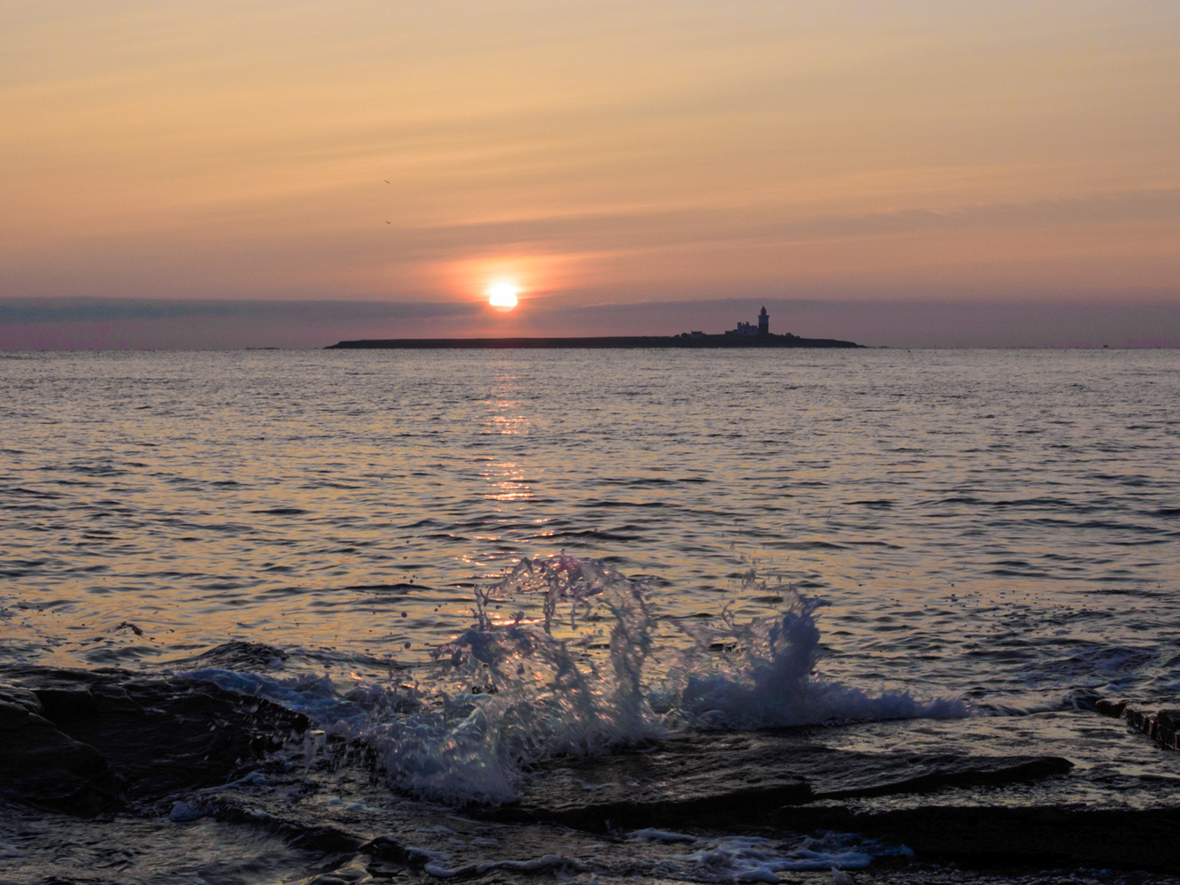
The diminishing size of the wavelets help emphasize the distance between the island and the foreground.
Conversely, pictures with minimal content can appear flattered, as there is little information to suggest distance. Abstract photographs can seem to flatter too when there is nothing to identify what we are looking at. We don’t know how far away the objects are from each other or the camera.
Of course, photographers blur the background of their subjects by using a long lens, proximity, and a wide aperture. That decreases depth in the image but gives separation of the subject from the background. (Read about the law of separation in my previous article.) Meanwhile, landscape photographers usually shoot with wide angle lenses and utilize a maximum depth of field, making the image appear deeper and more three-dimensional. Careful control of depth of field, such as allowing the background to gradually fall out of focus, can increase the feeling of distance behind the subject too.
Similarly, foreground objects with plenty of contrast set against a slightly hazy or misty backdrop can help show depth as well. Meanwhile, heavy fog that hides everything in the background may make the image seem shallow, especially if accompanied by the typically soft, even light.

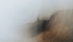
An example of low and high perspective in the same shot. The thick fog minimizes the image, making it hard to discern the relative distances of the three posts on the left, while the yacht appears small and just visible through the murk, adding perspective.
Such diffused lighting can work well for portraits, as blemishes, pimples, and Cyrano’s big nose becomes less pronounced too, whereas strong light with deep shadows increases the apparent perspective. So, a landscape photographer may look for starker light with pronounced shadows to add a feeling of greater distance.
Finally, showing movement close to the camera can increase the depth of an image too. When you look out of the side window of a moving car, close objects pass in a blur, while distant ones appear to move by more slowly. Using a slightly longer shutter can give a similar effect, making the mind think the foreground is closer than the stopped movement further back.

There are no right or wrong ways of using perspective in a photograph. It is a decision for the photographer to make. However, awareness of these techniques can help reinforce the choices we make when composing a shot.
Of course, there are exceptions to all these examples, and there are other methods available too. Being aware of what can increase or decrease the apparent perspective can help add impact to a photograph, especially when combining these techniques. But that doesn't mean you can't also experiment with opposing methods of showing or hiding perspective in the same image as I did with the yacht in the fog photo above; juxtaposition often works in photography.
I hope you found that useful. Have a look through some of your photos and see how you may already subconsciously have discovered techniques that add depth or shallowness to your images. I look forward to seeing some posted below with examples of both. Please also include your explanation of how some of the perspective techniques you used.


Great piece as always. Beautiful use of lines in your photography
Thank you, Michelle.
Interesting article with good points. However, JUST changing the lens/focal length dose not change perspective. Only movement will do that.
You are quite right. JUST changing the focal length basically crops the scene for you, but the different things in the scene remain the same, with respect to perspective distortion and their size relative to one another.
Hi Cliff and Tom, Thanks for the comments. That's why I used this wording: "give the illusion of greater or less perspective,." A telephoto lens seems to make the background larger in comparison to foreground subjects, but it is just an illusion. Just the same as using a crop sensor camera, or cropping in post processing.
You are right, you have to change the camera position to actually change the perspective.
Yes, Ivor, one of the many things I appreciate about your writing is that you are very careful to word things precisely, so as to never make a statement that is false, even if only false by pedantic standards.
I wish more writers would strive to word their sentences as carefully and precisely as you do. When writers are a bit careless about their semantics, it is extremely irritating.
I am usually very irritated when I read articles, here or elsewhere ...... but I am never irritated by your articles at all because of the care you take to word every single phrase in an accurate, precise manner. Thank you for that!
Thank you Ivor - there is so much more to separation than buying a F1.2 lens and blurring out the background. Looking back in 2030, will todays "bokeh blur" and "teal and orange" pictures look as dated as 1980s "Glamor Glow" or 1950s "Kodachrome colours"?
Can I suggest that when looking for how to deliver separation in compositions - have a look at the master, Fan Ho. He creates separation in so many ways - and all with an F3.5 Rolliflex. Furthermore he could do it in both black & wihte and in colour!
Here is a great collection from a recent show at the Metropolitan -
https://mymodernmet.com/fan-ho-hong-kong-street-photography/
and another from "Monovisions" - https://monovisions.com/fan-ho/
That is a great example of the importance of perspective (camera position) in composition.
It is remarkable that none of the 7 primary human subjects overlap each other. Yet they are so very close to overlapping, that if the camera position had been any different - even by an inch or three - there would have been awkward, unsightly overlapping of one subject with another, and then the photo would just be "a nice, interesting photo" instead of "a timeless masterpiece".
Extremely precise camera positioning at the moment of capture is everything when it comes to excellent composition ... and it is something that relies entirely on the photographer to get right, as opposed to things like focus and exposure, which camera technology is now doing for us at an increasing pace.
EDIT:
Yes, I am aware that there is an 8th human in the frame, and that he/she overlaps with the foremost human. But that 8th human is not at all integral to the scene in any way, and therefore does not count as a "human subject" to me. So the overlapping simply does not matter.
What is astonishing about Fan Ho is that he uses all the different ways to separate his compositions - not just one "trademark" sytle. You can see just how many different techniques he could use on a single day out photographing in the crowded back streets of Hong Kong - just look at his contact sheets!
I think your observation about overlap is spot on - it looks as though he sets up his composition for the environment - and then waits for the human interest (or sometimes the boats in the harbour) to come into the frame and create just the right pattern before he trips the shutter. Is it something about composing on a 6x6 TLR screen looking down and away from the line of sight that does it?
There is a good bet that whatever Ivor puts into his next article on creating separation in compositons - that Fan Ho will have a dozen fabulous images to illustrate it!