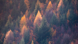
Editing landscape photos can feel overwhelming with all the tools available, but you don’t need to use most of them. The key is knowing which adjustments actually make a difference. A few simple changes can turn a flat raw file into something that reflects the scene as you remember it.
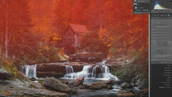
Coming to you from William Patino, this practical video walks through a Lightroom workflow that focuses on the essential tools for landscape editing. Before making any adjustments, having a clear vision for the final image helps guide the process. The first step is lens corrections—removing chromatic aberration and fixing distortion. While it’s not always necessary, it’s a good habit, especially for images with strong horizon lines. The main work happens in the Basic panel, where global adjustments control exposure, highlights, and shadows. Raising the exposure brightens everything, but pulling back highlights prevents the sky from blowing out. Shadows can be lifted, but not too much—keeping some depth makes the image feel natural.
The video also covers local adjustments, which help refine the image beyond broad exposure changes. The adjustment brush is one of the most useful tools, allowing for targeted edits. For example, darkening the sky slightly draws attention back to the landscape. Lightening the foreground elements can create a stronger sense of depth. Unlike global adjustments, local changes let you enhance specific areas without affecting the entire image. A simple technique is warming up the background while keeping the foreground cooler, which mimics natural contrast.
Another important step is color grading. Rather than pushing saturation too far, using subtle adjustments in the Color Grading panel helps balance highlights, midtones, and shadows. Warming the highlights while slightly cooling the shadows creates a more natural look. The healing tool is also covered, particularly for removing dust spots. A quick scan of the image at full resolution makes it easier to find and remove these distractions.
The final touches involve small refinements—enhancing light in certain areas with the adjustment brush, softening edges where needed, and making sure the overall balance looks right. Before and after comparisons help confirm that edits improve the image without making it look unnatural. Check out the video above for the full rundown from Patino.
And if you really want to dive into landscape photography, check out our latest tutorial, "Photographing the World: Japan II - Discovering Hidden Gems with Elia Locardi!”
Join the Fstoppers community for free
-
Post comments and join in the discussions
-
Browse the site ad-free
-
Share your work and get featured in the community
-
Compete in the photo contests for fun and prizes
1 Comment
First the image looks like a dark image with zebras on saving the highlights with a negative turn of the exposure dial on top of camera, some have a neg 3 and the A7RV has neg 5 but the foreground then is dark, looks hard to recover but not! Most all mirrorless cameras today are ISO Invariant meaning you can capture at a lower ISO setting getting a darker image BUT in post you just increase exposure to brighten, but with lower exposure shadow detail is brought out just by increasing shadows or some blacks also. Just knowing this about ISO Invariance will be of comfort out in the field looking at the camera LCD image. Also in the field in the capturing if you just Bracket say 3 or 5 at +/- 2EV then images processed in an a HDR program in Lrc the results would be almost perfect.
All well just some help for field work, there is one thing never shown in videos of editing in Lrc and yes the LC is a first thing then comes the 4 little squares upper right where you will find YOUR cameras styles or profiles that you would select if capturing a jpeg but does not effect out come of a RAW. Just drag your pointer over each image and you will see the difference of all and one maybe a good start, most times portrait will get rid of the blues in shadows meaning less need at the start to increase shadows. Just info the profiles are not the same as or from the camera maker but Lrc's best guess to how they effect an image. For grins you can take jpgs using each and compare to Lrc, they are so close!
For the correct colors or the best you remember first you can leave a shot or select a WB under. IF you have learned how to use the color picker then moving around the image you will see in the left top smaller image the changes also under the picker and under the histogram you will see a percentage of each color. the trick is to get all colors the same value but basically in the 40's or you can pick on a white place or supposed to be white, the A7RV has a Std, whit or amber - The white selection will get rid of the blue shade on whites say capturing boats with a setting sun behind or even some whites like in this image of snow in the tops of the mountains have a blueish white, the point is it could be fixed when captured like capturing things with snow say a polar bear on snow there is a difference when seen in person.
All this can be done real fast before even a slider if even touched.
My example of getting all colors right is a image taken at night of the center of the Milky Way where the Galactic Center below Pegasus is supposed to be almost pure white or if on a beach with some surf there will be some white parts. If click on the Galactic Center most times the sky will be blueish (a shade of) not black or grey and Pegasus wings will be magenta and body of horse will be lighter shade of blue than the sky. All only picking on the Galactic center white with no other sliders moved,
Something never said "Why is the moon so white at night?" The surface is a grey, like center grey on the histogram. Making the orange/yellow light of the daytime sun bouncing off the Moon whiter than white with no color at all.
LED lights are white because they have a colored filter over the base to make them super white.
Colors in an image makes it and it is the colors you saw to begin with is what caught your eye or pictured in your mind that would make great in post.
Just some help to make a great start to your art!
3. Very rare is it you see clouds or even texture in clouds during fall photos but Zebra's turned on and the exposure dial turned neg to lower the Zebras will you get clouds with texture but again like the image in the article it will be dark but the only way to save the highlights. But the best colors of fall is always under clouds!