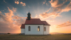
Giving your photos a striking and moody style isn't complicated if you use Lightroom effectively. In this tutorial, Möhrle shows you exactly how to achieve a dark silver look—a cool, dramatic effect that emphasizes your subject while adding depth to the image.
Coming to you from Christian Möhrle, the video starts by explaining the importance of cropping to direct attention. Möhrle positions his subject off-center, utilizing the rule of thirds, allowing the viewer's eye to move naturally toward the main focus. He then sets the stage for that distinctive dark silver feel by switching to the white balance settings. Möhrle opts for colder tones, significantly dropping the temperature to highlight subtle blues. The outcome isn't about making everything blue, though. It’s about achieving a metallic silver finish by carefully managing color intensity and temperature.
One of the most useful aspects Möhrle covers is selective darkening with Lightroom’s masking tools. He doesn't blanket the entire image in darkness. Instead, he precisely isolates the subject from the background, adjusting each separately. Using AI-driven background masking combined with radial and linear gradients, Möhrle achieves natural-looking shadows and directional lighting effects. For instance, by applying gradients from various angles—top-left, bottom-right, even diagonally—he creates shadows and highlights that feel authentic, as if the light is coming from outside the frame. This technique significantly enhances the dimensionality of the photo and ensures your subject stands out dramatically.
What sets Möhrle's method apart is the emphasis on subtlety. He repeatedly stresses the importance of paying attention to the histogram to avoid overly dark or unnatural-looking areas. This careful monitoring ensures you maintain detail in the shadows without sacrificing the mood of your final image. Additionally, Möhrle provides a practical approach to managing color balance and brightness, making it easier to achieve professional results consistently.
Beyond the background adjustments, Möhrle introduces targeted highlights and shadows adjustments on smaller details, such as the bird and a tree trunk. By carefully brushing in highlights and shadows separately, he boosts the realism of directional lighting. It's a step many overlook, but it significantly impacts how viewers perceive depth and realism in your photos. Möhrle further enhances the dark silver aesthetic using split toning in the color grading panel, specifically applying cooler tones to shadows and midtones, reinforcing the metallic feel without making the colors overly saturated.
Möhrle's tips on sharpening provide another layer of refinement. He carefully tweaks sharpening settings, ensuring maximum detail without introducing unwanted artifacts or noise. By lowering radius and increasing detail, you can target crispness exactly where it counts. Check out the video above for the full rundown from Möhrle.

Join the Fstoppers community for free
-
Post comments and join in the discussions
-
Browse the site ad-free
-
Share your work and get featured in the community
-
Compete in the photo contests for fun and prizes
No comments yet