Color grading your images can transform how people feel when viewing your work. Knowing how to do it right in Lightroom can mean the difference between a flat photo and one that connects emotionally.
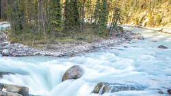
Coming to you from Sarah Chaput de Saintonge, this practical video walks you through Lightroom's powerful color grading panel and how to use it effectively on your images. Chaput de Saintonge starts with a neutral, snowy landscape to demonstrate the basics of adjusting contrast, curves, and white balance. She emphasizes that it's okay if your adjustments initially make the image look oversaturated—this is something you'll fix later on. You'll see her create mood by carefully shifting color tones toward cyan and golden hues, highlighting the complementary relationships between colors. She then explains how subtle adjustments in shadow and highlight colors can introduce qualities reminiscent of popular series like "Ozark."
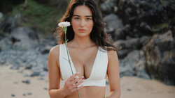
In the second half, Chaput de Saintonge moves onto portraits and demonstrates how critical careful color management is for skin tones. She advises against aggressively shifting skin tones into unnatural hues unless you're aiming for a stylized effect. Using a self-portrait, she shows how subtle warmth in highlights keeps the skin looking natural, while adjustments to shadows add mood without compromising realism. Chaput de Saintonge offers practical tips to avoid common pitfalls, like unintentionally giving skin tones a lifeless appearance by using cool colors excessively in shadowed areas.
Throughout the demonstration, Chaput de Saintonge consistently recommends restraint and subtlety. She reminds you that dramatic shifts in midtones, while impactful, must be handled carefully to avoid an overly stylized look. She also points out underused features, such as the blending and balance sliders, explaining clearly when they might help—and when they’re unnecessary. Her advice consistently favors manual adjustments in shadows, highlights, and midtones, rather than relying too heavily on automated blending or presets. She shows you how powerful even slight color shifts can be, significantly changing the emotion your images convey, and encourages thoughtful experimentation to find your personal style. Check out the video above for the full rundown from Chaput de Saintonge.


Join the Fstoppers community for free
-
Post comments and join in the discussions
-
Browse the site ad-free
-
Share your work and get featured in the community
-
Compete in the photo contests for fun and prizes
No comments yet