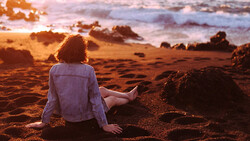
Accurate color control can transform average photos into striking images. Lightroom’s color adjustment tools helps you emphasize specific elements, making your pictures more vibrant without compromising realism.
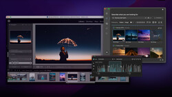
Coming to you from Aaron Nace with Phlearn, this practical video walks you through how to achieve precise color adjustments using Lightroom Classic. Nace begins by demonstrating basic edits like hitting the Auto button, quickly enhancing shadows and highlights to balance exposure. While Auto provides a decent starting point, it treats the entire photo uniformly, which isn’t always ideal. Individual elements—like the yellow foliage, green trees, or blue skies—might need specific adjustments beyond basic corrections. Instead of boosting general vibrance or saturation across the board, Nace shows you how to target each color separately, creating a nuanced, balanced look.
The key tool Nace highlights is Lightroom's Color Mixer panel, specifically using Hue, Saturation, and Luminance (HSL) controls. He emphasizes how using the interactive adjustment tool within HSL is more intuitive than sliders alone. By clicking directly on your image, Lightroom identifies exactly which colors you’re adjusting—useful since scenes often contain unexpected color mixes. For example, trees aren't just green; they often contain subtle yellows or oranges. Adjusting these individually prevents overly artificial-looking edits. Nace clearly explains how small tweaks in saturation or luminance can drastically enhance specific parts of your photo, guiding the viewer's eye precisely where you want it.
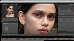
Beyond basic color adjustments, Nace introduces Point Color, a lesser-known Lightroom feature. This allows you to pick an exact shade in your image using an eyedropper, then precisely adjust its hue, saturation, and brightness without altering nearby tones. It’s ideal when you want fine control over particular elements—like making autumn leaves stand out without affecting adjacent colors. He also suggests that using Point Color alongside HSL gives you maximum flexibility, especially when subtlety matters.
Nace further discusses Lightroom’s Calibration panel, another valuable but often overlooked tool. While he typically doesn't use it heavily himself, Nace explains how Calibration lets you subtly shift primary red, green, and blue tones across the entire image. This panel can enhance colors in ways standard HSL adjustments can't quite reach, useful for adding gentle warmth or coolness without sacrificing natural appearances.
Throughout the tutorial, Nace reinforces the importance of starting your edits with Auto adjustments, then progressively refining color with HSL, Point Color, and Calibration. He avoids broad-brush solutions, cautioning against simply turning up global vibrance or saturation. Instead, the approach he shares encourages careful, deliberate decisions, enhancing only the colors that truly improve your composition and storytelling.
Ultimately, this tutorial isn’t about flashy editing tricks—it’s about thoughtfully selecting which colors matter most and making subtle, intentional adjustments. The result is a more balanced, natural-looking image that still pops, highlighting precisely what drew your attention when capturing the photo. Check out the video above for the full rundown from Nace.


Join the Fstoppers community for free
-
Post comments and join in the discussions
-
Browse the site ad-free
-
Share your work and get featured in the community
-
Compete in the photo contests for fun and prizes
1 Comment
Very VERY Informative kinda fast but to the point!!! One thing not mentioned is the color picker in the basic section. This is where you select the picker and them roam around the image for a equal of all colors level in the same percentage like 30% or 40%, I can never remember which percentage to use a main reason I bring this subject up.
Another is the cameras profiles under the four little square blocks, yes I normally stay at ST (Standard) when capturing vs taking a capture in each but when capturing in RAW it has no affect to the image but it does show on the camera LCD screen for it only effects the jpeg and that is what the rear or eyepiece screen shows is the in camera processing of the jpeg image. The point is in post editing at the start and picking the profiles and scanning over each you see what each has on the image like seeing the jpeg, sort of, but a starting point and you may see a selection that will help you see what the camera will show you when out in the field next time. Like when doing astro milky ways and you are on a beach and also want to see the Yin and Yang colors in Pegasus while out in the dark and on your camera, I find PT (portrait) where you get a tan beach, a baby blue sky, and the colors naturally in Pegasus instead of a black sky and all.
Just a little help out in the field to see what the camera is collecting with the light.
Also using the the color picker in the basic section and rolling over the image to get equal percentages in all histogram colors, but a little help to know what percentage level to look for!!!
Lastly I guess it is up to the photographer as the artist adjusts from what was seen to what is in the final art.
1. My A7SM1 set to portrait and what my screen out in the field showed, makes ones heart melt on in the field and when sharing to another on camera image.