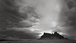
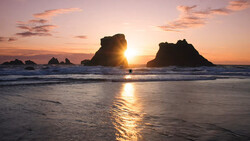
Adjusting colors in your images can transform a good photo into one that's genuinely striking. Mastering the art of color grading allows you to personalize your photos, making them stand out with intentional style.
Coming to you from Aaron Nace with Phlearn, this practical video explains how to use Lightroom Classic’s built-in color grading tools to add artistic flair to your photos. Nace begins by guiding you through Lightroom’s existing artistic profiles, quickly demonstrating how these preset options offer a simple entry point into creative editing. They're easy to use: you click through and select what fits your mood, adjusting intensity to your liking. While convenient, these built-in options limit your creative control because they're preset packages without fine-tuning capability. Still, understanding them is valuable since they offer instant inspiration or starting points that you can refine later.
Next, Nace moves beyond presets to the Color Grading panel, a powerful but approachable tool that allows detailed adjustments. He clearly explains the importance of independently controlling color in shadows, midtones, and highlights—each critical for achieving subtle, professional looks. Using these settings, you can separately modify tones, creating depth and dimension that presets can’t fully deliver. Nace suggests a practical technique: begin by maximizing saturation temporarily, then dialing in the precise hue. After identifying your preferred color, pull back the saturation to achieve a balanced, refined appearance. Keeping these edits subtle ensures your photos feel natural and intentional rather than overly stylized or artificial.
Nace then demonstrates how the Blending and Balance sliders can significantly influence the outcome. The Blending slider affects how distinctly colors remain separated or smoothly mix between shadows, midtones, and highlights. A lower setting keeps tones isolated, ideal for dramatic looks; a higher blending provides natural transitions. Similarly, the Balance slider lets you shift the emphasis between shadows and highlights. For example, pushing the slider toward shadows prioritizes darker tones, while pulling it toward highlights emphasizes brighter colors. Mastering these tools provides nuanced control, ensuring your images communicate exactly the mood you envision.
The tutorial also covers creating your own presets, enabling consistent application of your favorite color treatments. Nace clearly explains that you should save presets selectively—don't just dump everything into them. Specifically, limit presets to include only your color grading adjustments, excluding unrelated settings like exposure or contrast. He walks you through the practical steps of saving and applying these presets, highlighting how presets speed up your workflow by instantly applying your custom edits to new images. Check out the video above for the full rundown from Nace.


Join the Fstoppers community for free
-
Post comments and join in the discussions
-
Browse the site ad-free
-
Share your work and get featured in the community
-
Compete in the photo contests for fun and prizes
No comments yet