

A good monitor is hard to appreciate until you have used a bad one. While we spend decades arguing over which camera has better color rendition, we don’t pay as much attention to the screens we view these colors on. If the screen is wrong, everything is wrong.
Introduction
At 39,000 ft on a flight to Japan, I am quite frustrated by the inflight entertainment display. I mean, it’s not just that it feels like a knockoff iPad from 2013, but also just how terrible the colors are. I tried to watch The Devil Wears Prada, but frankly couldn’t. Sure, my eye is a little pickier when it comes to these things, as I have had the pleasure of knowing what is the finest in monitor tech. One of the monitors I would consider among the “finest” is the EIZO ColorEdge CG2700X. When compared to an in-flight entertainment display, it’s a technological marvel. Of course, I am sure you are here to read a proper review, not a comparison of a high-end photography monitor to an in-flight display of a Boeing 787.
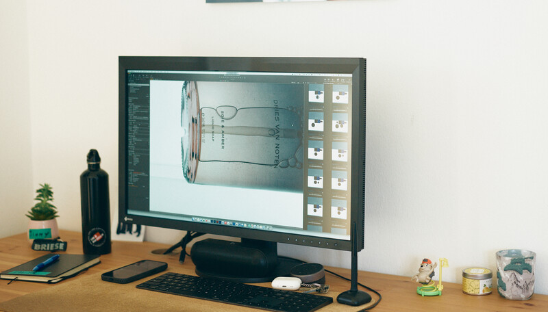
A good monitor for me is a monitor you can simply trust. It should disappear and not give you any headaches about color accuracy, shadows being too warm, or the highlights being blown out. You should also not need to worry about how the image will look on a different calibrated display. As such, a monitor should be designed less to impress with its looks and more around how your work looks on it. This is the curious thing about the EIZO ColorEdge CG2700X: it’s made for professionals who care about reliability. Having used some very good-looking fancy monitors (think the ones from Apple), I realized it’s not about the looks; it’s about the inside. The best way to describe my experience with the EIZO ColorEdge CG2700X is that I stopped second-guessing what I was seeing.
Build Quality
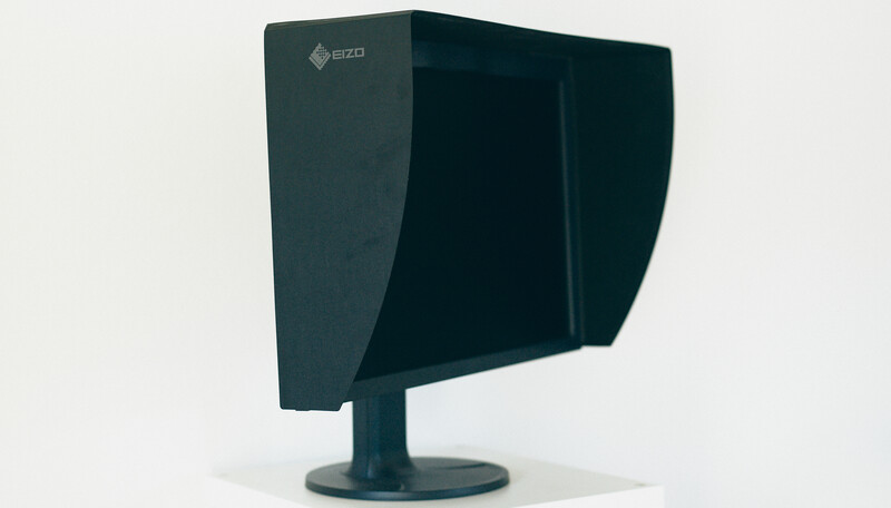
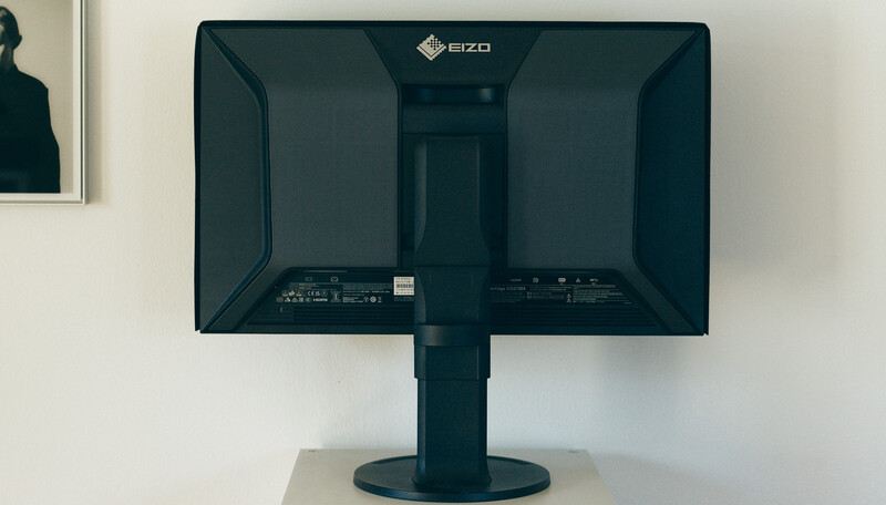
While not a particularly glamorous design marvel that stops the eye, the EIZO ColorEdge CG2700X is a professional tool. The housing is solid, and the stand is stable. The adjustments feel very controlled. I had no problem adjusting the monitor to exactly where I wanted it. With some monitors, this is not quite possible, sometimes due to the size, sometimes due to poor stand quality.
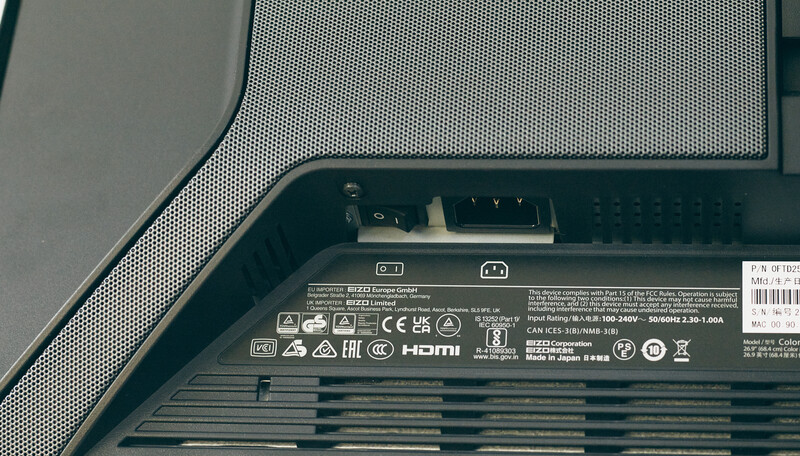
Call me old-fashioned, but I love physical switches. The EIZO ColorEdge CG2700X has a physical on/off switch on the back that physically cuts the power to the monitor, which tells me immediately that it’s off. While a small detail others might not find as significant as I did, it’s nice knowing I am not drawing any power from the wall when I am not working. Yes, the energy crisis is very much a hot topic, especially for me.
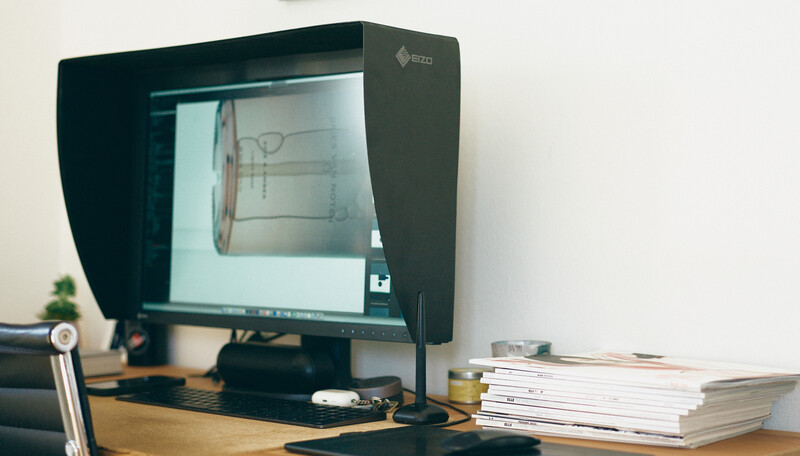
The supplied monitor hood is detachable and much easier to install and remove than I expected. I work at night quite often, so I have a ScreenBar Halo from BenQ – something you can’t use together with a monitor hood. Being able to install the hood during the day and remove it during the night was a game-changer for me. It simply clicks into place with magnets. Installed in under a minute, off in 10 seconds.
Features
The headline feature for me is the built-in calibration sensor. It folds out automatically from the top bezel and allows the display to recalibrate itself without requiring a separate calibration device to be connected.

Calibration is one of those tasks everyone knows they should perform regularly, but it is also easy to delay and can be a bit tedious. The built-in sensor takes care of the friction. While it seems like a luxury item that is not 100% necessary, let me tell you, it actually is. You can even let the monitor perform calibration automatically, which keeps the consistency up.
The EIZO ColorNavigator software gives you a very high degree of control over the colors you are seeing. You can create different targets depending on what you are working on. For example, the same image won’t look the same in print and on the web. I often have to tweak the final color grade to make it fit the final medium.
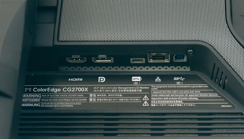
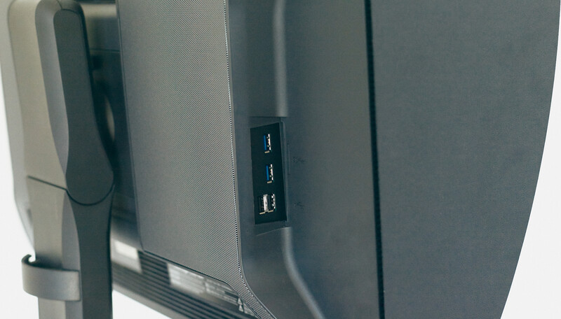
Lord knows I love a good selection of ports, especially an Ethernet port. The USB-C port is the main point for me. I want to be able to connect my Mac directly to the monitor, have it charge, and use it like a desktop. This is all possible with the port on the EIZO ColorEdge CG2700X. The port delivers 94 W of power. This is enough to charge the 14-inch Mac, however it might be a little underpowered for the larger 16-inch version, which needs a 100+ W output. It’s enough to keep it at around the same battery level, though. The built-in Gigabit Ethernet port is also quite convenient. Given that Wi-Fi can be unstable or not fast enough, this port is very welcome. I would’ve, of course, preferred to see a 5 or 10 Gigabit port, though. In any case, the wide selection of different ports keeps the desk setup clean and simple. I love that.
Performance and Color Accuracy
The 27-inch 4K panel is extremely sharp. At this size, the pixel density is high enough that fine details, typography, and image edges look clean without making the display physically overwhelming on a normal desk.
More importantly, the panel is even and consistent. Brightness and color do not appear to shift dramatically across the screen, which is essential when retouching and doing color grading. On a less consistent display, an image may look slightly darker or warmer simply because it has been moved to another part of the panel. This is not something I want to think about when trying to make a tight deadline.
Skin tones are where I notice monitor quality most quickly. On the EIZO ColorEdge CG2700X, small differences in red, magenta, and yellow are easy to distinguish without the image looking exaggerated. Subtle gradients remain smooth, dark tones retain separation, and neutral areas do actually look neutral.
The monitor does not make your work look artificially exciting (think Apple); instead, it gives a controlled and believable image. That may be less dramatic in a showroom, but it is far more useful when the final image has to be printed, published, or delivered to a client.
What I Liked
- Color accuracy
- Consistency
- Built-in calibrator
- Detachable hood
What Can Be Improved
- Price
- Size options – no 31/32-inch option
- Only one USB-C port
- Only a 60 Hz refresh rate (not suitable for gaming)
Closing Thoughts
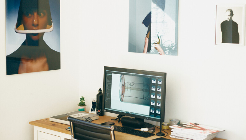
The EIZO ColorEdge CG2700X is not a monitor that everyone needs. It is quite expensive and built around the practical features that a creator might need. If you are looking for a gaming monitor, this is not it. That said, I did play a fair deal of X-Plane 12 on it, and it was good enough for me.
For photographers and retouchers who need reliable color, it does exactly as advertised. There is no doubt about the image on the screen. Built-in calibration, strong uniformity, and practical connectivity, alongside a clever overall design, contribute to a display that feels reasonable rather than just expensive.
Overall, this is a monitor I can recommend, not to everyone, but to photographers (especially medium-format shooters) or colorists.






Join the Fstoppers community for free
-
Post comments and join in the discussions
-
Browse the site ad-free
-
Share your work and get featured in the community
-
Compete in the photo contests for fun and prizes
2 Comments
Meh. I’ve got two NEC PA322 32” 4K wide-gamut displays side-by-side. They retailed for $3000 each. Got one refurbished for $568 eight years ago and the second one used three years ago for about $500. Among the best displays ever made. Sadly, NEC was bought out by Sharp, which discontinued the pro PA series.
I don’t trust any display that has a built-in calibrator that measures near the edge of the panel. I want my calibration done dead-center.
Also, about 15 years ago Eizo screwed a colleague of mine who had sprung for their $4000 top-of-the-line RGB LED backlit 27” display by dropping support for the display in the calibration app when they updated it for a newer version of macOS. He switched to NEC. Eizo displays may be good, but I don’t trust the company.
To me, choice of display monitor comes down to your particular photographic and video applications. I used an EIZO CS2740 for several years, calibrated (Calibrite HL) for a number of reference modes to do portrait and lifestyle event photography and video. Even with a properly color managed workflow, screen, Photoshop/LR ProPhoto color space, converted color spaces and embedded files for distribution the colors, saturation, and contrast on editing screen never looked like what a viewer would see on a wide gamut or Display P3 mobile phone, Tablet, or P3 monitor. The EIZO using Adobe RGB display favored cyans and greens and the P3 devices favor more vibrant reds and yellows appropriate for portraits and event photography regardless if the final files were converted to and embedded as DisplayP3 or sRGB versions. So I got tired of this issue and now edit with a P3 Monitor (Apple Studio Display XDR). PS ProPhoto editing while viewing on the XDR monitor in Display P3 reference mode allows me to better assess skin tones prior to final conversion, and then generate two versions one Display P3 and one sRGB for distribution. Now what I see while editing color, saturation, contrast matches well with P3 devices (anything Apple phone tablets and also other wide gamut devices like Samsung phones etc. Yes the EIZO worked well for finalizing Adobe RGB for Print but was woeful for assessing skin tones for how most people view their photos on tablets, laptops, phones with P3 or related screens. The P3 displays are also so much better for editing video.