
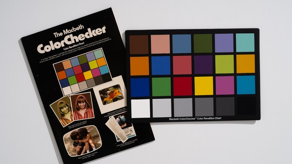
A small card of 24 painted squares turns 50 this year. It is still made, still sold, and still sitting in the front pocket of a lot of camera bags, because it answers a question that cameras have never learned to answer on their own: what color is this, actually?
Happy birthday to the ColorChecker. Here is what it does, why the design has barely moved since 1976, and where the thing has ended up in five decades of use.
Summer 1976: A Known Truth You Could Put in the Frame
The chart was introduced in a short paper called "A Color-Rendition Chart," published by C. S. McCamy, H. Marcus, and J. G. Davidson in the Journal of Applied Photographic Engineering in the summer of 1976. The three worked at Macbeth, then a division of Kollmorgen, and their problem was that photography had no portable, agreed-upon answer to what a color was. You could describe a color, and you could argue about it, but you could not put a known quantity inside the frame and measure against it afterward.
The clever part is not that the patches are colored. It is what they are made of. Each patch was engineered so its spectral reflectance mimics a real class of object, so that it shifts under changing light the same way real skin, real foliage, and real sky shift. A patch that only matched skin under one light source would be useless. A patch that behaves like skin across daylight, tungsten, and overcast is a color body double, and it fools film and sensors the same way the real thing does. That single decision is why a card designed for color negative film still profiles a mirrorless camera correctly half a century later.
It was also built to be photographed rather than displayed. The original ran roughly 13 by 9 inches, big enough to read clearly in a frame from across a studio.

Four Rows, Six Columns, and Skin in the First Position
The layout has a logic that rewards knowing it. The top row is the naturals: dark skin, light skin, blue sky, foliage, blue flower, bluish green. The second row holds the in-betweens, oranges and purples and yellow-greens. The third is primaries and secondaries, red, green, blue, cyan, magenta, and yellow, which is where camera, screen, and printer have to agree with each other. The fourth row is the grayscale, white through black.
Skin leads the chart. The ordering is an engineering judgment rather than an accident of layout. Human vision is far less forgiving of skin that looks wrong than it is of a sky or a leaf that is slightly off, so a reference built to get skin right pulls the rest of the frame along with it. Fifty years on, the first two patches you meet are still a dark skin tone and a light one.
The row that does the most daily work, though, is the boring one. If you never do anything else with the chart, shoot one frame with it at the top of a setup and set your white balance off the gray patches in editing. That single step removes most of what people spend an evening chasing slider by slider.

What a Color Cast Actually Costs You
The argument for a reference is easier to see than to describe. The three pairs below use my own portraits to show what three specific white balance failures do to a face.
Warm light with a daylight setting is a common miss. It pushes a red garment toward orange, drains the pink out of blossoms, and leaves skin looking ruddy in a way that reads as a bad tan rather than an obvious error. Nothing here looks broken, which is exactly the problem. It looks like a choice.

Green tint from fluorescent or cheap LED lighting or foliage/grass is worse, because green is the cast people are least practiced at seeing. It turns a white shirt faintly dirty and takes the warmth out of skin, and photographers routinely fix the color temperature while leaving the tint untouched, because the frame looks approximately correct once the orange is gone.

A blue cast is the easiest of the three to spot on a neutral background and the easiest to over-correct, and overshooting it swings skin straight into orange.

It Outlived Its Own Replacement
In 2000, GretagMacbeth released the ColorChecker DC, built specifically for profiling digital cameras. It carried 237 patches across a 14 by 8.5 inch card, with a far wider gamut than the original and a set of high-gloss patches for extra saturation. On paper it was a straightforward improvement. It is gone, and the 24-patch version it was meant to supersede is the one still in production. Twenty-four patches turned out to be about as many as a person can read at a glance and lay out reliably in a frame, and past a certain point more data stopped making anyone's pictures better.
The corporate history behind the card is busier than the card itself. The Macbeth Artificial Daylight Company was founded in 1915 and the Munsell Color Company in 1918. Kollmorgen merged with Macbeth in 1965 and acquired Munsell in 1970, which put light and color under one roof six years before the chart existed. Gretag merged with Macbeth in 1997, X-Rite acquired the business in 2006, Danaher acquired X-Rite in 2012, and in July 2021 the photo and video portfolio moved to Calibrite. Through all of it, the color materials have continued to come from the Munsell lab.
One change is worth knowing about if you own an older chart. The pigments were reformulated for charts manufactured from November 2014, in an announcement X-Rite made the following year, for safety and environmental reasons. The look is the same, but the measured values shifted slightly, so a chart from 2005 and a chart from today are not strictly interchangeable as references. If you are comparing profiles built years apart, that is where the discrepancy is coming from.

One Design, Five Sizes
The Classic is made in five sizes, and the range is wider than most people realize. The Nano is 24 by 40 mm, roughly a postage stamp, for jewelry and coins and anything else shot at macro distances. The Mini is 63.5 by 109 mm. The Classic itself is 203 by 292 mm, the studio standard and a little smaller than the 1976 original. The XL steps up to 375 by 534 mm for landscapes and large sets, and the Mega is 1016 by 1524 mm, built to be legible from across a field or from a drone overhead.

For work that needs more than 24 patches, the Digital SG puts 140 on a semi-gloss card the same letter size as the Classic. Those 140 are the original 24, a 17-step grayscale for fine tonal control, and 14 dedicated skin-tone patches, which is a direct descendant of the two that opened the first chart in 1976. It is the right tool if you are building custom camera profiles and want the widest gamut and the finest control available. It is overkill if what you need is a reliable white balance reference, and at $369 against $99 for the Classic, it is worth being honest with yourself about which of those you are actually doing.

Where It Ends Up
The chart shows up in places well outside commercial photography. Museums and archives use it in cultural heritage imaging, where the whole point of photographing an artifact is that the record has to be measurably faithful rather than attractive, and natural history collections put one in frame alongside specimens for the same reason. A tool that museums depend on has become old enough to be a museum piece itself.
It has also been pointed at hardware headed off the planet. The image below is from June 2008, inside the Malin Space Science Systems clean room in San Diego, during calibration testing of the Mars Descent Imager for NASA's Mars Science Laboratory. The chart did not go to Mars, because the rovers carry purpose-built radiometric targets designed for the specific problem of Martian light and dust. But the camera that would photograph the descent was characterized against a ColorChecker on a bench on Earth first.

Fifty Years On
The ColorChecker Classic is $99, the Classic Mini is $74, and the Passport Photo 2, which folds the chart into a hard case built to survive a camera bag, is $119. The Digital SG is $369. For most photographers, the honest recommendation is the cheapest one you will actually carry, because a chart in a drawer at home has a measured accuracy of zero.
What is striking about the anniversary is how little there is to update, because that's how effective the system is. Film gave way to sensors, and sensors got better every eighteen months for two decades. The card did not change, because the question did not change. Fifty years on, it is still 24 squares, and it is still the fastest way to stop guessing.
Join the Fstoppers community for free
-
Post comments and join in the discussions
-
Browse the site ad-free
-
Share your work and get featured in the community
-
Compete in the photo contests for fun and prizes
3 Comments
I still have my original but haven't used in can't remember when.
Same for calibrating my Monitor.
"Always put off until "tomorrow" what you should, but don't feel like doing today!
A very interesting article. I’ve been curious about this for years. But, after reading, I still don’t know how to use it, except for white balance, which I already knew about.
Another great article, Alex, good work. I purchased one years ago for video work, back when cameras used to produce their own unique colour shifts, but don't use it much any more. One thing I learned when researching colour cards is that they don't last forever. They fade over time due to UV exposure, so keep them in their sleeve and away from light when not in use.