
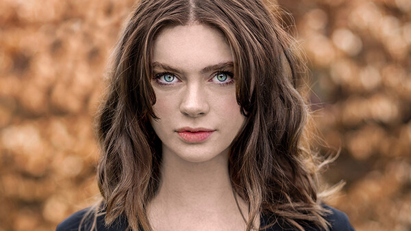
There are two characters that sit atop adjacent shoulders either side of my head and squabble over portraiture. One takes the form of my Gran and she sits there quietly knitting and ensuring me that rules are there for a reason and without them there would be chaos; she’s the voice of tranquillity, reason and over-feeding. Then, annexed on my opposite shoulder is James Dean wearing a leather jacket. He mocks my conformity assuredly and between drags of a cigar, James states that “what is normal for the spider is chaos for the fly” and “rules are there to be broken.”
Well, sorry Gran, but anarchy sometimes prevails and I’m going to have to side with James on this one. I will take that cup of tea when you’re ready though...
HDR
That’s right, I’m coming out of the gates swinging (and mixing metaphors). HDR is treated with the sort of contempt you might expect for someone who barks at babies and kicks kittens. Like most nice things, us humans have gone overboard and tried to ruin it; we’ve taken it to a haloed, oversaturated, and contrasty grave. However, when used in careful moderation it can be incredibly effective. You need look no further than Mr. Joel Grimes and his composite commercial portraits like the images below. Yes, they aren’t for the purist and have a distinct feel to them but don’t be too quick to write them off. If Joel’s work isn’t doing it for you, Lee Jeffries – who I will come on to shortly – employs HDR to devastating effect.

Basketball Stadium by Joel Grimes on 500px.com

Monique, Big Sur. by Joel Grimes on 500px.com

Joel Grimes by Joel Grimes on 500px.com
Over-Exposure/Under-Exposure
This, I feel, is an area that is misunderstood too often. An over-exposed image is a bad thing – yes – but if the subject is properly exposed then blown-out areas can look great! When it comes to portraiture, the chief fear with over-exposure is a loss of texture in the skin. So, expose for the skin and then sometimes it’s worth just letting the light run wild. With regards to under-exposure it's more to do with tastes, you grungy mood-loving folk will be mildly less displeased to learn. It is a very thin line to tread and the first time you see your artistically under-exposed creation on a non-calibrated monitor you'll want to drive the owner's thoughtless face through the inaccurate display. But, fortune favours the brave Padawan, so embrace the dark side. (Oh, believe me, I know what I did there. Come at me Star Wars fans!)

selina by Martin Strauss on 500px.com

Veiled by Jessica Drossin on 500px.com

Adv by Denis Kartavenko on 500px.com
No Eyes
Oh shut up, Rob, no eye contact is hardly a taboo. You’re right, but no eyes in the image at all, is. Eyes are called the windows to the soul (a positively sickly sentiment) which means most portraits aim to capture their beauty. There’s something incredibly engaging about eye contact. Now I’m not suggesting you pin down your model and gouge their eyes out – I’m not sure what release form that would require – but obstructions can make an image more memorable than eye contact at times. Here are three examples:

*** by Alexander Sikov on 500px.com

Robin by Hartmut Nörenberg on 500px.com

Portrait of beautiful young woman with colored glasses by Oleg Gekman on 500px.com
Wide Angle Lenses
If you were to ask which the best lenses for portraiture are, you’re not likely to get any wide angle, let alone ultra wide angle lenses, in the list. Generally speaking 50mm to 200mm tend to be the nice range with minimal facial distortion, although the 35mms like to make guest appearances here and there. Admittedly, fashion photographers sometimes shoot with wider focal lengths but wide angle lenses usually do one of two things: lose the subject in the frame or make them look like a caricature. As interesting and unique as the results may be to the photographer and viewers, the model is likely to untag herself from the image with physics defying speed and you will be promptly maimed to death upon your next encounter.
However, if the common conception of beauty is neither the aim nor the requirement, the amount of character and personality you can capture is fascinating. I need refer you no further than to Mr. Lee Jeffries’ portraits. What’s also worth noting is that he often uses HDR in his portraits so these examples double the 'rule' breaking goodness.

LB by Lee Jeffries on 500px.com

Manchester by Lee Jeffries on 500px.com

Untitled by Lee Jeffries on 500px.com
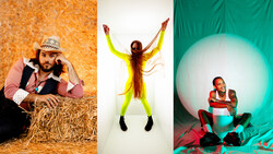
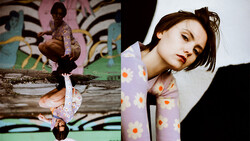
Avoid Bright Clothing
This isn’t necessarily a rule, but if you’ll delay your angry comment I can explain. I’m talking specifically of portraiture where the subject is the focus. Obviously, fashion photography is going to have bright garments and the industry would be a duller place if the most interesting dresses couldn’t be photographed. However, splashes of bright colour can make a portrait, particularly if you employ colour theory. That is, if you bring in complimentary colours.
None of the below examples have picked their colours by accident. There’s no need to be afraid of colour taking focus off your subject as long as you use it to enhance the image.

GABI. by Cristy Elaine on 500px.com

Dasha by Jay Kreens on 500px.com

Maria by Ann Nevreva on 500px.com
Avoid Busy Backgrounds
There is an easy trap to fall in to with backgrounds. If you’re shooting wide open and populating your frame with primarily gooey bokeh, it might seem as if it doesn’t matter what it is you’re liquefying. A smudge is a smudge after all. Amanda Diaz was the person that first taught me this: what you blur out is important. In fact, it’s not far off being as important as a sharp background. But whether you’re going to dissolve your background in to scattered bubbles or keep the scene sharp throughout, generally good advice is to avoid busy backgrounds. This is much for the same reason as avoiding bright clothing; you’re distracting from your subject.
That said, it can be used to great effect if it adds something to the scene. There’s no place for laziness here. If your background is cluttered you ought to ask yourself “would this portrait look better with a more minimalistic backdrop?” If it’s an unambiguous “yes” then you might want to relocate.
The below examples show just how effective a busy frame can be. The first would certainly look nice shot in a studio with a black backdrop, but would it look better? – I don’t think so. The second example I would go as far as to say it simply wouldn’t work without the clutter of trees and leaves, although the composition is what really brings the image together. The final example is breaking all sorts of taboos – some of which I haven’t even mentioned – and I love it all the more for that. It’s under-exposed, the backdrop is a mess of bokehfied lights, there’s no eyes and it has a very strong colour cast. Despite all this, the image taken as a whole works brilliantly with a strong cinematic feel.

Autumn girl by Oleksandr Pshevlotskyy on 500px.com

Magic Lanterns by Alessandro Di Cicco on 500px.com

Charlotte by Jesse Herzog on 500px.com
Strobes are Essential
This ‘rule’ has been pretty must smashed to pieces of late. Of course, window light was always a great source but these days, there is a little known photographer by the name of Dani Diamond turning strobe manufacturers grey. That’s not to say artificial light isn’t often needed and highly useful, but essential? Nope. This ease with which exposures of select areas can be tweaked to preference has brought to fruition a new breed of shooting styles, in which the image is purposely under-exposed so that the subject can be brought up a stop or two in post.

Vanessa - Natural Light - Dani Diamond by Dani Diamond on 500px.com

April - Natural Light by Dani Diamond on 500px.com

Caitlin - Natural Light by Dani Diamond on 500px.com
So run free fellow 'togs. Cast your shackles and shoulder-dwelling ghost Grans aside and embrace your inner James Dean. Be bold. Be brave. Break the rules. But remember, if it doesn't work out, you can always just blame me.


Join the Fstoppers community for free
-
Post comments and join in the discussions
-
Browse the site ad-free
-
Share your work and get featured in the community
-
Compete in the photo contests for fun and prizes
17 Comments
Robert, each of your interesting points pulled me along to the next all the way tie the end. Saving your article.
That's very kind -- thanks, Sean. I'm glad you enjoyed it.
Great article with beautiful examples. Thanks.
A competent photographer that happens to be a skilled writer as well. Just what this site needs!
What a collection of stunning portraits! Each one of these artists can inspire the other photographers according to their own style
I still hate HDR. There is nothing about it that like, even slightly. But all the rest... Rules were meant to be broken. It's that thinking outside the box that makes for an individual style.
Great article, as someone who went from musician to photographer, it really it was fun to hear about taboo's and even better about breaking them.
This is my 1st comment here on Fstoppers and I just want to say I love this article. The writing style is similar to cracked.
I personally believe that the artistic vision of the photographer is the most important thing and whatever tools he uses to achieve it is irrelevant.
The last one rings so true. I was forced to go natural light on a recent outdoor shoot after I made the very humiliating mistake of forgetting to charge the battery pack the night before ( I of course did not admit that and blamed on the equipment). It turned out to be a blessing as it was a cloudy day with beautiful soft light everywhere. With how much data is retained in raw files these days, it's so easy to "light" and "relight" a photo in post and selectively darken areas to make your subject pop that way you would using strobes.
Why do you think it's OK to steal photos? A photographer writing for a photography website should no better. You couldn't even credit the original photog?? I guess we should start downloading images off robertkbaggs.com and using them like free stock.
Hi Stuart,
We take crediting photographers very seriously. Unfortunately, we had a bit of an issue with the embedding code, and that caused accompanying information not to be carried over as it normally is. We're fixing that right now.
500px embed codes are failing to pull the photographer, the image title and the hotlink back to the 500px page. We're not sure why it's happening and other websites are experiencing the same problem.
Stuart, if you are going to criticize someone please recheck your spelling. Example: "okay" not "OK" (the abbreviation of Oklahoma", rather than "no" it should read "know", and what is with double question marks "??".
All I can think about while looking at many of the images above is that dodge & burn has become too easy in Photoshop. Everyone is over doing it.
Fantastic article! A beautiful collection of portraits.
Thanks. But I suppose some of examples are not quite relevant to "portrait" genre.
Adv by Denis Kartavenko on 500px.com ("Over-Exposure/Under-Exposure") - definitely not a portrait
"No Eyes" images is not about portraits at all but more like fashion shots.
Genre mixing is quite usual these days but I don't like this phenomena much.
I really appreciate this article. My portrait photography utilizes natural light, so I've already broken that rule. Now I'll have to give some of these other ideas a try. I love portrait photography.
-Chris "AoxoA" Hooper of Austin Tx.
https://aoxoa.co/austin-tx-portrait-photographer-headshot-photography/