Composition may be one of the most widely discussed artistic aspects in photography. In theory, the idea is simple. Putting it to work, particularly in motion arts, is easier said than done. Composition is one of the most important creative aspects of any filmmaking. Simply put, it is the act of defining the position, arrangement, and view of objects within the frame. The composition is, in effect, representing the point of view of your viewer and it will have a direct impact on how that viewer feels when they see it.
The subject of composition is composed of (no pun intended) five elements: scale, angle, space, background, and color. Here are explanations of each along with real world examples illustrating the concepts.
Scale
Scale is essentially the size of the subject in your frame. For example, are you shooting a very close up shot of just your subjects eyes or is the shot wide enough to include the entire room and everyone else in it? Scale is greatly affected by lens choice. A wide angle lens tends to distort facial features at close range as well as accelerate motion throughout your frame. For this reason, wide angle lenses are rarely used to photograph portraits but ideal for enhancing the menacing speed of a race car coming down a track.
Conversely, a telephoto lens compresses your image making the objects in frame appear to move much slower. In addition, larger faces and body types tend to benefit from a telephoto lens as it will slim down features. Also important to note is that longer focal lengths help decrease the depth of field in your image giving you those blurry backgrounds so often sought after. This is widely accepted look for cinematic purposes whereas a wider angle lends itself more to editorial work where candid moments are more commonly viewed.

This portrait was purposely shot with a wide angle lens at about 12 inches from the subjects face. The result was excessively distorted but visually interesting when used with intent

Shots of traffic congestion or long lines of trains such as this are almost always shot using a telephoto lens. The resulting image is very compressed making the distance from foreground to foreground appear minimal
Angle
The angle of the camera in relation to your subject is extremely important in conveying an emotion and intent for your shot as well as directing a viewer’s focus.
The first, and most obvious, aspect of angle is camera height. How high is your camera in relation to your subject? The height of your camera can have a dramatic effect on the emotion being conveyed. A simple example is that of photographing a child. The typical placement of camera when photographing a child is from above while looking down. Subconsciously, this placement conveys a sense of superiority over your subject as being above them must mean you are in charge.
On the other hand, getting down low and shooting up towards the child will convey a sense of inferiority as the subject will appear larger than life and strong in relation to the viewer. Use a wide angle lens and this effect will be exaggerated even further.

This portrait of a man in a suit conveys a sense of "importance" as we look up at from a lower angle. The emotion is further enhanced by the fact that he is dressed as a professional
The last thought to consider is photographing someone at eye level. Doing so conveys a sense of “connection” as you are able to see directly into their eyes. Move the camera to the side of their face for a profile and the feeling now becomes a sense of “voyeurism” almost as if you are watching them without their knowledge.

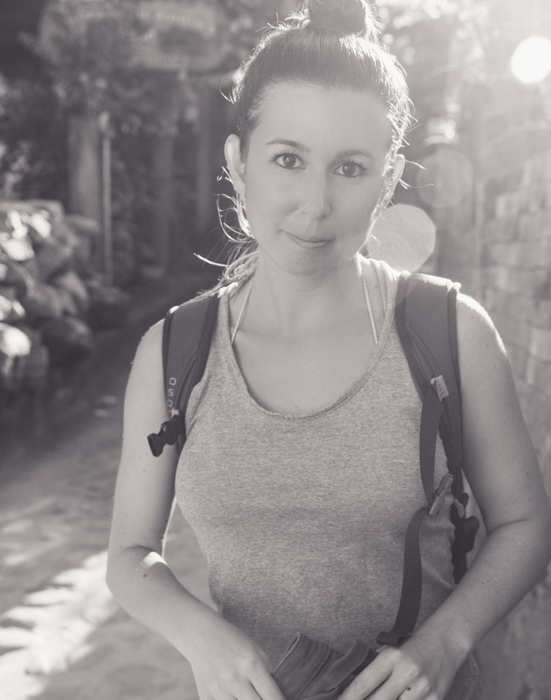
Here is a portrait shot at eye level with a strong focus on the subject's eyes. Direct focus on eyes connects the viewer to the "soul" of your subject and is further enhanced by the sun flare and conversion to black and white
Space
Space is simply the idea of where your subject is placed within your frame. Realistically, where you place your subject in the frame is a subjective concept, however, there are standard conventions that are widely accepted.
The Rule of Thirds is probably the most used spacial technique in photography. Imagine your 16:9 frame divided into thirds horizontally and vertically with four points of intersection. These four points are considered “pleasing” to the eye for no particular reason other than it being the general consensus amongst most cultures. Placing key elements of your subject, such as their eyes or head, at these intersecting points is ideal for most situations.

This photo of a hot air balloon has a thirds grid laid overlaid to showcase the points of interest. In the bottom third we have the carriage and the balloon team and as our eyes progress to the top right third we see the intense flame entering the mouth of the balloon
Negative space is another important consideration. Simply put, negative space is the area that surrounds your subject which does not include detail. It helps define what your subject is and leads your viewer's eye to that point. It provides breathing room and prevents visual clutter creating a more visually compelling argument.

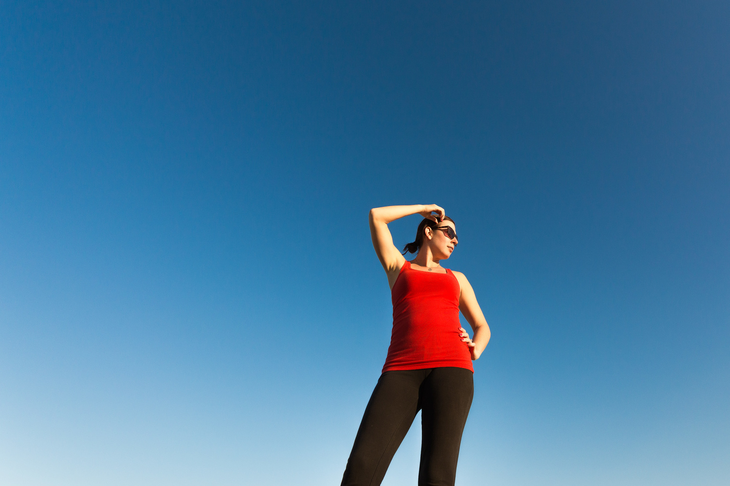
This low angled portrait is dramatic in pose but more importantly, the fact that it is surrounded by sky and nothing else. The negative space emphasizes the subject and is further impacted by the strong contrast of complementary colors
Background/Foreground
Background and foreground. Backgrounds should complement your subject not distract you away from it. Poles sticking out of heads or crazy patterns are probably not going to achieve this. Can’t avoid the background? Pull out a telelphoto lens, open up your aperture, and get close to your subject to blur out the background.

This background complements our subject as we have a Dr. entering the frame into negative space and we can semi-discern the fact that it is a hospital setting with a row of beds. Additionally, we have employed the rule of thirds with key points of interest at intersections
Alternatively, foreground elements, which may seem to distract at first, add a bit of realism to your image as most day to day visual experiences are often obstructed by people moving around you, or objects getting in your way. Next time you are out filming, try adding some foreground by shooting very close to a wall or through tree branches. People moving quickly across the front of your frame can also be visually interesting and provide a nice cut point in post-production.

Here we have used a computer screen as an element of interest in our foreground. Although it is blurry, it gives context to our subject as we can clearly tell what he is doing
Color
Color is incredibly powerful in attracting the eye and conveying emotion. Humans are pre-programmed to associate different colors with certain feelings. For example, reds and warmer colors tend to evoke a sense of love or strength and will complement a cozy fireplace scene. Conversely, red can also represent a sense of anger, rage, or danger. Therefore, think about the type of scene you are shooting and implement colors of varying degrees to complement the overall emotion of that scene.

This warm, fireside scene employs the use of red and yellow colors to suit the cozy mood

Conversely, this shot is strikingly all about the red color cast from the railroad light and the sense of danger it conveys
Conclusion
The beauty of photography and filmmaking is that the latter is simply an extension of the former. Most of us start by appreciating the basics of photography and the basic concepts of this art carry over easily into the world of video. Composition is no different except you must keep in mind that your subject will be moving as you film them. Take these five tips with you and go out to practice each. Take a person and photograph them from far away. Then get so close you can see the color of their eyes. Shoot them in a cluttered forest and then an open parking lot. Examine the differences between these shots and see if the feeling or you experience is any different. By putting these concepts into practice, you will be sure and remember them time and time again.


Could you point out to me where in this article I can find "The Keys to Composition in Filmmaking"? These are just basic characteristics of perspectives etc. And why so many examples in portrait mode? At least use stillframes from a movie.
Maybe using the word "keys" in the title was not the best choice. Perhaps "suggestions" or "tips" would be better suited? Regardless, the verbiage is accurate and doesn't cover just perspective. Color has nothing to do with perspective. I do agree that I should have pulled still frames from videos I've shot but frankly, I did not have enough time to parse through all of my footage archives. The photograpghs I included, vertical or not, get the point across visually.