
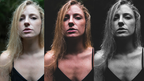
I'll preface this by saying that I am in no way bashing the Instagram community, other photographers, or their style. I got to be curious about why these Instagram portrait photographers were gaining such popularity. If you search any of the various Instagram "superhubs," you'll see this style crowding the pages. Once deconstructed, there isn't much to the look that has exploded across social media in the last year. Though there isn't much to it, there is certainly some work involved. It's not always as simple as a few sliders in the Instagram editor.
The Fade
This might be the most obvious addition to these edits. The shadows and occasionally the highlights have some major fade added to them. A dreamy look seems to be the name of the game and we all know we don't see life with that kind of haze, making the image feel surreal. Photoshop and Lightroom both offer the ability to add this effect, and while Instagram also has a "fade" slider, you have little control over the effect this way. I used Lightroom to add this effect, here's how.
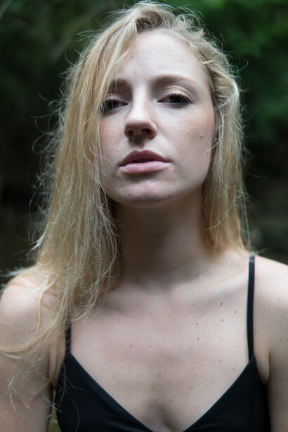
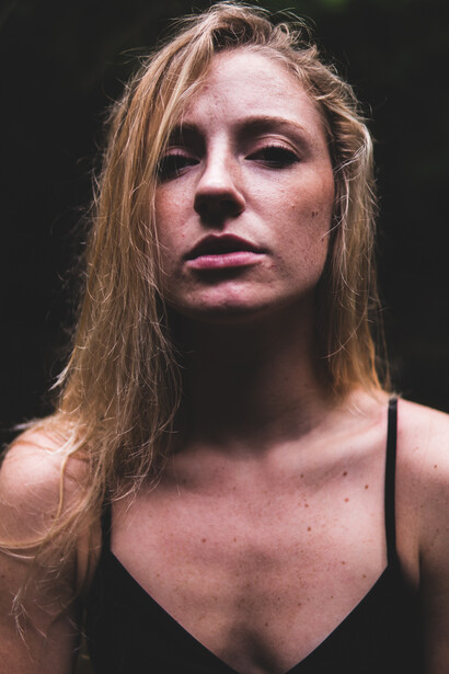
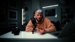
Let's look at our base image. We have a fairly well exposed raw file with a decently balanced histogram.


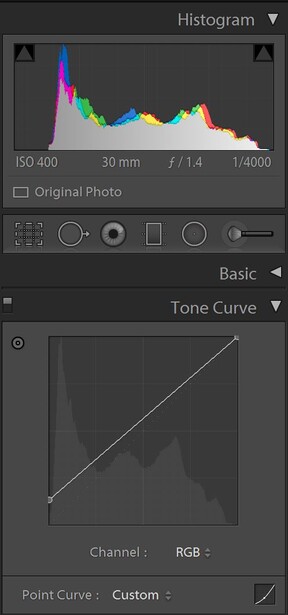
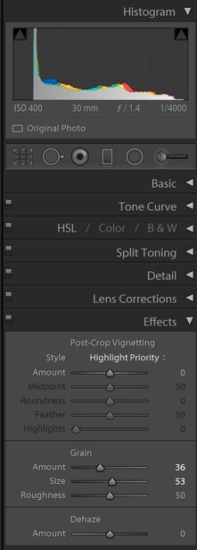
In order to have control of the Black Point and White Point (the dots in each corner of the curve), we must first press the button in the bottom right corner of the Tone Curve tab as I have in this image. When hovered over you will be given a prompt that says “Click to Edit Point Curve.” From there, your Tone Curve tab should look like the image above. Now let's add the fade. Grab the bottom left point, the Black Point, and drag it up along the edge of the histogram like so. Once that's done, you'll see that the image becomes flat and unappealing.
Not great right? This is the point where a lot of the dramatic effect comes in. Using the Tone Curve we're going to pull the shadow values down to darken those parts of the image separate from the highlights. Your Tone Curve should look something like this afterwards. Keep in mind all of this should be adjusted based on the individual image and to your taste. Not every image will need the same amount of fade or shadow adjustment.


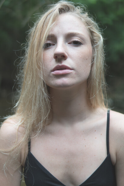
This still isn't great, mainly because the highlights have remained untouched. I prefer to give them a little bump to add some contrast to the image. Use the top right quarter of the tone curve to bring up the highlights.

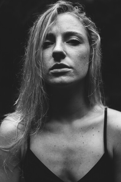
That's really all there is to it when it comes to the faded look. It's a simple addition to the image that makes a huge impact on this look. Keep in mind also that this will have varying success depending on the contrast and lighting of the image. If your subject isn't well lit, they'll fall into shadow. This may or may not be a look you're going for but if you know what to look for while you're shooting you'll come out with better results.
The Grain
Almost every one of these portraits I see has some noticeable grain in the image. I'm not talking about digital noise, but added grain via editing software. I've always found it funny that for years photographers, myself included, complained about how they couldn't get super clean images at higher ISOs but now we're adding grain to everything. I definitely add grain to a lot of my images, but it's an interesting trend. This effect is simple: Find the grain slider under the Effects tab in Lightroom and add however much you'd like. You can also adjust the grain size and roughness to mimic higher speed films.
Basic Corrections/Contrast
There are a few other luminance adjustments that I usually make because I don't feel the Tone Curve can do all of the work for this style. I often drag down the highlights and shadows a little more here. Depending on the image, I may bring the shadows up to include more detail or even move the black/white sliders to increase or decrease contrast as necessary. I have a preset made for this style and this is what my Basic tab looks like with it applied.

From here's it is basically finished. I chose to display the final image in black and white, done simply by pressing Black and White in the Basic tab. For some images it may be necessary to tone the highlights or shadows of an image. There are a few ways to do this, including the Tone Curve or the Split Toning tab in Lightroom. I prefer the Tone Curve to do this as I can adjust individual color channels to really get a good mix of colors if necessary. Split toning simply adds one color at a certain saturation value to either the highlight or shadow.

Love it or hate it, it's a style. Trends come and go but this is certainly a big part of photography now. With this style cramming its way into the Internet, it may very well define the era. I can imagine looking back on my old work and thinking about this look much the way that the styles of the 80s and 90s are looked down upon. I like this look and while it doesn't work for every photo, some of these techniques can be applied elsewhere. What do you think of the Instagram style craze?


Join the Fstoppers community for free
-
Post comments and join in the discussions
-
Browse the site ad-free
-
Share your work and get featured in the community
-
Compete in the photo contests for fun and prizes
30 Comments
Are you depressed?
I know the article isn't super strong but this is a little too much
https://www.technologyreview.com/s/602208/how-an-algorithm-learned-to-i…
HAHAHA
As the last person on earth without an Instagram account, articles like this are a good reminder why I don't. Having smug narcissists constantly interrupting my day with their mediocre & pointless photos can be its own special HELL...
"How To Ruin A Perfectly Decent Photo" should be the title. Sorry... I dislike the result(s)... alot!
I don't get the purpose of this article.
time for you to get onto those presets im releasing to double check your settings. pathetic what you call 'the instagram look'
Not a fan of this article, but damn.. you guys are BRUTAL!
Just my opinion, but why would anyone want to create the cheap amateurish of look of Instagram filters in anything? You do know that you can tone your photos the way you want and post them as is, sans Insta filters? Just bc it's there doesn't mean you have to use them at all. FStoppers editors: Quality over Quantity
This is a quality article. People ask how to get this look all the time. Spencer provides the answer here. You don't have to like the look personally to appreciate Spencer's efforts in helping out those who do care to know.
I think the overwhelming responses to this article speaks for itself. Sorry. :)
If you read the article, you know why. "Photoshop and Lightroom both offer the ability to add this effect, and while Instagram also has a "fade" slider, you have little control over the effect this way."
The filter looks can easily be replicated by people who have messed up with the curves before. It's just we [photographers] don't intend to use this style as the Instagram look can be done by our mobile phones. Having to replicate it using PS or LR will be a wasted effort.
I am not a totally against Instagram filters, but let the look stay on the app [Instagram] and create something better with our computers and it's professional suite of imaging software.
Gosh that is horrible
No.
Another thing, filters in general. The whole #nofilter nonsense, if people actually knew what filters were, they probably wouldn't be raving about not using them. Sure sometimes nofilter is ok. But I like to take control over my final photograph and the process of taking it. Maybe I just take things too seriously and over-think them as well.
EYE LOVE EAT!
I don't understand why people are so judgemental about this. We have some haters here calling this type of photography meaningless or that the presents are bad while they are posting out of focus waterslide pics or some trees with absurd color and way to much fake flare, color distortion, and frames. I'm not judging as my pics are all shit, but when you think someone elses work is pointless or bad remember that many people think the same about your "work."
I know you are mentioning me as one of the judgmental. I don't hate the guy for posting it. Neither hate the instagram look. If you read my comment, there was no insult to the writer's work at all but more of a honest opinion regarding the topic of replicating Instagram filters on photoshop.
Next time, before you attack me and my work - make sure I am totally being "judgmental".
Thank you for demonstrating my point. You felt I was attacking you, while that was not my intent. My point is, everyone has their own opinion about what they like and what they don't like, however creating something "better" is a different story all together. Please don't take offence, I just have been feeling as though this forum is arrogant at the moment and that each person here believes themselves to be somehow better artists because they are on this forum instead of another forum. Everyones photography is as "good" or "bad" as the person who is looking at it thinks it is.
But as I have mentioned. I wasn't talking about his work at all. It's about the topic of replicating the filter looks in photoshop and lightroom. Neither I commented about the outcome of his examples.
First, to reply to your comment "Having to replicate it using PS or LR will be a wasted effort.", if you read this article, you know the author already answered that "Photoshop and Lightroom both offer the ability to add this effect, and while Instagram also has a "fade" slider, you have little control over the effect this way."
Second, if you weren't talking about his work "at all" then what were you talking about when you say "let the look stay on the app [Instagram] and create something better with our computers"? When you say "better" were you talking about the insta community's work then? Im confused.
I actually think this photo looks great. I wonder if you guys could take that original photo and post a version that is objectively vastly superior. My guess is that some of you may be mixing up your anger for how easily Instagram can make photos appear attractive to the masses with the style itself. Aren't photographers responsible for producing images that appeal to vast quantities of people, both practiced and unpracticed? If we only cater to the elite photographer, won't we end up fading out of existence? This whole response thread sounds like a bunch of "stuck-in-their-ways" crusty old people. My own opinion is that we should be learning from what makes the style above so attractive and creating a version of it which leverages the skills of a practiced photographer/retoucher. In that way we could end up owning a better version of it. The tutorial above is a great step in that direction.
Retouching and toning is an art form, not a, "one click and done" option for the masses who are content with whatever result it gives them. I've *never* used an Insta filter on my photos, since i've worked hard doing it in photoshop. But i get downright nauseous when i see photos i've edited run through an insta filter bc the person thinks all photos have to be filterized before posting, not really caring what it looks like, because.... photos must be filterized in insta before they post them. People know instagram filters by their particular look (which isn't good)- which is also the reason it's so reviled in the photographic community.
Lo Fi, Lo Fi!! Everything has already been said about insta filters: https://www.youtube.com/watch?v=Nn-dD-QKYN4
Here's a great collection of LUTs, Philip Bloom used them before and they really have that 'New-Instagram' look. Albeit they're meant for very flat images. They'll destroy a regular image.
http://deluts.businesscatalyst.com/index.html
I think the original has more of that instagram look. Maybe the instagram look of now, but the other ones are a nice twist on the original photo.
What is Instagram?