
As you get more comfortable with editing, you’ll probably come across color spaces. Just picking a random color space to edit or export with can cause major issues with your photos, however. Want to know which color space to use and when?
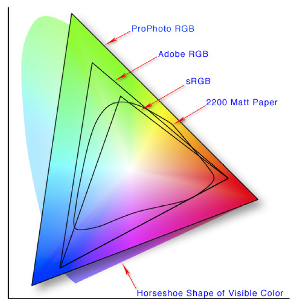
First, let’s take a look at what a color space actually is. The image below is a diagram of some different color spaces, laid over the top of the CIE diagram (a fancy scientific model of all colors we can perceive).
These color spaces have a significant impact on how your image will look in different programs and across different applications. While making a mistake won’t start anything on fire, it can ruin the appearance of your image if you use an incompatible color space with some devices. Colors can be washed out or oversaturated, prints can come out looking off, or the file might get rejected by the online service.
An even more dramatic example just popped up in the news and actually prompted this guide: a badly formatted color space made for a wallpaper that would crash Android devices.
For photographers, a color space can be best understood in the context of what it does for their images: it maps a range of colors into an available “space.” The science behind these spaces, how they came to be defined, and more, is all quite complex. As a photographer, it’s easier to just build a simple mental model of which space to use and when by following a few simple guidelines.
Shooting
If you’re shooting JPEG images, your choice of color space in the camera is significant. Since the JPEG format only offers a limited range of colors without the ability to alter it down the road, you have to choose carefully. Your camera menu should present you with a few choices, typically sRGB and Adobe RGB.
sRGB
If you’re not shooting specifically to print, sRGB is the safer choice. As the format common to web devices and almost every device made in the last 15+ years, no device should have a problem displaying the image. That all sounds great! Why would I use anything else, you might ask. The answer to that goes back to the space diagram. As you can see above, sRGB has the most limited range of any of the usual color gamuts.
Adobe RGB
Shooting JPEGs with Adobe RGB is a tricky thing to recommend. In theory, it offers a wider color space (one that was originally developed to better align with printing), as well as the ability to convert down to sRGB without much issue. In practice, the workflow challenges mean it doesn’t make much sense to still shoot JPEG by the time you’ve gotten that deep into the complexities of color and editing. Put simply, you can shoot Adobe RGB but will end up wanting to convert to sRGB for most applications other than printing anyway.
Are You Shooting Raw?
If you’re shooting raw, you might be feeling left out. Don’t be. A raw image doesn’t really have a defined color space. A raw file isn’t even an image, at least when your camera records it. Instead, it’s a stream of information from the sensor. When you load it into a raw processor, like Lightroom, Capture One Pro, or Luminar, that software can convert the stream of information into an actual picture. At that point, you can choose what color space you want to be working with.
Editing
JPEG
A JPEG image will already have its color space defined. If you set your camera to sRGB, you’re basically good to go. Make whatever edits you want, and save a finished copy of the file. If you shot in Adobe RGB, however, and are planning on sharing your image via the web, social media, or some other non-print media channel, you’ll want to convert back to sRGB.
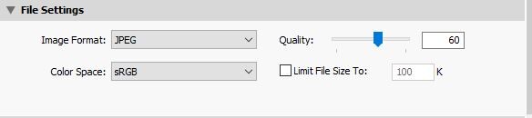
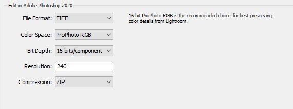
From Lightroom, you can select your color space on export.
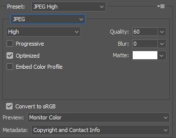
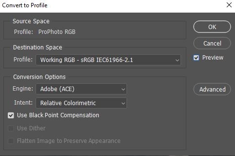
In Photoshop, you can select to convert to sRGB when saving via the “Save for Web” dialog. If you prefer, you can also convert manually by going Edit>Convert to Profile.
Raw
Exporting to Software
If you’re moving an image between editing tools, it only makes sense to preserve as much color information as possible. What this means is don’t choose a smaller color space than the one you started with, unless necessary. Lightroom even reminds you of this in the preference settings.
If you’re working with another piece of software, which may not support this color space, like an older plugin, for instance, you can choose the next best available color space, typically Adobe RGB.
In other editing tools, the same philosophy applies: start with ProPhoto RGB or AdobeRGB if unavailable and plan on finishing your files in sRGB, unless your printer, lab, or publisher requests something else specifically.
Bit Depth
Another thing to keep in mind is the bit depth. Some editing tools will let you choose to work in 8 bit or 16 bit modes. Again, there’s a bunch of math and computer science underlying this, but put simply, a 16-bit image can represent colors with much smoother gradations. Going to 16 bit is especially important if you're going to be making large tonal changes or using tools to alter tones. An easy example is the gradient tool, which can look blocky under some conditions in 8 bit mode. If you’re working with these larger color spaces, you should probably be working with 16 bits as well.
Wrapping Up
Color gets messy quickly! Fortunately, there are only a few things you’ll want to keep in mind for 99% of your work. Lastly, just remember that because most software defaults to some pretty reasonable selections these days, I'd only suggest changing away from those defaults with good reason.
sRGB: Universally accessible and what your finished file should probably use.
Adobe RGB: Printing and some plugins. If you’re working with a high-end lab or professional publisher, you can give them an Adobe RGB file to get better results, but they have to support it. When moving a raw file into an editing workspace, Adobe RGB can keep more colors than sRGB and might be supported by some editing tools that don’t support ProPhoto RGB. Remember to convert down to sRGB, however, or you’ll end up with washed-out colors!
ProPhoto RGB: The editing workspace that was probably selected for you. Don’t forget to use 16 bits with this one, however. You’ll keep the most colors intact and have the greatest flexibility when editing in this space. Again, you’ll need to convert to sRGB on export for most purposes, however.


Join the Fstoppers community for free
-
Post comments and join in the discussions
-
Browse the site ad-free
-
Share your work and get featured in the community
-
Compete in the photo contests for fun and prizes
26 Comments
Very useful article.. another topic that gets lost in the snobbery on Internet forums at times, they always seem to end up in these knowledge pissing contests alongside diffraction, hyperfocal length, Bokeh, pixel density and the like.
All such topics are equally important, but, perhaps, not relevant for all. I would say take what works for you and forget the rest :)
One does not have to know how to build a car in order to be a good driver...
I never said they aren’t important, I said they are used as tools in a pissing contest between people who like to imply they have more knowledge of a subject than the person they are arguing with... and the eventual outcome is a lot of waffle that bears no relevance to actual photography ends up in the public domain. There are 2 types of people in Photography world, those that sit at home discussing specs and those that don’t sit at home and use their camera.
Ah...Okay...Thataway...I would still say ignore and take what works for you...I am just a hardcore techie and also ex-adobe almost 20 years ago :)
I think I use adobe RGB in camera (which I guess doesn’t matter as I use the RAW file) then the same for handover between Capture One and Affinity, and the return journey, then export in sRGB.
Don't think most monitors or camera LCDs can display the gamut, but, does not matter really. Once you get deeper into that, nothing will matter excepting the end result :)
I think my logic for the software was the increased amount of info being passed across was relevant, even if the monitor can’t resolve it, so for pixel editing in Affinity it was better to be getting the max colour spectrum from C1 and of course sending the same one back. When I first set it up I had the return journey set to sRGB and couldn’t understand why the imported image looked different to the one I sent.. Changing it resolved the issue so I guess it means something.
It's a huge field by itself, colour I mean. I purchased Affinity Photo besides some others during this lockdown and I like what I see in Affinity so far. I tried C1 and it failed to import some of my earlier canon 450D raw files as also some more current Nikon ones so, did not get that. So far though, I am only impressed with ON1 Photo Raw and am waiting for the next update to fix a few issues (which I use...not a show stopper) before I switch to it. For my kind of photography (wildlife and macros), I would not have to go into PS anymore...Just ON1 would do the job.
If you use the Adobe RGB or sRGB setting in your camera it affects only the JPG. I prefer sRGB for JPG because most of the devices can display it (as told in the article). I think you trolled here. Taking care of the colours (colour space) is a very important task in many fields of photography and computer generated visual content. Colour accuracy is e.g. very important in professional advertising (CMYK conversation). Adobe did a very good job with inventing Adobe RGB. This field is huge and it is very hard to understand, it is pure mathematics if you go into the details. (I am far from really understanding it, I admit).
I wasn’t trolling, I actually said it’s a really useful article.. but that doesn’t escape from the fact it’s one of the main dick swinging subjects for those want to sound more intelligent than others.
The fact? Says who? A discussion about a subject can also lead to improve ones knowledge and not only to a "knowledge pissing contest" as you see it. What is your contribution, btw? Cheers.
My contribution is to enjoy the photography side of things and not try to serve my ego by attempting to sound like I know more fancy words and numbers than the next man... sorry if my view on life hurts you.
Nice portfolio btw, good images
Colourspace is not relevant when shooting raw and selecting any colourspace or image enhancements in the camera only affect the raw preview and the JPG if that is being saved. Unless you are printing (even if you are for the most part), sRGB is still the way to go. I have serious doubts on how many monitors (or camera LCDs) are actually capable of more than 70% of the NTSC gamut, and then, it is also dependant on the ambient etc on viewing.
Forgot to add...As long as you are shooting raw, there is no "disaster" :)
---"Forgot to add...As long as you are shooting raw, there is no 'disaster'"
There could be, if you export with the wrong colorspace.
Yes and no...When you export a raster image, the colour space would be embedded in a profile in most cases and the rendering would depend on the application it is being rendered in. So, it's not just the export, it is also dependant on the render after that. Most applications would default to sRGB, so, should not be an issue unless that is changed for a specific purpose.
So, in other words, there could be a disaster so it's best to just do it right. Yes?
We should talk about profiling and calibration of camera and monitor as well and the used illuminant (e.g. D50 or D65) if we care about a wider colour space than sRGB. I'd rather use the colourspace of the camera itself instead of converting it to ProPhoto RGB or Adobe RGB. I wonder why in general not many talk about this. And on the other side, there is not much sense to use any wider colour space than sRGB if one not at least uses a monitor with a wide colour space or at least one which covers sRGB and(!)/or calibrates it.
Most of the time sRGB is quite enough to work with, but when it comes to skin tones or subtle colour shades you discover where the limits of using sRGB, a not calibrated monitor and a not profiled camera are.
My wife got me to finally profile my Nikons. I once shot a business portrait of her (with flash, 5500K). All looked very good, the skin tones were good, but her lipstick was a tick off. It was not exactly the red which she had chosen. And if you know how (some) women take their time to find the perfect colour of the lipstick, you understand the concerns. So I finally profiled my cameras (for different light settings) and voilà, the colour of the lipstick matched very very close to the real colour our eyes see.
Think you missed the point...There is no colourspace in raw data...
A colour space is all possible colours a device can show or deliver. It is exactly the point.
Exactly...Once you move to a device...The raw has no image or colour space...Only sensor data...
Let's say it like this: One should use a colour space that matches at least the available number of colours a (raw) device delivers. If LR uses ProPhoto RGB as internal colour space then only because this makes (almost) sure the available colours that can be retrieved from the raw data fit within.
On the other hand, we humans have to work at any time with converted data. We adjust, make changes and then we convert it to sRGB most of the time. And then it is displayed on a monitor or printed on paper which again changes the way colours are presented . And if that is not enough already, the environmental light is affecting our reception of colours as well, again a conversion takes place. This time in our brains.
Edit: sensor data is "colours" and "image", just in a very special way not recognizable by living creatures. But after all, what we see is the product of nerve-cell data (eye = sensor) and interpretation of our neural network (brain).
There is no "image" in the raw data. It is important to understand that part...
Please define "image" then. I understand it as: A pattern of (ordered) data.
---"We should talk about profiling and calibration of camera and monitor as well and the used illuminant (e.g. D50 or D65) "
There have been a handful of articles on this already.
Almost forgot...Will do a small video on this soon :)