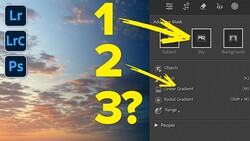
When a photographer drops a new element into a composite photograph, one of the biggest challenges is using shadows to create believable depth to the image. This video from Colin Smith at PhotoshopCAFE helps make that task easier by breaking down the process into four simple parts.
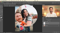
Using a couple of stock images, Smith shows viewers how the direction, quality, and quantity of light will all affect the look of the shadows in your image. While he concentrates adding the shadows themselves, it's important to note that if you are adding a new element to an image, it's critical to select images with matching (or at least similar) light sources. It's going to be nearly impossible to convincingly add a side-lit portrait of dad to a family photo taken outdoors at noon while the sun is shining straight down.
Once you have selected images with similar shadows, you can go about following Smith's tutorial for adding shadows to your new element.
Make sure to watch all the through the video for the fourth tip, because the blur added at the end is essential to creating a believable shadow. I hadn't used the field blur tool when adding shadows before seeing this video, and it's a handy trick to create a convincing composite.
What tricks are in your Photoshop toolbag for adding shadows to an image? Leave a comment below and share your best techniques.


Join the Fstoppers community for free
-
Post comments and join in the discussions
-
Browse the site ad-free
-
Share your work and get featured in the community
-
Compete in the photo contests for fun and prizes
11 Comments
Look at the stop sign. Any hard shadows going off and to the right? No. It's overcast. There are no shadows at all. The shadow he's creating looks impossible and wrong simply because it exists.
But look again. There are shadows under the car. They're extremely soft. He should have tried to emulate that.
really?
One of the worst article I've ever read on FS
Oh wow, I thought this was a joke. Please change the title of the article to, "How NOT to fake a shadow."
what the F is this? content on fstoppers should be kept at a certain standard, this should be far below it.
wow, that is just... garbage.
Wow, such a poor example. Surely stuff like this shouldn't even exist on FS?
Did you watch the video? I showed the correct placement and then explained that I was changing the shadow angle (to a non-correct angle - I said that in the video) so that the viewer could clearly see the "shadow fall off" technique. I'm trying to teach the STEPS of making the shadows, not trying to create a realistic composite, I clearly said that in the video. In hindsight I now know I should have just used a plain white background to demonstrate the technique, because people often judge "tutorial examples" as if they are "real art."
The purpose of a tutorial is that the result prove the value of the technique. It's not enough to show us HOW to do it; you have to show us why doing it WORKS. It was fine to point out that you were exaggerating for demo purposes, but I think most of us were expecting a demo of a realistic effect.
I get the point of this, I think more thought should have been taken in selecting the content from adobe stock. Perhaps a sunny scene and not a 7m Dino. Personally I’d have inserted a car or other elements that fit that stock scene.
I did watch the video in its entirety (FYI).
Posting an article like this ok, but if it’s going to end up on FS or any other pro community as it is you know you’re asking for it.
And I'm ok with it, just don't miss a good learning opportunity because you are nitpicking, I spent my prep time preparing a solid lesson that can be applied to any project. I know people prefer this over someone doing it perfectly, but unable to articulate how they did it or pass on the knowledge.
When you are teaching (really teaching, not mumbling) you are concentrating on talking at the same time, not over moving your mouse pointer, keeping the steps simple and clear, pacing, vocal cadence, keep consistence distance to the microphone, remembering to call out ALL steps, calling out MAC and PC shortcuts, .. etc. So hard to keep it simple and uncluttered. Not the environment for creating your masterpieces. (I have won numerous awards for my artwork, but that a whole different mindset). But I realize now, I should have taken more time with sample files, because people throw out the baby with the bathwater. Good learning experience. (Although on youtube (so far) this video has 5,000 views, over 200 likes and only 11 dislikes (94.9% like ratio), so I don't count that as a total flop ;))