Photoshop recently updated its hue/saturation adjustment tool, making it simpler and more intuitive to quickly modify colors in your images. Mastering color adjustment techniques can significantly improve your editing efficiency and image quality, offering precision control without complicated procedures.
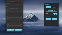
Coming to you from Aaron Nace with Phlearn, this helpful video explores Photoshop’s redesigned hue/saturation interface, highlighting how the updated color icons simplify the selection and manipulation of individual colors. Previously, you had to navigate drop-down menus to select colors, but now color icons allow quicker, visual selections, enhancing your workflow. Nace demonstrates practical shortcuts, such as using keyboard modifiers like Shift or Option/Alt to speed up or slow down slider movements, providing you with finer control over color adjustments. The video also covers useful reset options, letting you quickly revert settings to their default state, ensuring you can experiment freely without worrying about losing your starting point.
Additionally, the tutorial dives into two main ways to target specific colors. You can either directly click on a color icon or use the eyedropper tool to select exact colors from your image. Nace emphasizes how double-clicking a color icon brings up the color picker, enabling precise targeting. This method lets you isolate subtle hues within your image, such as adjusting only the pink areas without unintentionally affecting other red tones. The improved specificity of color selection makes subtle color corrections more manageable, saving you editing time and minimizing mistakes.
One standout feature explained is the "colorize" option, which uniformly applies a single hue across your entire image. While potentially useful for certain creative effects, Nace points out that it’s generally best combined with layer masks for localized adjustments, maintaining realism in your edits. The video also critiques the hand tool's limited functionality, currently restricted to adjusting saturation when dragging horizontally. Nace suggests it would be more practical if vertical dragging could simultaneously adjust hue, giving a quicker, more intuitive user experience.
Nace concludes by identifying additional improvements he'd like to see implemented, such as integrating eyedropper functionality directly into default color adjustments. He argues this would simplify the process further, allowing immediate color targeting without needing to switch tools or preselect a color. These enhancements would make Photoshop’s hue/saturation adjustments even more streamlined for everyday editing tasks. Check out the video above for the full rundown from Nace.


Join the Fstoppers community for free
-
Post comments and join in the discussions
-
Browse the site ad-free
-
Share your work and get featured in the community
-
Compete in the photo contests for fun and prizes
No comments yet