
We love Sports Illustrated Swimsuit Edition and we're going to guess by you clicking on this story that you feel the same. We've gathered up a few hilarious blasts-from-the-past covers and a few more recent covers and it got us thinking about how things have changed in swimsuit photography over the years.
From the discretion of the photos selected for the cover, to the lighting, and the editing- it's almost hard to believe that it's even the same magazine. Check out the ten covers below to see what we mean.
The first ever Sports Illustrated Swimsuit Edition from 1964.
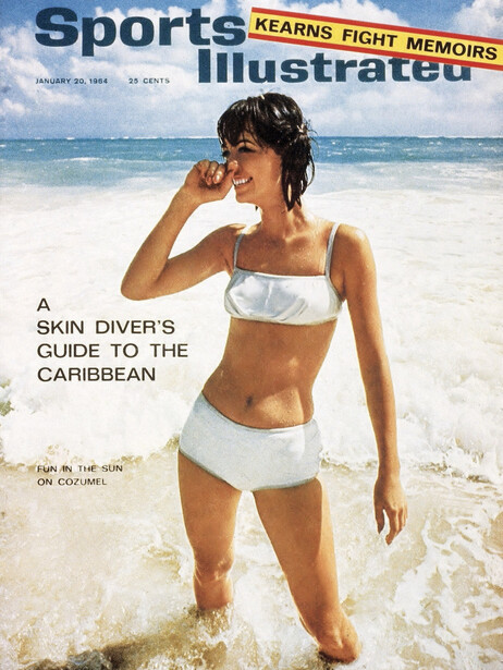
Holy metallic! We love the sunny, smiley snapshot-y elements of this picture. There's what seems to be no filter used and minimal editing.

Bleach blonde and a sunny beach - quintessential SI even before the graces of Christie Brinkley and Heidi Klum. I wish I could track down what camera this was taken on; I love the grainy and slightly overexposed combo.
Okay, brace yourselves for the following cover:
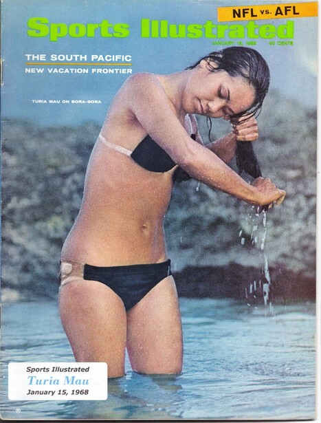
What? Is? This?
If this above photo left you confused, you aren't alone. I'm somewhat perplexed as to how this was ever selected as the cover photo. It's like an awkward paparazzi shot from People Magazine if People Magazine even did paparazzi shots in the 60s. The lighting isn't good and there's seemingly no editing as far as our eyes can see.
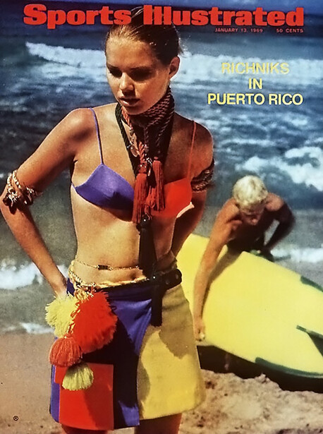
I find the above both bizarre and wonderful and I love it. The editing used in the kitsch-y backdrop looks very much its age- old school.
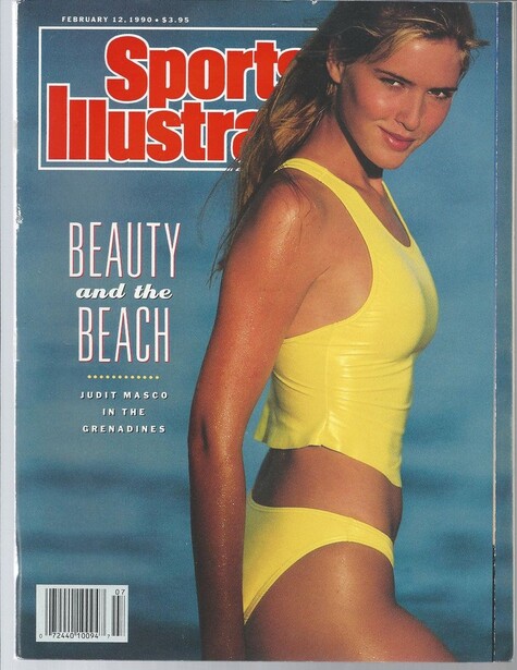
Alas, the first cover that is recognizable of today's magazine. There's strategic lighting and maybe even some prehistoric Photoshop used. What do you guys think?
Again, no more broad daylight unfiltered snaps. With the texture and glow of the picture, it has what seems to be a nice filter effect.

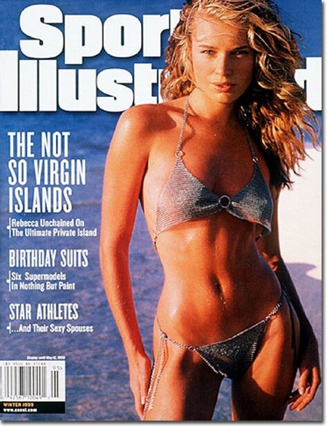
The first cover that has clear airbrushing, although done with a very natural effect.
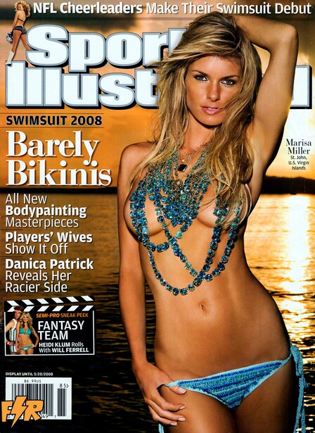
A night shot with strobe lighting and what we'd guess to be strategic ISO and very minimal editing.

Holy Photoshop! I really don't understand this and neither did Lee when this issue came out in 2012 (see his explanation of the editing breakdown here). There are just so many issues here; it's been Photoshopped into looking like plastic: the chin, the arm, the hair, I could go on.

Thankfully, the Photoshop has been taken down a notch (or 10) since the 2012 blunder, but I still feel like it's a little too edited for what I expect from SI. It looks mildly cartoon-esque to me, I much prefer the covers from the 90s and early 2000s for their dewy, natural feel to them.
What are your thoughts on the editing and the style of the covers? Do you like them more every year or do you prefer the less-fuss photos?


Join the Fstoppers community for free
-
Post comments and join in the discussions
-
Browse the site ad-free
-
Share your work and get featured in the community
-
Compete in the photo contests for fun and prizes
8 Comments
"Less is more" never was more appropriate, Wow 2012 is just ridiculous, 2015 still too plastic for my taste, too much manipulation, visible dodge and burn, would be a better pic if dialed back a notch and if there was more of the natural skin texture. Yamila's cover from I think around 2003 is very natural looking, probably shot on slide film, with very little editing done... I think the limit lies somewhere there.
Reminds me of a funny or die article: :
"I Got the Swimsuit Issue Cover By Making It Look Like I'm About to Show You My..."
http://www.funnyordie.com/articles/e5be71d5ac/i-got-the-swimsuit-issue-…
The older covers, to me, say "I look good in a bathing suit." The recent covers say "Don't I look good in a bathing suit?" I much prefer the former.
Well as a straight male and buyer of these I wouldn't even look at the overly edited skin lol. I think the important part in the editing is this type of image is the dodge/burn. I personally would love to see more realistic skin,not to sound like a slizzy or perverted, but honestly there are many other things that are distracting me from looking that far into it as a buyer, but as a photographer that is a completely different story of course but I and most other straight males don't buy these for the quality of skin editing.
If I were shooting/editing I'd make it to my own style as the primary guidance and then whatever is the "norm" for industry standards set by the publication such as SI's standards. Either what they tell you or what you studied from the swimsuit magazine versions. To me if its fairly random then I'd say go with what your style calls for in swimsuit photography, if not follow their guidelines, if they want plastic and they pay for plastic, you do plastic, if you want the job of course.
Since Jay Maisel did the first few swim suit issues, why not ask him what camera he used. Or better yet, an interview would be interesting.
"some prehistoric Photoshop" - good one ;)
When Photoshop is excessive to the point the woman doesn't look real, it is repulsive to me. I haven't bothered looking at swimsuit issues in years due to how unreal the women look. I wonder who makes the decisions to ruin what were probably excellent photos by overusing editing software. How can anyone think the results are better? These women are beautiful in their real skin. Let us see them as they are, with retouching only used only in the most conservative way, if used at all.
kind of a useless article except for the fact that you have Skip Frye one of the best surfboard shaper alive on the cover on the 1969 SI.