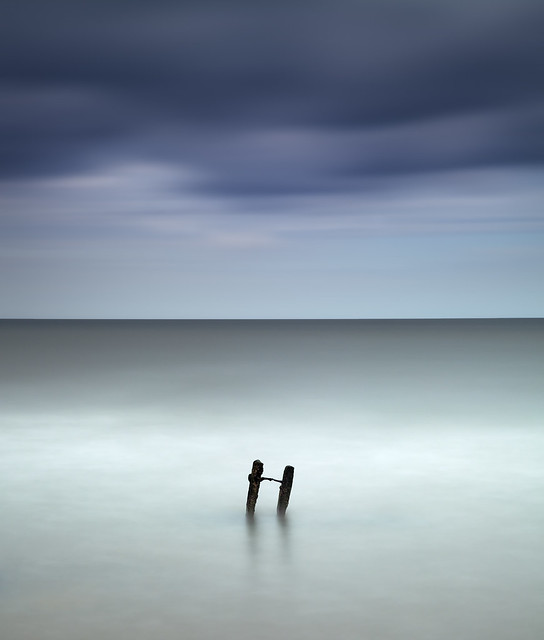
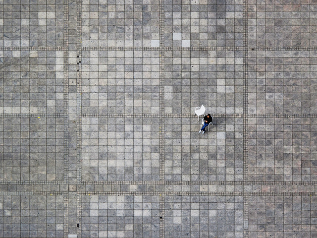
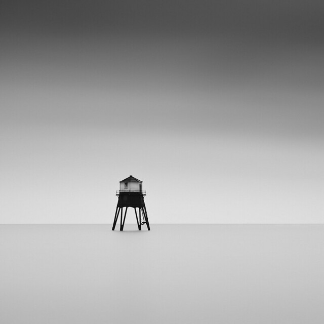
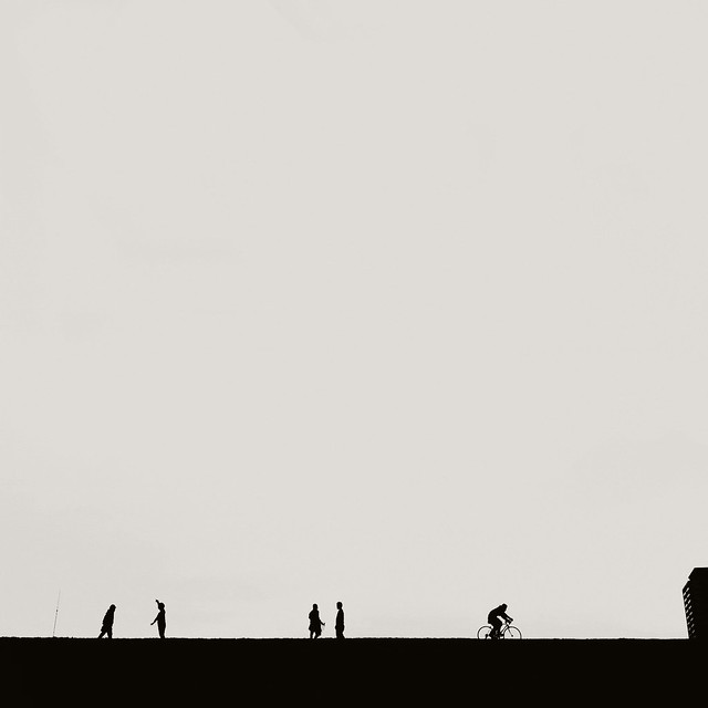
As photographers, we sometimes tend to make tight compositions and make the main subject in the photo take over a large area of the frame. We feel that if its important, we need to focus on it, make it apparent and zoom on it. Sometimes, zooming out or stepping back and making your main subject take only a tiny area of the frame, can do magic to your images. Check out these great images of minimalism found on Flickr.
If you ever took images that fall under that category, feel free to share them with us on our Facebook Group. Remember, sometimes less is more.

Photo: Dan Desroches.

Photo: Andy Brown.

Photo: Maria Strömvik.

Photo: Uschi.

Photo: Mingfong.

Photo: Hengki Koentjoro.

Photo: Jacopo Mortilla.

Photo: Gavin Dunbar.

Photo: Mutablend.

Photo: Srivatsan Sankaran.

Photo: Grant Hamilton.

Photo: Matthias.

Photo: Liam.

Photo: Radiohead.

Photo: David Frutos Egea.


Nice post, cool shots!
Great post!! KISS!
Lovely images. A sneaky one of my own to add in there: http://www.flickr.com/photos/osphotography/8345474844/
nice! I like it
I shot a whole series last year! I'll be very pleased if you check it out :)
http://www.flickr.com/photos/decadencevisuals/sets/72157632432163845/
You got there pretty nice photos, except the watermarks are destroying the whole image...
Thx for the feedback roman!! But I like them so ;)
PS: you pretty much "destroy" your photos too ;)
In many ways...;)
What I meant is that the photos are minimalistic and the watermark takes attention from the image.
Jokes now by side! You're quite right Roman! This actually brings out the classical photographer dilemma "To watermark or not to watermark" again. Sure in some cases it's distracting, but I chose to do it. It's the only way to protect my photos online, and besides it's a good marketing tool :)
PS: "online" it's not my final output (Consider it as just a catalog ;) ) My final prints are clean :)
How beautiful and simple! Amazing how much there is to see. Love the guy ice fishing in Mingfong's image. Nice work everyone.
I really like this style. These pictures are so calming...
Love it!!