We all want those stunning portraits, but what subtle errors are creeping into your shots and holding back your potential? Let’s see the five most common blunders in portrait photography and how to elevate your work instantly.
Martin Castein, a portrait and landscape photographer and highly knowledgeable tutor from London, highlights the mistakes beginners make in portrait photography, explains common pitfalls with real-life examples, and offers simple, actionable solutions.
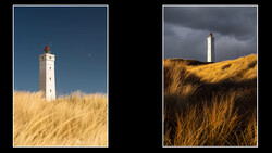
While the video discusses other important points, the one that resonated most with me is the idea that color choices can work against you. Martin highlights a common mistake made by photographers, especially beginners, who struggle to control the color palette in their shots. He notes that overly saturated elements, such as bright blue skies or lush green grass, can distract viewers and draw attention away from the human subject. To avoid this, he suggests using more neutral or desaturated colors in the environment and, just as importantly, advising subjects on their clothing choices. He also recommends steering clear of bold patterns and overly vivid colors, proposing instead that subjects wear solid or darker shades to reduce visual distractions. This method helps to keep the subject as the main focus, resulting in cleaner, more professional images.
Another important point the video highlights is how camera height influences perspective. Martin shows that simply shooting at your natural eye level can unintentionally make your subject look more vulnerable if you are tall and looking down, or more dominant if you are shorter and looking up. Changing your camera height is crucial for managing the psychological effect of the portrait, and in most cases, lowering the camera to the subject’s eye level offers the most natural and neutral perspective.
Tune in to the video to discover the remaining mistakes, including how to react to shifting light and the importance of camera height, and transform your portraiture with clear, expert advice.


Join the Fstoppers community for free
-
Post comments and join in the discussions
-
Browse the site ad-free
-
Share your work and get featured in the community
-
Compete in the photo contests for fun and prizes
1 Comment
The wrong one looks real, just needs a few adjustments, the right one looks AI fake, not what you want in a portrait. IMHO.