It's nice to have friends from far off places. Especially when they are talented, hard working photographers who have something interesting to share. Such is the case with Helsinki-based photographer Anders Lönnfeldt. Anders started out working in radio, TV and short films but these days his focus is on commercials, music videos, portrait and concert photography. In this post, Anders demonstrates how to knock out character rich portraits for a magazine spread with just a little bit of preparation, flexibility, creativity and luck.
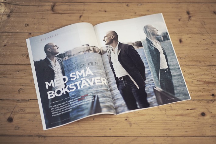
Location Scouting For a Portrait Series by Anders Lönnfeldt“About a year ago a friend, who is also a colleague of mine, recommended me for a portrait shoot that he didn't have time to do. The mission was to photograph one of Finland's biggest film producers for a film magazine. This was an opportunity I couldn’t say no to. I called the guy and asked if he could spare an hour for a photo shoot. I didn't want to ask for more of his time since I knew he is a busy man. Laughingly he said "I'm not that good looking that you would even want to photograph me for that long". We scheduled the photo shoot and agreed that I would meet him at his office and photograph nearby. Since the plan was to produce 5-6 great photos in the short amount of time of an hour, I wanted to plan the shoot in detail. This, so that I would know exactly what to do on location. I was lucky that there were great locations outside of his office and that the locations were so different from each other. I took photos of the locations with my smart phone as reference so I would remember what I had in mind for the shoot. Let me present the location shots and the result.
Portrait #1
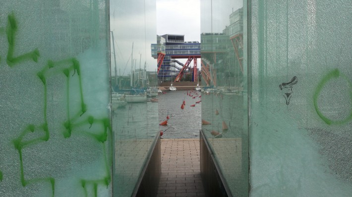
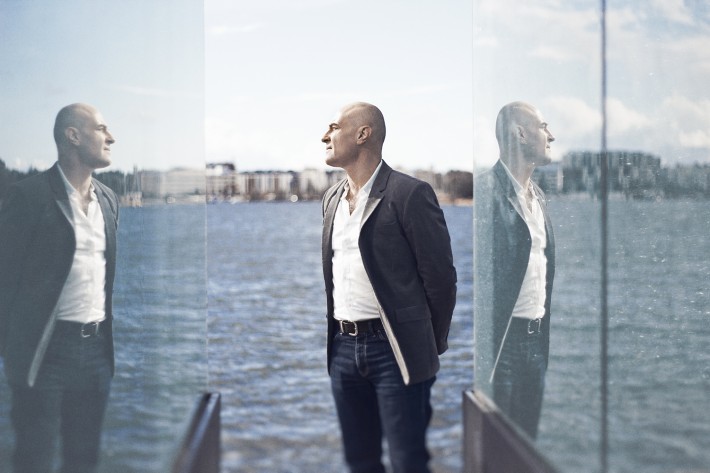
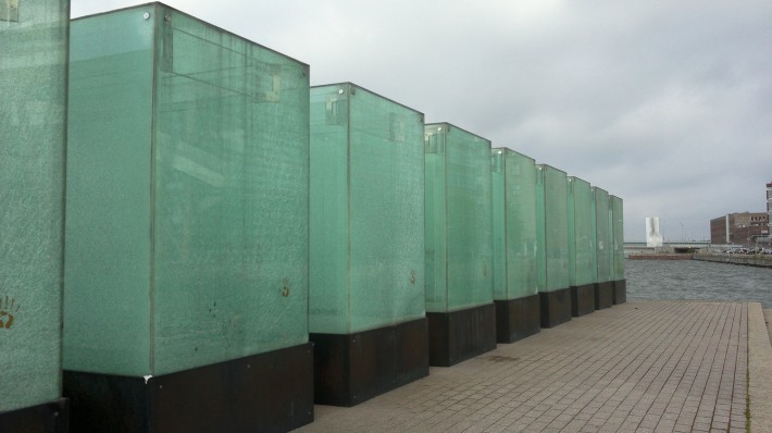
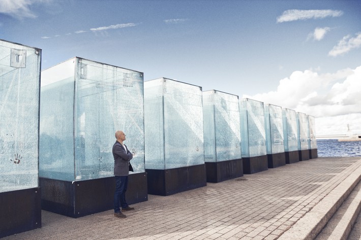
I found these really unique looking “glass boxes”, which I eagerly wanted to use as elements in some of the
portraits. I wanted to shoot in between the boxes to get some great depth to the photograph. I actually
ended up shooting from the opposite side, so I had the sea in the background instead of the building you
see in the reference picture. But I had no idea that I would get these awesome reflections in the glass boxes
on both sides of him. This is one reason why I like shooting on location instead of in studio; you never really know what you get, and the surprise can be totally rewarding. In my opinion, this turned out to be the best shot from the portrait series. And I feel it’s still one of the best portraits I’ve ever shot.
Portrait #2
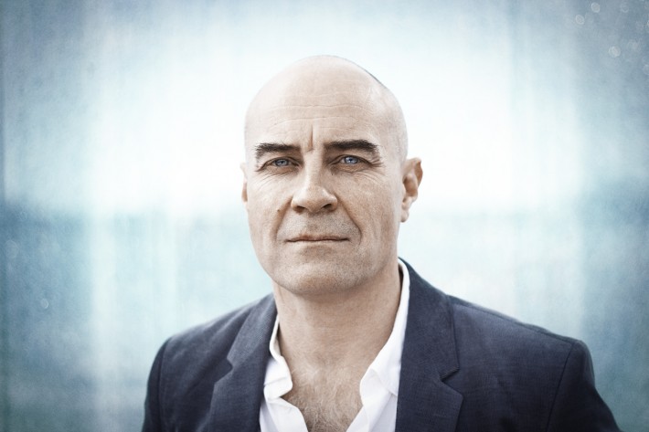
Every time I shoot a series of portraits I want to photograph the classic headshot. Even if I like creative
portraits I would say that the classic sometimes wins over the creative. Usually these headshots turn out to
be some of the best photos from the shoot. Here he is standing in front of one of the “glass boxes”. The
glass reflected the light nicely, giving him a soft and beautiful backlight which I really like.
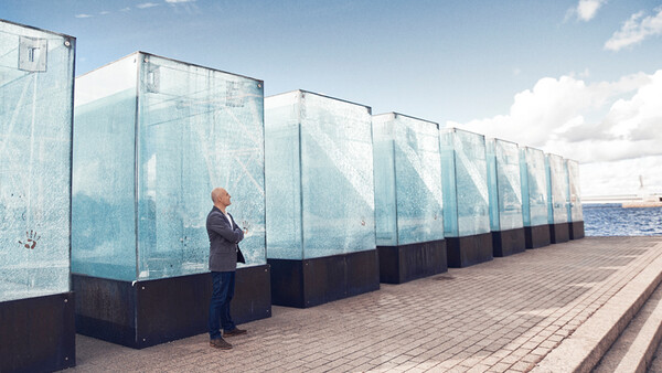
Portrait #3
Since the “glass boxes” looked so grand just on their own, I wanted to show their whole grandness and the
diagonals that they shaped from this point of view. As you can see from the photos above, I was lucky with
having some sunlight on the day of the shoot, resulting in some graphical shadows being thrown on the
ground in front of the boxes. These shadows add a bit of contrast to the photograph. Even if this
photograph doesn’t really count as a portrait in itself, I think it works great in a set of portraits. I usually want to see a wider shot of the person as well.
Portrait #4
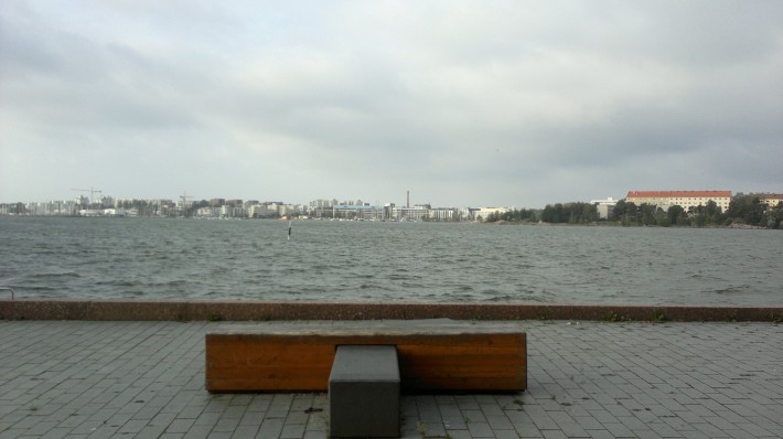
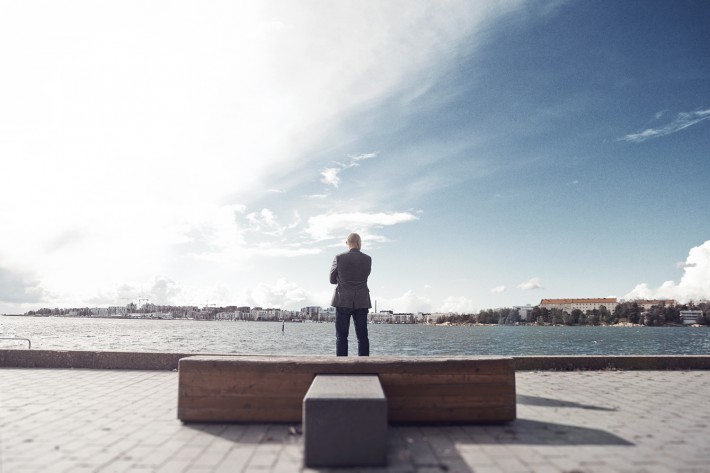
I found this interesting bench within a stone's throw from the “glass boxes”. I really like graphic
photography and when I saw this bench I instantly knew that it would look awesome to put it in the centre
of the photo and having him stand on the other side of the bench. The clouds in the sky added a bit of
drama to the photo which I was happy about.
Portrait #5
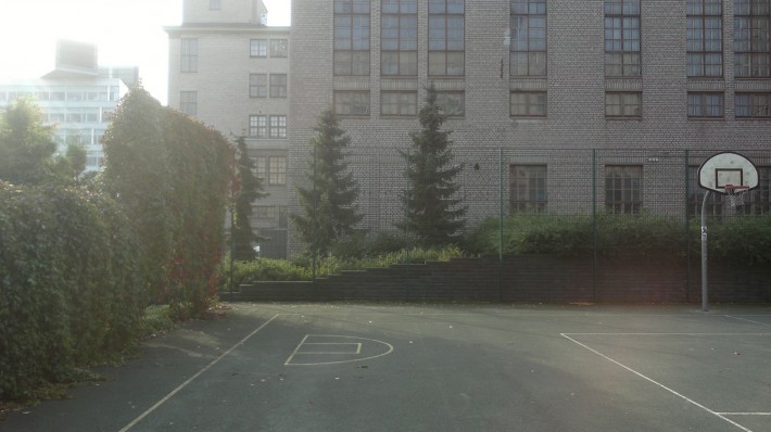
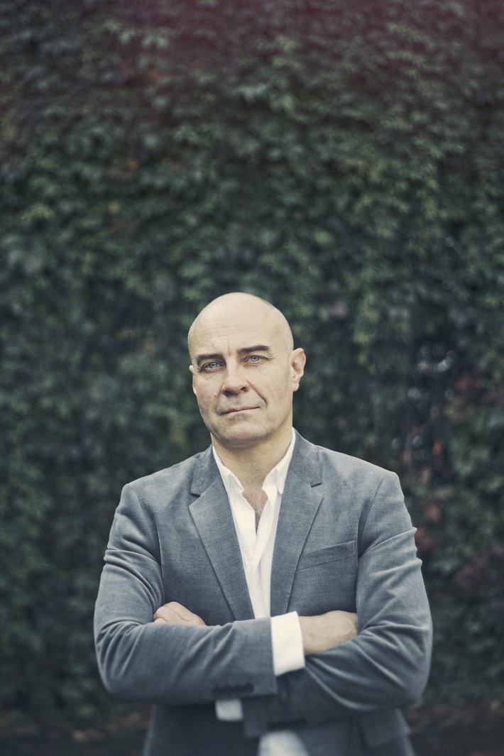
I found this location about 300 meters from the previous location. My plan was to have him standing in the middle of the basketball field. I also wanted to get the white lines on the ground of the field to build some kind of symmetry in the photo. I tried this out but it was impossible because the sunlight was too heavy on his face. I had to get him into the shadow and come up with a plan B quickly. So I simply had him standing in front of the hedge using it as a background. Quite a basic portrait, but it worked. Sometimes your idea looks better in your mind, but doesn’t work on location. This happened here. However, I’m still happy about the result.
Portrait #6
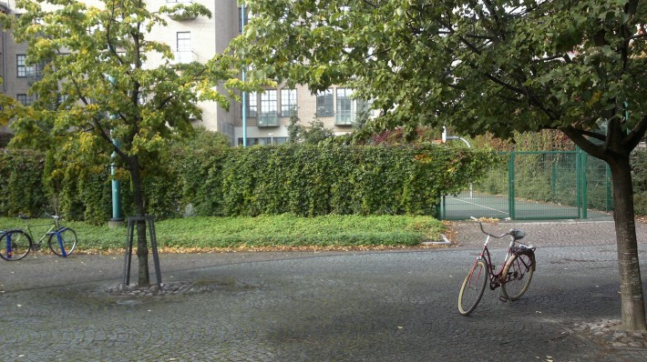
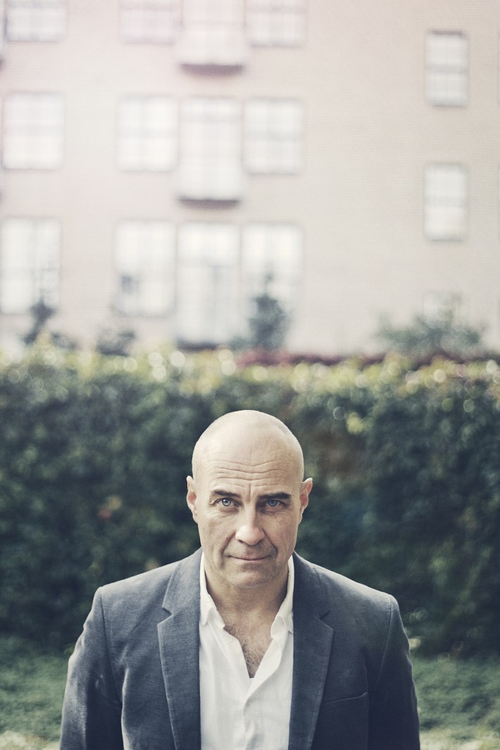
On the reference picture you can see the basketball field from the outside. You can also see my bike to the right. We call these bikes “mommocykel” in Finland, which means “granny bike”. They are without a doubt the best bikes in the world. However, this turned out to be a really great location. Even though it was a sunny day I managed to find some great shadow areas under the trees, which gave some nice soft light in the face. The background with its concrete wall and the green hedge also gave several layers of depth to the photo.
After this shot one hour had passed, which meant my time was up. Although I had a couple ideas more that I wished I would have had time for, I was happy and jumped on my “mommocykel” and went home to edit the photos. I managed to create a look that I was happy with, and the outcome was great. The photos also looked fabulous on print.”
Anders Lönnfeldt
Want to be friends with Anders Lönnfeldt? (Who doesn't!?) Then be sure to like him on his Facebook page. For those of you who are not looking to make new friends, no problem. To keep up with all his latest activities, just stalk him from a distance on Twitter (@AndersLonnfeldt).

Join the Fstoppers community for free
-
Post comments and join in the discussions
-
Browse the site ad-free
-
Share your work and get featured in the community
-
Compete in the photo contests for fun and prizes
25 Comments
What a fantastic write up of an excellent set of photos! One of the best articles on fstoppers for some time. Thank you.
Couldn't agree more. I love learning about other people's creative process.
The three shots around the "glass boxes" are freaking EPIC! Especially the one with the bench, I can imagine it as a huge print on the wall!
Awesome read. I just want to put this here though.
Agent 47. He's still alive.
Great article and images! My favorite is portrait #2. I loved the colors in this one and how his blue eyes match the color of the background
... cool, but there are some pretty bad horizon-problems. You should fix that.
I have the same gripe. I love straight lines, but the more i looked at his photos and other photos that are slightly off, I've realized that sort of thing is really subjective. And I actually think that maybe these portraits are even better for it.
i would have corrected it, but some really good photographers i've seen keep it in, i guess they feel it gives it more character.
different strokes for different folks I suppose.
I guess so. Haven't even thought about it.
haha :D
I'm so OCD about it, especially with the bench shot. but the more I starred at it, the more I loved it and came to love the way the walkway isn't perfectly straight.
Really great shots man! I love the tones, they create the perfect mood.
I didn't see your website in the artice, do you have one I could see more of your work at?
Interesting that we look at photos so differently:)
But thanks for your feedback. I'm glad you like what you see. You can find my porfolio here: http://www.anderslonnfeldt.com/
Enjoy:)
Great piece. Matt Turner said it best. Just an outstanding article. That one shot for the magazine layout was absolutely perfect.
Excellent article! I have a question: did you edit color of a glass box in portrait #3? Also, why is that same photo a bit warmer in the header of article?
Cheers,
Ilija
Thanks for asking! I did not edit the color of the glass boxes separately, but since I made a look for the photos it affected the glass boxes also.
But I have no idea why the photo in the header is a bit warmer :)
- Anders
I think it might be the way your browser handles color. The photos look pretty desaturated to me in Google Chrome until I use hover zoom.. they might not be saved in sRGB or for browsers w/o color management.
I don't think it's related to browser. My guess is that upload script messed it up. Here is a print screen comparison...
Just my guess because I dealt with that for a few weeks before I finally figured it out.
This is great. Thanks for sharing.
Great write up and fantastic photos. I especially like the ones with the glass boxes.
Love these shots!
Watching them I have a Rene Magritte feeling
Hi guys! Thanks a lot for your comments. I'm glad to hear that you enjoy the article.
Fint! :)
Tack:)
Portrait #3 does indeed count as a portrait; an environmental portrait. So well done, it's one of my favourite images in the series