Recently I was lucky enough to have a day off, something that doesn't happen too often. I woke up that morning feeling a little burnt out from the daily non-stop marathon that is living and working as a freelancer in New York City. I dragged myself out into the kitchen, made myself some bacon and eggs and sat down to eat. Over breakfast, I realized I hadn't made a picture for myself in almost a full year. It seemed crazy to me that as a professional in the photo industry, I couldn't even find one day to go out and photograph something that wasn't for a client.
I thought about what I could do to kickstart my creative flow, loosen up and try something different, and most importantly make a new picture. One that I wanted to make. I thought about how complicated a photo shoot can get between photographers, their clients, models, assistants, digital techs, lighting, sets, video, sound, and somehow wrangling each of these things so they all work smoothly together. I needed a vacation. I realized I had to go somewhere with a slower lifestyle that was nice and relaxing. Now, my number one goal was to keep what ever I was about to photograph very simple: including only my camera, myself and a subject. I grabbed my shoot pad, drew up a lighting diagram, and wrote out an equipment list:
 At this point, all I had to do was prep, test, and shoot!
I called B&H and picked up a few things that I needed like ScrimJims, Flat Black Fabric, and some extra A-Clamps. That's my prepping, done. Next I had to test what I thought up and make sure it worked the way I imagined. I had decided to go to Massachusetts, I have friends and family there. So, on my way out of the city, I picked up the equipment and headed north. When I got there I thought "what better test subject than Nana?" So I headed to her place and built my set. It took me about 10 minutes to set up, that's my keeping-it-simple goal achieved. I threw up two stands and clamps, attached the ScrimJims with flat black fabric to the clamps so they hung vertically. I used A-Clamps to attach one ScrimJim to the top to make a ceiling, and one at the back for the background. I folded the right and left side of the fabric in to leave an opening of about eight inches on either side, that created the edge light. Basically, I made a 42 inch cube that one could walk into and stand for a portrait.

Once I had a chance to edit and analyze what I liked and didn't like about these pictures of my Nana, I could figure out what I wanted to change or fix. I liked the light on her face, though I thought it could be a bit harder, same with the rim light. I loved the effect on her glasses, and the shape of the negative fill on the sides of her face. One thing I wasn't entirely thrilled with though, was the depth of field. I knew I'd be able to get a much more shallow depth of field with a medium format system than I could with my Nikon because of the sensor size. I called up a fellow photographer friend and it just so happened he had an extra Hasselblad that he was willing to let me borrow for the day!
I had a camera that would give me the depth of field I was looking for, I had a location arranged in a local city, and I had my "cube". All I had left to do was wait for a sunny day so I could get the harde light that I was looking for, and shoot.
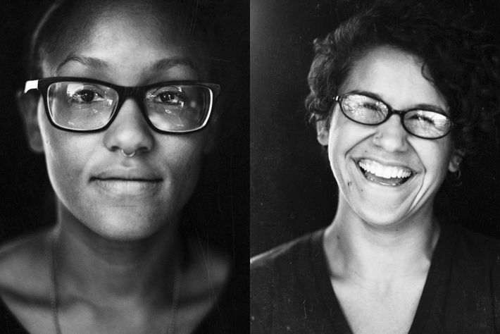
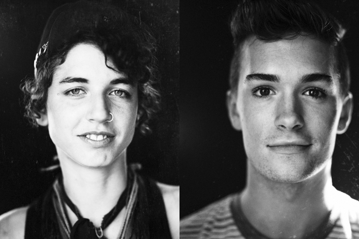
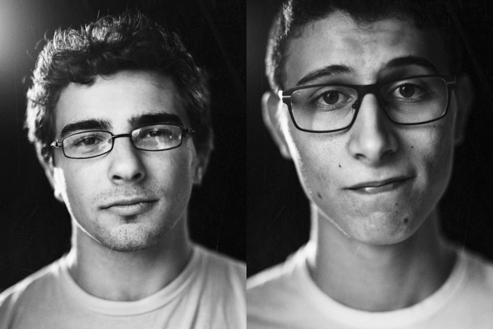
Here's what I got:

Aina & Irene

Stephen & Kaitlin

Patrick & Kate

Carlo

Dan & Danielle

Olivia & Audrey

Jesse & Eli

Olivia

Will & Kasai
As I mentioned at the beginning of this post, I was feeling burned out and uninspired. After finishing this project, I feel like my creative mind has been revived, and I am ready to dive head-first back into the industry. I think what is important for people to take away from my experience and this post is how simple it is for anyone to just take a step back and self-assess. See what they're doing in life, whether or not their content or happy, think about why they're doing what they are. Especially for artists, I think it's critical to come to a realization and make time to step away and practice your art, for you. Because lets be honest, most of us didn't decide to become artists for the money, we did it because we love it and we feel compelled to do it. When we don't have a chance to feed our souls with what we love, our art and work becomes monotonous and unfulfilling and no one wants that.
You can find more of my current work on my website, and keep up to date with me and my new work by following me on Twitter and Instagram.


nice work! the projects we do for ourselves always turn out best imo
Thanks Sam!
Great work. Did you just ask people on the street to pose for you? Do you have any photos of your setup?
That's exactly what I did. I set up on the side walk and asked everyone that walked by. At the time I didn't think to photograph the set, but I'm planning on going out on the streets on NYC soon. I'll be sure to photograph my set then! Follow me on Instagram, I'll post it there!
Great idea, simplicity is key, love it. On the little drawing of the diagram, i see the "cube" and another sheet of something. Is this glass you shot through to give this rough marked effect ? or a reflector ? or finally nothing used in the shoot ?
Thank you! Sorry if the diagram was confusing, the bit that looks like glass is just a side-view of the set. The gritty feel was achieved after the shoot through a process of printing, marking the prints and scanning at a high resolution. I didn't use any reflectors, just north light. I only had that "cube" and a camera, thats it!
Thanks for the answer Justin, wasn't confusing, just didn't get it :) much clearer now, and it was simply inspiring. Appreciate your time :)
Why didn't you switch lens for a shallow DOF vs. jumping up to a 17 grand camera
The Portraits of my Nana were shot on my Nikon D800 with a Zeiss 100mm Makro at f/2, that lens has a very shallow depth of field, but you can clearly see the difference between that and the ones shot on the Hasselblad. The reason why there's such a difference is the size of the sensor, the larger the sensor, the more shallow depth of field one can achieve. That's why for this project, medium format was the best choice for the effect I was looking for.
What about doing a close up bokeh panorama in place of getting a hasselblad (which most of us wouldn't have access to)?
I suppose you could try something like that in post, but in my opinion if it can be done in camera, you should do it there. I do understand that most people won't have access to a medium format system, but its just what worked for me and it gave me the look I was going for, that coupled with the right lens choice). I'd be interested to see how your technique turns out, if you try it, feel free to email me! (email is on my website).
Think about how inspired you'd be if you had more days off......
The portraits look amazing my friend!!
Thank you!
Hi Justin, when you say "marking the prints" what do you mean? I really like the PP on these.
I used things like the metal bit that holds in an eraser on a pencil (without the eraser) to scratch up the surface, and sandpaper ranging from fine to heavy grit to add wear and tear to the print. Once I got the effect I liked, I scanned the print and fixed any mistakes I may have made in Photoshop.
great work indeed and thanks for sharing !!! Do you remember apertures you used (especially with Dan)? Outstanding bokeh and expressions! Do you really compose that tight or do you crop at PP?
Thank you. I used the same aperture and lens/extension tube for everyone. It was a Hasselblad 100mm at f/2.0 with the 1.2x Teleconverter (I believe). The teleconverter allowed me to get that extra shallow depth of field. I do almost always compose and 'crop' in camera because when you crop into an image, you'll loose the effect of the lens that you chose. On these images, if I had shot from farther away and cropped in, the depth of field would not have appeared to be as shallow. As you get farther away from your subject, your depth of field will inherently and exponentially increase whether or not you change your aperture. It's a very technical thing, and I'm sure if you research it someone can describe it much better than I can!
thanks a lot! i estimated that you did not shoot wide open, i was wrong... very good info, thanks again.... looking for more from you!
This is lovely! Now I'm not that advanced yet, but I think I'd be able to get this shallow with my 50mm F/1.2 wide open on a full sensor...am I totally off?
i think you will get this shallow, but not the same blur character.... compare for example 50 2.0 and 100 2.0 having the same composition, you will get same DOF, but different blur character...my 2 cents...
Very well put, accurate assessment, Zenza, thank you.
Great portraits! I love the creativity of the cube and your finished images. Great work Justin.
i lover this and wanted to do something similar in concept but the laws here are iffy. i was under the impression in nyc one could not set up lik you did without the a permit. did you need to get one? any info on that would be great! :)
So legally, in NYC you cannot place anything on the ground without a permit not even a tripod, technically. But luckily (last time I knew anyway) permits for shooting in NYC are free! All you have to do is call city hall and tell them what you're doing and the date, time, and location and they will issue you a permit. I shot in a small town in Western Massachusetts and actually had the police coming by just for fun and because they were curious about what I was doing! They did not require a permit, haha. Good luck!
I just gotta say... these are stunning portraits, Justin. Do you have a photo of the setup you did with ScrimJims, Flat Black Fabric, and A-Clamps? It's a little difficult to picture just by reading. I'm excited to check out all of your work, man.
...very easy going and nice xx