
Studio photographers are often admired for their lighting skills, and for good reason. Creating compelling portrait lighting is not only extremely difficult, but requires lighting gear, backdrops, and a shooting space. Editing can play either a small or large role in the final image. Have you ever wondered how much of what you see was created in camera, as opposed to in the editing room? In this article, I will show you some before and after images from my own studio work and lift the veil on my editing process.
As a portrait photographer, I love to gain knowledge and improve my lighting skills. I have studied with many photographers I admire, in order to grow in my knowledge of lighting in an attempt to find my own personal voice as a visual artist. I often experiment, holding late night studio sessions with photographer friends where we explore different lights, modifiers, and even replicate lighting from some of our favorite portrait artists.
I mention this to lay the groundwork for this article and dispel any misconceptions, because there is no substitute for understanding how to manipulate light in the studio. There is no shortcut past the fundamentals, and as great as technology is today, you still can’t fix bad lighting in post-production. This means that my primary concern is to create an image in camera that has the raw materials I need for the editing room.
Another concern for me is the kind of image I am attempting to create and the purpose it will serve. When I create a head-and-shoulders headshot, generally I keep it clean and simple, avoiding a post-processed look. Therefore, the headshots I create are 95% finished in camera. This is especially true with business clients who are looking for a headshot to use on social media that represents them on their best day. I save the drama for my portrait work, and offer this in addition to clean and simple headshots.
So, just how much editing is done in post? For me, it varies depending on the capture, subject, and goal. There is no “one size fits all” approach, although most of my portraits are color graded and employ dramatic shadows with a varying degree of intensity. Let's examine some before and after images and discuss the process I used to create the final result.
Take this image of Lee. It’s easy to see that I’ve not changed the lighting in any major way from the original capture. The most notable difference between the two images is that I’ve color graded the final photo and moved away from the warmer tones in the original capture. One common technique I use is to paint in shadows just a bit using curves layers. This adds a touch of drama while preserving the original image. If you look closely, you may notice that I have darkened his hands just a touch as well, in order to help draw the eyes to the face, which is the focus of my portrait work.


Now, let’s go on to something that required a bit more post-production. In the image of Tarik below, the most noticeable difference, as with the image of Lee, is the use of color grading. The original image was also underexposed, which I sometimes do purposely, since it’s much easier to pull detail from the shadows in post. In this case, I was a bit more under than I would have liked, but I still had room to up the basic exposure before I began editing. The other difference here is that the overall drama of the lighting has been enhanced in post. Look at the shadows on the camera left side of his nose, for instance. The edit is quite a bit darker than the original. The same can be said of the highlights on his camera-right cheek. There is a much more distinct pop in the highlights than on the original. This was accomplished not only by simply raising the exposure, but as before, but utilizing a number of curves layers and painting in the shadows and highlights. I also added some textured layers to aid in color grading and the overall look I wanted. As with the first image, the bulk of the lighting work was done in my studio and not in post.


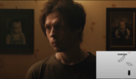
In the next image of my son, I used the same basic editing technique as I did for the two previous images, although this time, I added a lighting effect in post. After color grading the image, I painted in the shadows and highlights, as before, except with a heavier hand. This is most noticeable in his camera left cheek, which is considerably darker than in the original image. Next, the background vignette was painted in using another curves layer, in order to give the illusion that I had a background light hitting the canvas. Finally, I increased the contrast and crushed the darks and lights just a bit using the Levels slider to give the image the extra pop it needed to match his expression.


In the next image of Katherine, in addition to the techniques I already discussed, I have also retouched her skin. Personally, I prefer the “less is more” approach to retouching, although almost every image that leaves my studio is retouched to some degree or another. Sometimes, that means removing a single blemish or stray hair, but it depends on the person’s skin and the context of the image. I will not rehash what I already explained, since it should be clear at this point that the editing style was done in almost the same way as the previous images. I will add that here, as I often do, the image is cropped in from a 4x6 format to a 4x5. Although I realize I can set my camera to photograph in 4x5, I prefer the wider format for a variety of reasons. There are times where I feel the composition calls for a 4x6 crop in order to convey the message properly. In a practical sense, I also like having a bit of wiggle room in my images for cropping, since more often than not I will prefer to crop in, as I did here. Regarding our topic of lighting, another thing I like to do is paint in some light in the eyes and around the eyes. This not only brightens the eyes, but can help remove dark shadows from under them. Keep in mind that I used a very light touch for that, since it's very easy to overdo it.


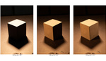
Next, let’s talk about the image of John below. It was created as an exploration of Dan Winters’ style, and although I did my best to replicate the lighting in my studio, I also relied on editing to bring the image to life and dial in the hard shadows, as well as the vignette. Unlike the previous images, the editing plays a more crucial role in the final result. The unedited image consisted of a key light, fill light, flag, and background light, which can all be seen in the unedited version. In post, however, I greatly enhanced the hard shadow on the camera right side of the subject’s face, and also brightened the background light to enhance circular glow. I also crushed the blacks and popped the highlights, although the overall feel of the image is still muted. The main thing to take note of here is that the importance of post-processing is now more integral to the final image. In the previous examples, the editing played a smaller role in creating the actual shadow density and light shape. Even so, I still did my best to remain faithful to the original lighting, without adding or creating completely new shadows or highlights that were not in some way already present in the raw file.


The final image I want to discuss also represents the most aggressive editing. Unlike the previous images, this one was created primarily in Affinity Photo during as an experiment in editing. The original image employed the standard Peter Hurley key-fill-kick lighting method, which is still apparent in the edit. I used a multiple texture layers, however, to give the image a gritty look, as well as curves layers to paint in the darks and lights. I also added the vignette and punched up the contrast detail to further the grainy texture and rawness of the image. As with the rest of the images, I added a color graded curve as well. In general, I rarely go this heavy in the edit room, but this image can serve as an example as to what you can do with a skillful hand in post. As with every image in this article, however, the original lighting is left largely unchanged.


Conclusion
Although some photographers use post-processing to create the bulk of their “look,” I have found that most of the photographers I am drawn to use editing as a way to enhance, rather than create, their vision. Instead of relying on a “fix it in post” mentality, they get the exposure, lighting, and final style very close in camera and use editing to polish what is already an excellent capture. I will also add that if you shoot tethered as I do, it's important to show your clients an accurate rendition of what the final image will look like. When my clients see the images pop up on my screen, it inspires them and helps to create positive energy during their session. It also affects your bottom line as a photographer. I am not, however, against using post-processing extensively, as I trust this essay has made clear. I hope that this glimpse into my editing process has been insightful, and as always, I would love to hear from you in the comments section.


There was a lot of burning and dodging in the darkroom...I sure did not like darkroom work lol, this is a heckuvalot easier!
Yep, but the principles are basically the same. I actually miss dodging and burning in the darkroom. It was very satisfying to see the image appear and also very stress relieving for me. Those were good times!
Let's just agree to disagree about darkrooms :)
I might come off a little hard here, but if those aftershots are your idea of shoving how little post processing you have done to the original image, might I suggest you drop the instagram filters before posting them so we can actually see the LR effect on the original picture? 95% done in camera and a 110% in LR.
I can understand photographers are afraid of the new AI software coming out, and if these pictures are your idea of a good portrait, you should be, course that is the kind a picture I expect AI will drop a ton of in the future.
But then, we might see photographers start making natural looking portraits to differentiate themself from the AI. We can only hope.
Yes, I think your before pictures are way better portraits than your overdone instagram portfolio digital art aftershots.
Don't take it personal as I can see you know your craft. It is just an attack on the overdone preset-adjusted shit Instagram style that has creeped into modern day photography. I hope it dies a slow and painful death.
I'm not sure how to respond to your comment. "Don't take it personal," you say, but then you go ahead and call my photos "overdone preset-adjusted shit Instagram style." Sounds kind of personal, no? LOL
But you are, of course, entitled to your opinion. I have noticed that you have no photos on your own profile, nor a website, which is fine. But I think it's easy to criticize others when you have no skin in the game. Personally, I would not call any other photographer's work "overdone preset-adjusted shit," even if that's what I thought of it, but that's just me.
I think you take beautiful portraits, but I also think you are a product of your time. You have a business to run and must deliver what the client asks, and the clients ask for what is up in time. Also, you see what other portrait photographers creates and whether you want to or not, you get affected and influenced by it.
What is up in time, is what I call "overdone preset-adjusted shit Instagram style" pictures. It is a style that look good on a webpage or on Instagram, but it does not look natural. Over-contrasty, over-saturated presets with fake colors, which makes pictures look more like paintings than photographs. That is the style I would like to see die out.
If it did, and if your clientele began to ask you to make their portrait in another style, you would do it, course that is what keep your business alive. Therefore, I do not attack you personally but the style you have to use, because that is what sell pictures today.
No, I don't have a business to run so there are no need for me to advertise myself on the internet. I also have made a deliberate decision that I do not need to upload pictures to the internet, either for personal gain nor anyone else's gain.
I might have uploaded one or two in different forum threads from time to time, but that's it.
I am not afraid to tell the truth as I see it. People are ofcourse entitled to disagree with me, but I will rather be frank, then lie to them.
Peace bro.
I always think of this video when I see comments like this. https://youtu.be/FYNjKxv1Akk?t=109
Sums it up perfectly.
For the sake of anyone who might think there is any truth in the above comment, let me set the record straight.
No, I did not develop a style based on what I thought my clients wanted. In fact, it's exactly the opposite. I was inspired by other photographers, mentored with them, and then developed a style that spoke to ME artistically and emotionally, without trying to please a specific person. In fact, I'm still growing and experimenting to develop my skills.
After doing this, clients began to find me and ask for the work I was creating. So, you are completely wrong on that point, and this is terrible advice for any photographer reading your comment who wants to create a successful brand. Your advice will guarantee failure and promote mediocrity. It's clearly not based on experience or any expertise.
If I were to change, or try to create a style based on what I thought people wanted, I would be a huge failure. Again, this is the opposite of what anyone who is successful in the arts and photography has done.
Do you think the best wedding photographers go around polling clients as to what their images should look like? Or do their potential clients instead see their work and then book them based on what the photographer is already creating? That is actually how this works in the real world.
Everyone is entitled to an opinion. But some opinions are based on experience and a track record of success. Some opinions are based on ignorance, bitterness, jealousy, or whatever else. When we read comments on forums, it's important to look at where it comes from and judge accordingly. This is why I would never call someone's work "shit," because I have actually put the work in myself and can appreciate how hard it is to do this. This is also why people should be able to check out a few of your portraits before you call someone's work Instagram filter shit. Context is key.
Peace bro.
What lighting are you using? led or flash?
Hey Andrew, I use both LED and flash. Some of these photos were a mix of both.
Thought there was some LED lighting. They always look like they need more work to fix
I use a Westcott Flex Kit and Nanlite and absolutely love both. I definitely don't feel like they need more work in post then using flash but I guess that depends on the individual and how you work.
For me it’s all about skin tones. I know that there can be a difference between screen skin tones and the printed skin tones. It took me a while and recalibrating to get both the same. The “after” images look a lot like adjustments made to look good with printing in mind.
The author has a specific look in mind.I would personally add more warmth to the skin tones even if that really is exactly how the subject looked.
My modelling lights are too warm in tone but the actual strobes are much more balanced. So much depends on the photographer’s personal judgements. What sort of a lighting look are they really looking for? Why?
I was expecting to see more on the way adjustments to shadows are used, vignettes and highlights.
My aim in the studio is different. At the moment I am aiming to convey depth using enough shadow and dark background.
Hi Martin, I definitely prefer cooler tones in my portrait work as a general rule, but it's completely a matter of preference. I like creating color graded portraits because I also offer my clients headshots that are not graded and have realistic skin tones and such. A dramatic portrait makes a nice contrast to a headshot that is more standard in color and tones.
I generally don't add vignettes or highlights. The portrait of my son is an exception. I like to get the lighting more-or-less where I like it in camera and then just tweak it from there in post.
Thanks. Lighting, I have discovered is a fascinating craft in its own right. Your images definitely have impact. The images remind me very much of the sort of tones that Chris Knight is aiming for in his book: The Dramatic Portrait.