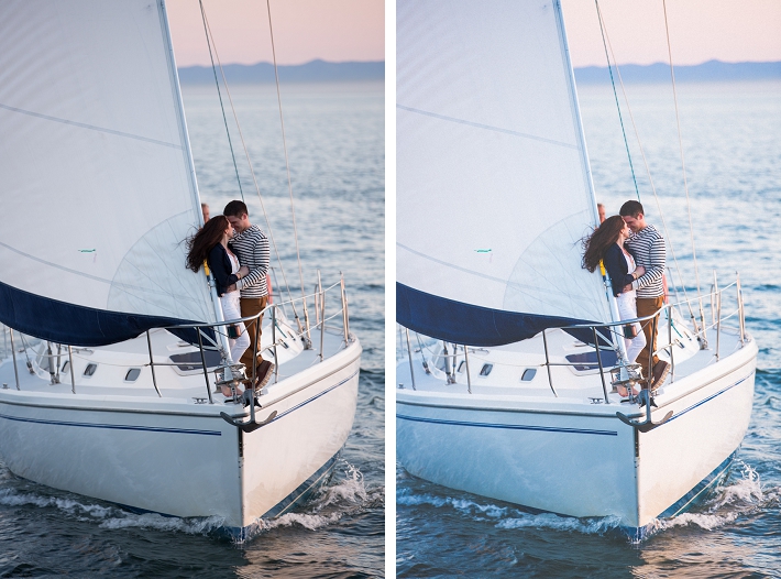
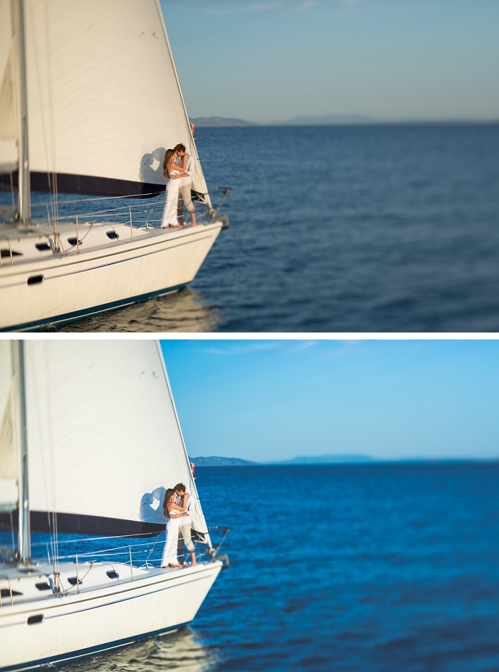
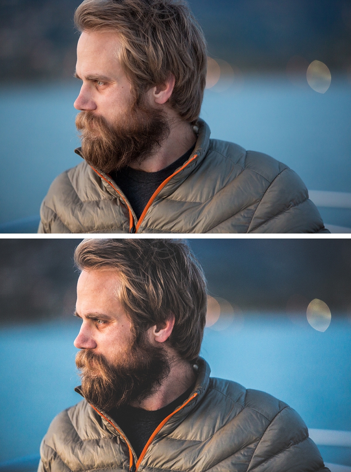
While in Las Vegas attending the annual WPPI conference I stopped in and spent some time at the print competition. There I repeatedly noticed that many of the prints had a matte type of look to them. Now part of this is the choice of paper they print on, but also how the photos is processed plays a big part as well. I created this quick video to share with you how this look is achieved very easily in Lightroom. I have also included some sample before and after photos below.
The look is basically achieved by using the tone curve in Lightroom. Previously this was only possible in Photoshop but with Lightroom 3 or 4 you are now able to pull it off right inside the program. In addition to being popular on color photos it also looks great on black and whites. Here are some samples showing the before and after of the matte look shown in the video. Let me know if you enjoy the tip and if so I'll continue creating these short video tutorials on ways to use Lightroom you might not have thought of before.
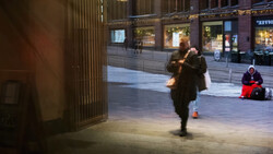
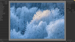
Here are some before and after samples showing how the matte look changes up the photos.


Here are some previous videos tips I recently posted here in Fstoppers:
Video Showing One of Lightroom's Most Under Utilized Tools
How to Easily Time Sync Your Files in Lightroom
Thanks for watching.


Join the Fstoppers community for free
-
Post comments and join in the discussions
-
Browse the site ad-free
-
Share your work and get featured in the community
-
Compete in the photo contests for fun and prizes
70 Comments
Very nice trick Trevor. I use this to white balance my sequence in Premiere, didn't know I could also do it in LR.
Brialliant tutorial, I've noticed this look a lot and I always wondered how they did it. Thanks!
Nice little tutorial, but it's actually lifting the blacks, not crushing them. I'd love to see more of these types of videos.
Hi Joe, you are absolutely right. My mistake there.
A fad for a particular pp curve or significant amount of fill-light (the equivalent effect in ACR) or otherwise causing a lifted misplaced black-point is just a fad. As for what happened to the blue channels in several of the sample image-pairs, that's a disaster.
We've been doing battle with this since the days of the Zone System and black&white prints on paper of various contrast grades, all of which is about the process of tone-placement to determine the initial exposure and the mapping from the scene with its relative contrasts between subjects (e.g. areas of sky to people's trousers) to the sensor's response curve to a final lower-contrast output medium. There's an illustration of this multi-stage curve-mapping, using greyscale strips, in Langford _Basic Photography_.
Awesome video! Exactly what I was looking for. Thanks!!
Do you guys have am equivalent for Aperture?
I cannot thank you enough for posting this. Amazing images by the way.
I always thought this look was to imitate printed paper for the web. (and those with poor, uncalibrated screens) I'm not sure how well this will appear on actual printed paper. And isn't "crushing blacks" the exact opposite of what is going on here? This is raising the blacks. Crushing the blacks would be more high-contrast "Tony Scott: Domino" style.
Thanks for sharing. Had no idea it was this simple. Have also been trying to emulate the Jose Villa (Fujifilm Pro400H) look on digital. Would love to see a tutorial on that as well.
Awesome. thanks
This was so insanely helpful for me! Thank you!!!!!
Thank you so much! I've been playing around with it so much but havent been able to figure it out. I ended up buying presets from VSCO (which are amazing!), and this would have saved me money...
Thank you so much for this! I've noticed it in a lot of food photography and was wondering how I might achieve the same thing -- but with Lightroom, not Photoshop. Perfect. Much appreciated.
YOU ARE MY HERO THANK YOU A MILLION TIMES!!! I got this look in Photoshop CS6 and could not figure out how to get it in Lightroom so THANK YOU!!!!
Thanks for taking the time to explain this. Really helped me get to grips with the tone curve. Plus, I like fooling around with effects like this!
Nice tips. But did you know about new film-simulating presets for Lightroom from reallyniceimages.com? They have something very similar in their 'Faded Films' presets collection.
Super helpful!! Thank you so much.
I just wanted to say this video has helped me find a style of editing that I think fits my photos perfectly. Thank you so much, Trevor! Great video and amazing shots!
Yes! Thank you- super helpful!