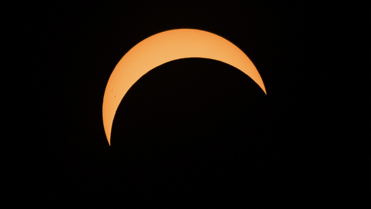
You might have heard that there was recently a solar eclipse across the United States. The event captivated much of the country, and this very neat data visualization shows just how that happened.
Coming to you from Imgur user moonrayswrong, this data visualization shows you how the #eclipse hashtag trended on Instagram during the hours it moved over the United states. The radius of each hexagon indicates (on a logarithmic scale) the total sharing of #eclipse at that time, while the redness of a hexagon indicates how much that deviates above the average sharing for that time or in other words, how much extra sharing the eclipse inspired (this is why New York has a large hexagon, but being away from totality, isn't red). As expected, you'll notice most red hexagons following the path of totality.
http://imgur.com/gallery/7fdV4
Here's a static image that shows #eclipse Instagram volume vs. average volume for the preceding three weeks, making the path of totality especially clear:
http://imgur.com/gallery/wrZet
I'm probably a bit biased, being a math geek and all, but I think it's really neat to watch the interaction of science and culture. I definitely did my part in sharing about the eclipse. If you did, share your shots in the comments!


wow, that is so cool.
On our way back from the eclipse, having quite some time to kill while being stuck in traffic, we noticed that you could see the path of the eclipse by just watching at the traffic on google maps. It was red all over the area of totality and quite accurate for the first hour or so...
That's super cool!!
We headed down to Eddyville KY and watched the eclipse. I was able to get a couple shots in with a homemade filter.