There is a trend growing in the photography world. The trend is to accompany photographs with explanatory text. I am not convinced this is a good thing. What do you think?
For a long time, I was a huge believer in the idea that an image must, for better or for worse, stand on its own two feet. No explanation needed. If one felt obligated to "explain" their image, I was inclined to feel as though the photograph was lacking in some way — something required compensation and, more often than not, that compensation came in the form of text. I have seen more and more of this from publishers big and small - photography monographs with just as many words as images. The question remains: Do photographs need an explanation? As I said, for a long time I would have said no, they do not. But, I think, my opinion may be shifting.
Everyone in the photography world, it seems, is flailing to stay afloat. The world is inundated with images. We see so many images in a day that it is nearly impossible for even the best photographers to stand apart from the crowd. In an effort to do so, more and more photographers are turning into wordsmiths. If I cannot win you over with a mere visual, allow me to "seal" the deal with a carefully worded textual accompaniment, kind of like adding a backup singer. Now, don't get me wrong, this kind of "artist statement" thing has been around for a long time. Yet, the intensity with which it is applied seems to have increased, exponentially, in the past year or two. Three new monographs come immediately to mind: Sally Davies' New Yorkers, Rebecca Norris Webb's Night Calls, and Taxi by Joesph Rodriguez. All three use text in different ways, but all three present in a way as if to say that words were, in fact, required.
So, why do I feel some text may be valuable? Well, with all three of the above books, I hesitated in my reviews (I have formally reviewed all of the books for various media). I wanted to claim that the text was unneeded and, actually, detrimental. However, I could not easily make such a claim. In all three cases, the words grew on me. They did, indeed, add "something" to the mix that may have, actually, made the photographs stand out in a visually choked existence. In a kind of "experiment," I decided to write this piece, an essay of sorts, where I will attempt to "explain" a dozen of my more known photographs. You tell me, do the words, the explanations, add anything of value to your experience? Honestly, I want to know. So, Let's begin.
This first image, titled "The Finger," is a photograph I captured after pursuing my subject for nearly two blocks. There was something about the man's bent shape that captured my attention. I followed. I made several images, but none of the photographs were wholly compelling. Then, at last, he shifted his hand to his back and raised that one lone finger. It was magic, I shot, quickly, and the image was made. I knew immediately that I had struck gold.

The Finger (c) Michael Ernest Sweet
Next, we have a photograph that I "coaxed" into existence. I love Coney Island, as have so many photographers before me. The beach at Coney Island is a special place, unlike any other place I've ever been. It is a beach beyond its time — a rough and troubled place with hardened and "expired" people. This man was sunning himself, working on his very own leather hide, when I spotted his potential. His skin was like saddle leather. I knew I had to make his photograph. I walked up to him, hovering over him with my 28mm Ricoh GR in hand, and asked him for directions to the restroom. He stretched out to point the direction and "snap," I had my image. Immortalized in ones and zeros, this man's tanned hide was now my photograph. Was it moral? Does it matter? Do you care? Do you need or want this explanation, or would you have been better satisfied by the image alone? Ah, to be or not to be: that is the question. Whether 'tis nobler in the mind to... add text or not to add text.

Like Leather (c) Michael Ernest Sweet
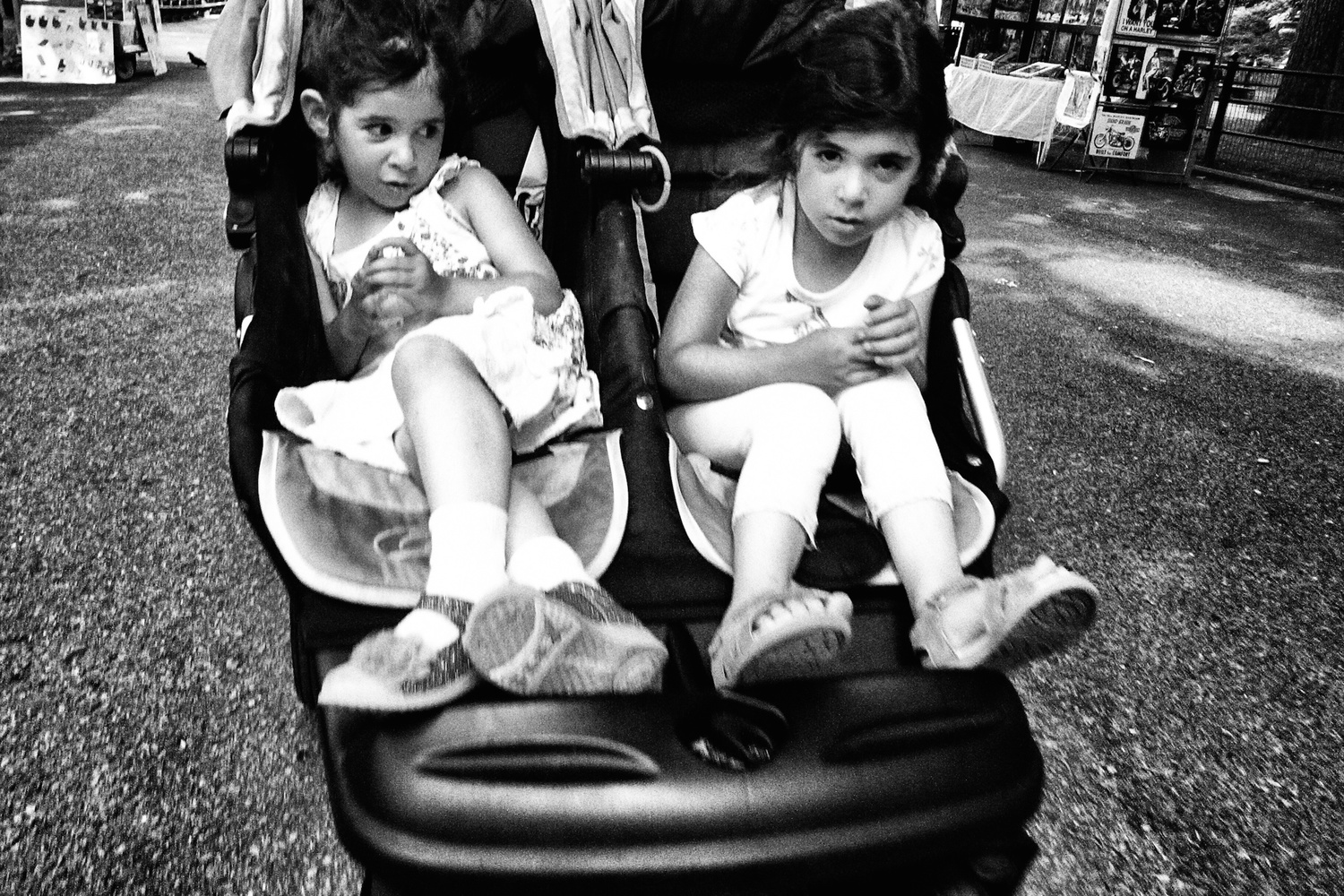
Sometimes, the perfect photographic opportunity is an act of reflexes. This photograph, "The Twins," was made only because I was quick on the shutter and not intimidated by shooting children. I jumped, I shot. Had I not made this image when I did and tried to follow these people down the sidewalk, I would have almost surely initiated a conflict. Be brave, be bold, take the shot.

Twins (c) Michael Ernest Sweet
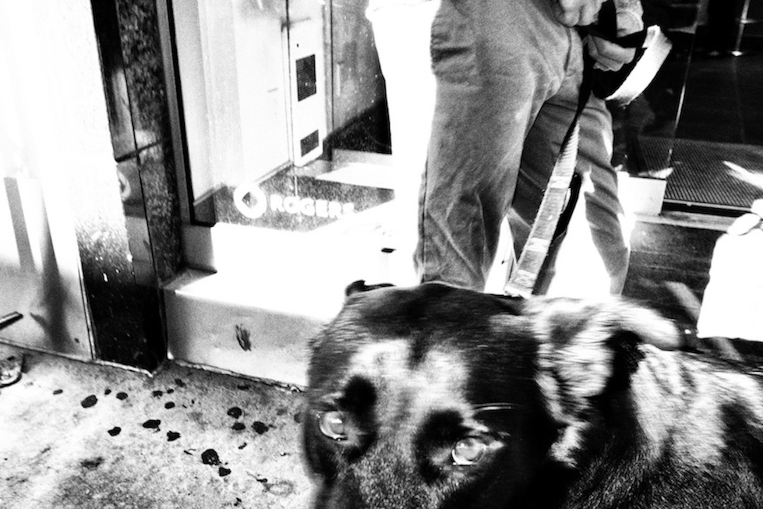
I believe focus and other technical skills are overrated. Most world-famous images are out of focus, even if just slightly. The reason? Many good images were made by capitalizing on the moment, not by stopping to perfect settings. Impulse, reaction, action! The subject matter, at least for me, is far more important than image quality or focus or exposure, etc. In this image, the dog, with his slightly crossed eyes, was way more valuable to me than my inability, at the moment, to try to make a technically perfect photograph. Do you know the number of perfect "umbrella" street photographs I've seen (and judged)? Use your energy to find content and forget about technical capability. A grainy, out-of-focus shot of someone standing off against a tank in communist China is always going to be more valuable and memorable than a technically perfect image of some woman holding an umbrella. Learn this lesson now, or throw your camera off your balcony and take up gardening.

Dog and Walker (c) Michael Ernest Sweet
The frame does matter. What is out of the frame is just as important as what is in the frame. I don't care about the eyes. Everyone photographs the eyes. Look elsewhere for the soul. Try to see how someone manifests their personality aside from the eyeballs. The rims of the glasses, the t-shirt logo, the slight upward grin of the mouth — these are all more visually powerful than the eyes. Portrait photographers need eyes; the rest of us would do better without them. This photograph is called "The Grin."

The Grin (c) Michael Ernest Sweet
I have made at least 100 (good) photos at Coney Island. The place is magical, but it is also a dump. Coney Island is a beach beyond its time. In this image, I aimed to capture the essence: a man relaxed and reclined, yet amid a pile of trash. The juxtaposition of the man (in his relaxed state) to the garbage and filth is a powerful statement. Coney Island is a wasteland as much as it is a playground. Capturing the man in an "upside-down" perspective adds to the image's ability to evoke unease and deprivation.

Death by Sun (c) Michael Ernest Sweet
For me, street photography has always meant beach photography also. The two are synonymous. I mean, why shouldn't they be? In this street photograph, "Ripples and Waves," as I call it, we find a woman at rest on the beach. I made this photograph, specifically, because she had her face shielded. Remember, I do not like the eyes. But also, I wanted to keep the woman's identity hidden. My aim, while photographing on the streets and beaches, is not to "expose" people. I want to feature their unique characteristics; I want to celebrate their human elements and, at the same time, respect their individuality, their identity. For me, this is the ultimate street photograph; enough is depicted, and yet, enough is concealed. This is the kind of balance that is often hard to achieve.

Ripples and Waves (c) Michael Ernest Sweet
Very early on in my practice as a street photographer, I learned that my signature would be all about getting in close and photographing elements of people's bodies. In an early conversation with Joel Meyerowitz, he mentioned to me the idea of the "human fragment," which not only became the title of my first monograph but would also become the name used to characterize my personal aesthetic. Indeed, the concept has evolved into allowing me to develop a unique style as a street photographer. This image, titled "The Board," really characterizes that approach to its fullest.

The Board (c) Michael Ernest Sweet
"Hanky Panky," this next image, was the cover photograph of my book, The Human Fragment. The image captures a man in a suit, yet there is no real proof of the man, as only the suit is captured in the image. I loved that fact. It was, truth be told, a stroke of luck. I knew I was photographing a man in a suit. I knew I was aiming to frame off his head, but I did not realize that the resulting image would have no evidence of human flesh whatsoever. That was an added bonus. This is perhaps one of my most iconic street photographs.

Hanky Panky (c) Michael Ernest Sweet
"Ice," this next image, was also one of the early images in an emerging aesthetic for me. The photograph frames off the head — a distinct feature I was still toying with at the time but that would, eventually, become a hallmark of my style. I have this image with the man's head as well. I have not shown that version of the image. It is not good. It is not a "Michael Sweet" photograph. Although I did not know it at the time, images with the heads intact would not be my thing. I have made many hundreds of photographs since with people's heads lopped off, but this image, titled "Ice," was one of the very first. It is a special photograph for me for this reason.

Ice (c) Michael Ernest Sweet
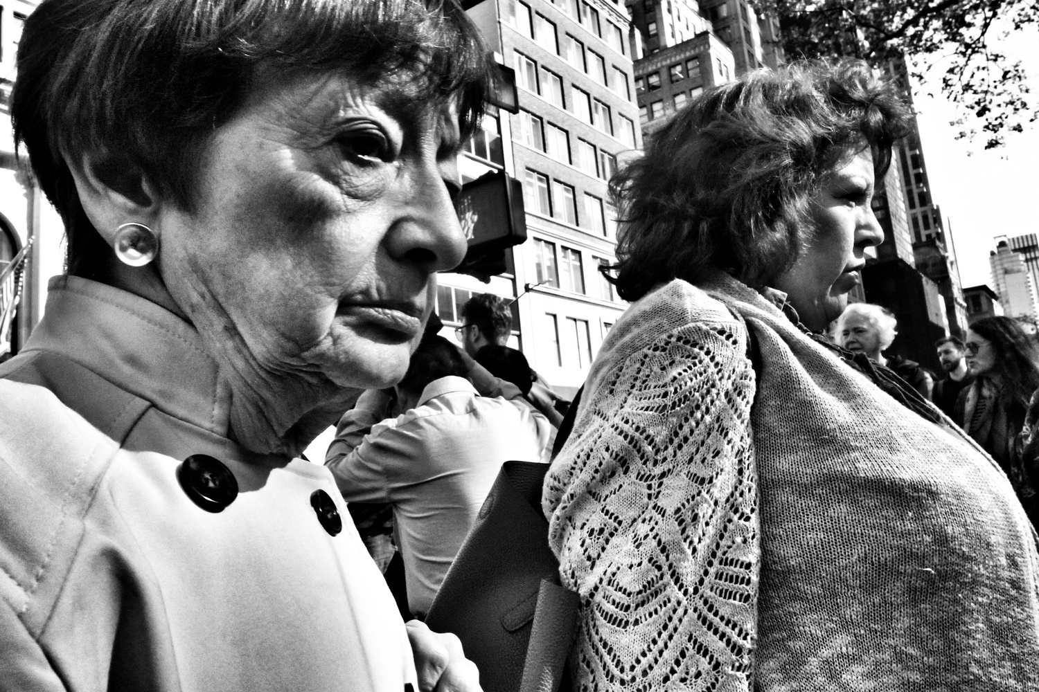
This next photograph is another example of the gods being on my side. The woman on the right caught my attention. I aimed to capture her photograph. Just as I went to release the shutter, the woman on the left entered the frame. Either woman would have captured my interest and either woman would have made a compelling shot. Together, however, they combine to make a shot of the day, or year, or maybe even a lifetime. This is a prime example of a photographer's luck. Many street photographers would pretend that such an image was intentional in some bizarre effort to epitomize their talent, but, truth be told, these kinds of shots are 99% of the time pure luck. So it goes. This photograph is titled "Two Women".

Two Women (c) Michael Ernest Sweet
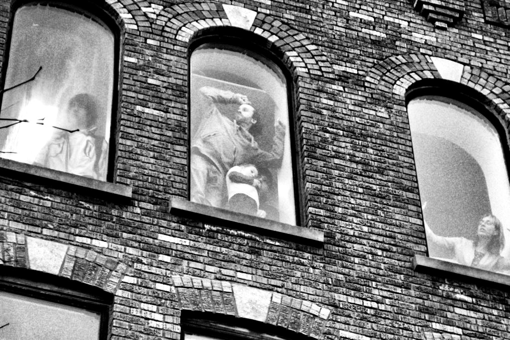
Finally, "Window People", comes in as one of my very first "serious" street photographs — so early, in fact, that it is not shot with my iconic camera the Ricoh GRD IV, but rather with a Samsung camera of some kind. What is notable about this image is that I made it with a new perspective in mind. Rather than focusing on what everyone was photographing, I turned around and photographed behind me. The scene in front was some kind of police racket — a brutal protest — but I decided to photograph those who were watching the drama unfold. This altered perspective — this idea to turn around — has remained with me ever since. Sometimes, the best photographs are not made from anything more radical than a simple (and slight) shift in perspective.

Window People (c) Michael Ernest Sweet
So, I ask again. Does the text add to the experience? Are words helpful or harmful when they accompany a photograph? I am still unsure, to be honest. I think the photographer should be unburdened to photograph without the need to feel an explanation is required. At the same time, I similarly feel a photographer should also be free to explain and expand, in words, if they feel that they want to do so. Put another way, I don't think either should be a "trend" per se, but rather merely an option. I must say, I do feel a little exposed by all of this. To explain or not to explain, that is (still) the question. What do you think?
Images used with permission.


Very well said!
Explaining a good photograph is like explaining a joke - if you have to do that it wasn't that good.
Great point, "BubbA"!
This is not about adding text or not. This is about shooting with or without consent of the subject. Is it ok to just shoot to get a great pic? I think not.
Photography being a visual medium it should in thebe able to talk for itself otherwise what would be the point. If your image contains some message that requires some additional detailed written explanation then perhaps photography was not the best medium to use in the first place. I always think a photograph should be able to stand on its own.