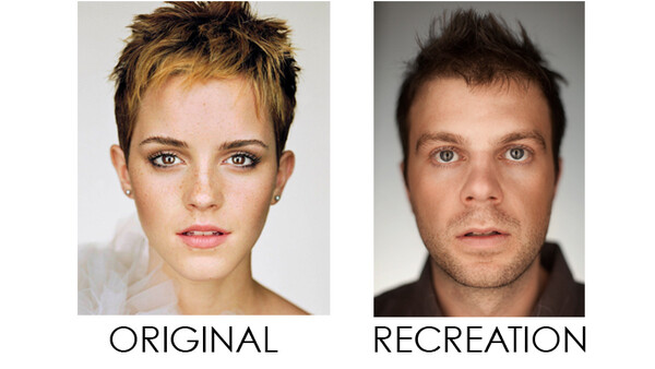
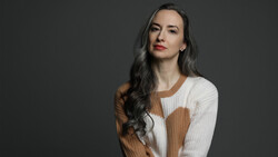
Martin Schoeller is a very successful portrait photographer whose work has been featured in The New Yorker, Outside Magazine, Entertainment Weekly, Rolling Stone, Time Magazine, GQ, Esquire, and Vogue. The style of these portraits is beautifully simple regardless of the nature of the person in front of the lens, and the guys at PHLEARN wanted to try and recreate his unique style.

"Every photographer knows that perfect lighting is never achieved instantly. It takes multiple lighting setups and a good bit of experimentation to find exactly what it is you’re looking for. In this case for an editorial-style headshot, we decided we wanted lighting inspired by the likes of editorial photographers such as Martin Schoeller and Peter Yang. We had to go through about five different lighting setups before we finally found one we really liked!"
Below is their final result. How do you think they did?

To read more on this tutorial, head over to PHLEARN.com.

10 Comments
cool article
If you can see the photographer in the reflection, and VERTICAL light sources immediately left and right of him ..why would you put strip lights - horizontally - immediately left and right of the subject?
The logic is lost on me.
http://www.youtube.com/watch?v=8ZTGXhWjAf4
I tried to do the sema thing once. This is the result
http://sphotos-f.ak.fbcdn.net/hphotos-ak-snc7/301711_10200317070038850_…
Don't edit with flux on - agreed!!!
You shouldn't have used a wide-angle lens. You will loose the ears
It's easy to copy, there are many behind the scenes fro Martin. I have no idea with why not show something personal and not copycat . Lame?
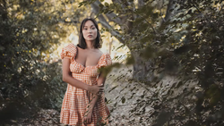
That was painful! With some practice you can look at a picture
and in just a few seconds figure out most of the setup. In this case, you can look
at Emma's eyes and have 80% of the lighting figured out. Fortunately in the
picture of her, just about all the lights were very clear and obvious. It shouldn't take anywhere near that
long to make a similar image by a bunch of trial and error. Here was my thought
process when I looked at the original:
In the original picture, there
are 3 lights visible. And the photographer's head. There are 2 vertical soft
light sources (softboxes, stripboxes, whatever, doesn't really matter) on the
left and right. They're pretty large, making them very soft. They're probably
placed about 1-2ft away from each other. You can see the photographer's head
because it's partly obscuring the 3rd light source, which appears to be about a
fraction of the size of the soft side lights. It's probably a beauty dish or
small
umbrella. It's just above the top of the side lights, creating just a touch of
separation on her eyes and nose, and also brightening her forehead a tad. It's also
the same brightness as the side lights.
All the lights aren't terribly
close to Emma - you can tell because of the size of the softboxes reflected in
her eyes, but also because of how the light falls off so quickly towards the
back of her head. This also shows that there are no backlights or rim lights.
The background is lit with a
light source from the left side as it's a touch brighter than the right. She's far enough from the backdrop
that there is no rim light caused by the background.
And there you have it. 3 lights on Emma, 1 on the
background, and no guessing around. Starting off with 2 light sources next to
and slightly behind their subject is like starting a test without reading the
instructions! Even in the final shot, you're missing the beauty dish, and the
side lights are entirely too close. The back of his head isn't lit nearly
enough.
That brings me to the lens
used. Just look at the ears. You can see Emma's ears, but not Chris's. That
simply says you're not using a long enough lens. Also, Chris's nose is huge (no
offense Chris, it's just because of the way it was taken, I'm sure your nose is
fine in real life!) and way too out of focus. That's all because it was shot
with a
relatively wide lens, rather than a more portrait style lens. I'm guessing she
was shot with either an 85 or 100mm lens. Those lenses have excellent
compression, but not too much (such as a 200) to make her look too flat.
And for the settings, Martin
definitely didn't use such a wide aperture! Her nose is almost completely in
focus, and her ears are just barely out of focus. The back of Chris's eyebrows
are just out of focus, whereas Emma's are crystal clear. I'm guessing he probably shot at 2.8,
especially if it was shot with a 100mm lens, but maybe even a touch higher than
that.
As far as editing, she's a lot
brighter (I want to say close to 2/3 of a stop, if not a full stop!), but a lot
of that is because of the missing beauty dish and the side lights being too
close to the front. Her eyes also have an incredible amount of sharpening done
to really get them to pop. Also having a smaller aperture would
help sharpness and clarity, especially with that 50 1.4 (I try not to shoot it
less than 2.0, just for that reason alone).
So even though this took me
about 15min to write up, understanding another photographer's setup should
really only take about 30 seconds. Understand the characteristics of light and how
they show up on a subject, and you won't be guessing when you try to duplicate
it.
So as far as this being a duplication of Martin's picture, it's
pretty far off in the details. However,
all that being said, this is still a great picture! There's really not a thing
wrong with it, and
it would look great as a bio picture!
I think it's a great article but I think most of people who wrote a comment here read too many sites and heard it all. Go outside and take pictures instead. You're getting nasty for no reason.
I stumbled across this lighting setup the same afternoon I became a proud owner of a few strips. Had a friend at the studio & I insisted on using them for a portrait. Eventually tried the same setup & got this (2nd & 3rd last images) http://seagrampearce.com/portfolio/portraits/