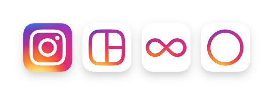
I have been on Instagram for quite some time now, almost five years actually. Being a designer by day I can appreciate the simplicity they have put forward for years. The way you can snap, edit, and post a photos so quickly is astonishing to me, and to a platform that works so well. Today, they are changing it all up with a super clean logo and branding across the line of their apps. They are also quietly pushing out the new UI which consists of a total overall of the look and feel of the app.
I don't know about you but I have come to realize change is inevitable, especially in the tech world. I have also learned in my years as a creative to adapt or get left behind. That mindset has helped me realize that change is not always bad. Though sometimes totally out there in some cases, I think the way Instagram is doing it is just brilliant. If you agree with me, hit me up in the comments below and let me know what you think of the new design along with the newest UI as its now live in the app store for everyone.
Check out the full Instagram blog post here.


Join the Fstoppers community for free
-
Post comments and join in the discussions
-
Browse the site ad-free
-
Share your work and get featured in the community
-
Compete in the photo contests for fun and prizes
30 Comments
The new UI is simple and easy to use. I really enjoy the overall brighter look it has now! IG is so far no disappointment and hopefully won't be in near future!
Loving it! It has evolved slowly but VERY well compared to previous platforms.
Excactly! Very slow, so you can adapt if you need to!
I appreciate the need for change and love to see the evolution of design. But I am not a fan of the day glow color scheme. I didn't care for it when Apple applied it to iOS and it doesn't make sense to me for Instagram. How do neon colors represent photography?
Totally agree with you on the change and evolution. Looking at it from the simplicity in the black and white version of the logo its damn near perfection from a brand update and revamp of the previous iteration. The color on the other hand is a bit of a off putting look and feel but in the end they are showing the color spectrum, which has everything to do with photography. They likely picked it because it was bright, refreshing, and also it sticks out on the home page! Ha.
I think the idea of the logo representing the color spectrum is a bit of a reach, haha. Picking it because it stands out seems much more plausible. I like the look of the black and white logo. And considering they went with a black and white interface, if they had kept that going with the logo it would've presented a more cohesive look from front to back.
They have been going the way of this rainbow color wheel scheme for a couple yeras with their other apps. They finally brought their main app to it though. I bet it was just to stand out and show it is full of life and personality. Black and white doesnt quite do that. The UI makes sense to do black adn whtie because it puts focus on the content, and evntually their ads. Ha! I wish they would have played with making the @, # and links bright pink to make them stand out and tie it all together though. Would have been a small change and could have charged up the reach of people clicking through to names a bit more.
I like almost all the updates, I'd say overall it's a win. The logo was outdated, but the new one feels like it's already outdated too, it's a little 2014 to me. On instagram.com, it shows the camera logo alone without the colorful background, and it looks good. I wish the simplicity of the new UI (making most things black, removing a lot of the in-app color) had translated to the logo as well. Design-wise, the main thing that's sticking out to me is the drop shadow when selecting a filter. Everything else is so minimalist and flat it jumps out to me a lot.
I agree that change is very important in today's world. And the new news feed algorithm made insta a better place. But the logo is something that's part of the brand, and it shouldn't be changed in my opinion(at least not into a rainbow...). It's too colorful, but the filters are more film-ish, old fashioned, and hipster-like. Gamespot had a similar colorful logo but the public feed-back made them change it back to a simple design.
Don't care.
Let me know when they fix their existing features instead of making superfluous cosmetic changes. With Post Notifications if I have more than one waiting for me I have no way to see what the earlier ones are only the most recent.
They have been making slight tweaks to that stuff for months now. They have updated the way you slide out to reply to comments and organize stuff like that but the explore page and the notifications has always beena tough one. I cant ever tell what is what and where its coming from. With a max of 99 that can get inside the notifcations feed at a time I have always had to turn on notifications to not miss a comment or someone reaching out
I'm not sure we're referring to the same thing so here's a Screenshot. At least on Android this is how the "Follow" Notification thing works. So I've got 3 notifications at the moment, I think alright maybe I extend this Card out and I can see what the other 2 are... nope just see the image for that one. It's really awful when I only follow about 15 close friends and still miss their stuff because I have no way to know what the other posts are.
Interesting. I have been stuck on iOS for years now and cant seem to shake them so I am not familiar with this UI. Does seem odd though. if you are only following a handful of people it might be suggested to just add push notifications for each account from inside Instagram. That way those might show up in individual pushes rather than a group like that.
Shameless plug: Follow me @PagesEdward
Still waiting for the "show all nipples" option in the profile settings.
The Tumblr app has no problem showing nudity.
Not disappointed with the new look. My news feed hasn't changed yet tho to curated feed, its still chronological.
I just updated it, not a huge fan of the logo (prefer the old one)...but the UI seems better so far.
So....
Its the Microsoft Zune logo colors and pattern.....
I don't get it....
This doesn't really affect my life at all - It could be a picture of a giraffe and I would still be okay with it.
#makeitagiraffebecauseidontcare
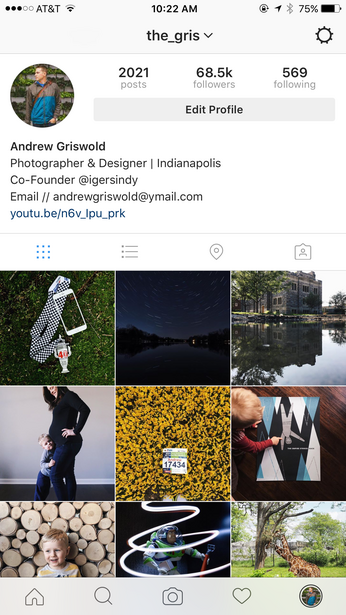
The only thing about the new ui I dislike is when your profile is selected (as in the final screenshot in the article) your profile pic isn't centered in the little black circle that surrounds it. My OCD graphic designer side wants to have a temper tantrum each time I see it. hahaha.
Obligatory
Killing video autoplay would be a much more welcome change...
You can turn this off in settings within Instagram actually. I did just read over 30% of posts are video now which is insane!
If they don't change they will phase out.
Andrew - I agree with you completely. I see a lot of complaining about the new interface and logo ( I like the interface better than the logo), but I think Instagram knows what they're doing. The move to black/white vs. blue is a great move I think, and people will adjust to it quickly. Very good stuff from them I think. My algorithm update hasn't happened yet though, everything is still chronological..
I just updated.... on my phone the new version is faster.... noticeably. The icon is ugly but I don't really sit there and look at it either.... I do like the b&w icons.... I still haven't seen the "other improvements" that are coming a la Facebook.... I'm pre-conditioned to believe those will suck when they get here just like Facebook does now.
Come On, what kind of article is this, this is clickbait. Really Andrew, you are not saying anything here. Tell us, why do we have to get ready?
Why? I think you missed the point. I am warning you to ignore the big glits and glamour of the updates to a logo and interfae and embrace the chance and move on. People are threatening to leave the platform because of a logo change? it is litearlly the same thing it was a few weeks ago but dressed differently. Added a few slight tweaks of identical none the less. Just a reminder to adapt to the changes and keep pushing forward.