
Based on Instagram being so important and popular for photographers at this particular time, and as a follow up on some Instagram tips I wrote about before, we constantly look for ways to stand out and be different or better.
Today I will talk about one of my favorite ways to do that and even provide a few of my custom Photoshop actions for free.
Panoramic or Cinematic
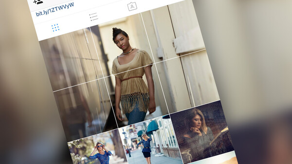
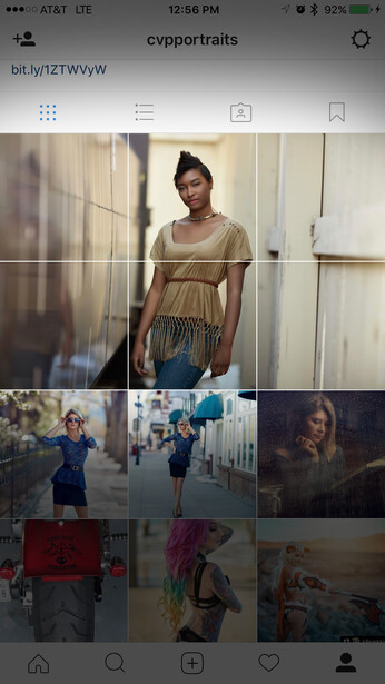
There are a few neat tricks with the new multi-photo layout within an Instagram post. One of them is to do a super wide panorama, by splitting your image into multiple parts. This takes advantage of Instagram's new-ish feature of allowing multiple images per post.
There are a couple reasons to do this, if you don’t and you scale the image down to fit in your post, especially on a panorama, your subject’s face is likely to be very small. I personally am always looking for ways to display images bigger, which can show more detail and quality (or enhance flaws, but that’s another discussion). So, enter the stitch image panorama. Basically you create a set of square images (in this example, 3) - and split your image across them. I’ve created an action to create these images for you… and will demonstrate it in the video below (Link to actions at bottom of article).
When done right, this looks really cool when someone is scrolling through your feed. I like to put something along the lines of “swipe to see the rest of the photo” in the caption (You could add that to the “left” image as well, on the photo if you felt it was necessary).
The benefit is you can get a crop that you would otherwise have to add padding on the top and bottom to fit within Instagram’s criteria, as well as your image is visually bigger, and can enhance the cinematic feel to the photo, while showing the subject in more detail.
You can see this panoramic example currently demonstrated on my Instagram: @cvpportraits
Square Grid
Another option is the square grid. In this example we’ll use a 9-up square grid with the same principle, which is to show your image larger than otherwise possible.
This method comes with a unique benefit in that, when scrolling through a feed one of the images on it’s own is usually not "obvious" what it is, which when combined with a caption that suggests it, can entice your visitor to go to your profile, which has your website link that’s clickable. Any time I can get the user to go to my profile page, rather than just seeing a photo in the feed is always a good thing, as any opportunity to put your customer where there’s a link to your website is just that much more opportunity for them to click… which can lead to more bookings. It’s a numbers game at that point, not saying this will definitely increase your bookings but it can certainly create the likelihood of more traffic referred from your Instagram to your website.
Then the other, and more obvious, benefit is that it looks cool and different than most are used to seeing.
This method does have a drawback, depending on how you post. After doing this, future posts need to be in increments of three, otherwise the grid gets mis-aligned and looks bad. I don’t always wish to post in increments of three, so when I post one of these I leave it up for awhile and then delete the squares and return to normal posting. This also serves to not “overdo” something like this. Unless you chose to do it with every picture, which would create a certain styled feed that may work for you, that’s your call.
My action easily created the grid for you, and even numbers a reference so you know which pictures to post in which order for the grid to display properly.
Here's a view of a 6-up grid (only using six, since in this case I felt the bottom took away from it):
Tutorial and Demonstration
Here's a short video tutorial, showing you the use of these two actions, As well as how to post the panoramic to Instagram and make sure that you keep the images in the correct order that they need to be.
Bonus Tips
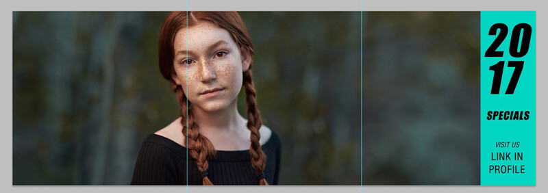
You don’t always have to fill the whole picture with a panorama, here’s an example of accomplishing two purposes at the same time. By putting the subject’s face more to the left which might entice a person to swipe if it’s half visible, and also to add a marketing message to the side as shown here: (During the "stop" in the action where you place your image, you don't have to be limited to just an image, you could put text other images, marketing materials, arrows to guide the user to swipe, anything you see fit).
With either of these actions, I do certainly suggest using a higher-resolution image to begin with. I created the placeholder documents in a higher resolution than a single post would be because when you split it up into separate images each image on its own needs to be a certain size so that it is not pixelated when it goes to Instagram, so whatever the resolution that you would post a single image at you would need to triple that for a three image wide panoramic.
It is worthy to note that there are apps within the app store that allow you to create a square grid like our 9-up grid, (most of them cost a few bucks) - and they work pretty well. One reason for doing it this way instead, is you get the power of Photoshop to add your marketing messages, branding, etc. - Which I feel is valuable, if used properly.
Free Photoshop Actions
Here's a link to my free actions for these Instagram grids.
Have you seen other cool “outside the box” concepts with Instagram? Share them, as well as what you do with our actions in the comments.


Join the Fstoppers community for free
-
Post comments and join in the discussions
-
Browse the site ad-free
-
Share your work and get featured in the community
-
Compete in the photo contests for fun and prizes
27 Comments
#4
https://fstoppers.com/education/dont-make-these-seven-instagram-mistake…
yep, I'm definitely aware of that opinion. It works for some, and not for others. And as I mentioned, its good for a temporary look, where you delete later, so you don't have any mis-alignment issues. - And I prefer the cinematic panorama more. The grid option is there in case someone wants to do it. Used properly, it can actually encourage people to the profile page to see the whole photo, which puts your bio link right in front of them, so it's really a preference, do choose to do it or not.
Thanks!
I unfollow anyone who does this. I find it annoying and usually clogs your feed with images of nonsense like ears and elbows.
This.
Was just going to comment this, Sure it makes your profile look a bit different but it makes your actual posts look like trash.
nice the multipost panorama, first time I see it 👍😁🤗
:) I believe I saw Chevrolet do it on an Instagram ad. I loved it the minute I saw it and wanted to make an easy way to accomplish.
My buddy D Scott Clark has been doing this I dig it!
https://www.instagram.com/p/BTZtFaclyWB/?taken-by=dscottclarkphoto
With all do respect, I disagree with these practices. And I can't help but think you do also, considering you do not use the grid idea, and up until today, have never used the panorama idea.
And I can't think of anyone who is having success on Instagram that is practicing these either. It's not the native language of the format. I can't stand looking at a picture of blurry grass, just because it's the lower corner image of a grid. That's immediate unfollow grounds for me. And the panorama idea is cool in theory but has the same problem. The first image is generally off-putting, as in your example. It's a beautiful portrait that I'd love to see in my feed, but a small sliver of a girls face isn't interesting content.
Photographers need to think about actually engaging an audience using the native language of the platform, instead of hoping that someone will care enough to click on their profile and experience their content in an entirely awkward format. Don't make it harder for your audience, make it easier.
I get it that it's just an opinion, but there are photographers that look to this site for advice. This feels like an opportunity to pedal photoshop actions. And "it can certainly create the likelihood of more traffic" is misleading and ambiguous at best.
Well certainly, opinions vary.
First, it's not peddling actions, as the actions are free and always will be.
Second, I do use grids - I just remove them as I mentioned after aehile, so I don't always have to post in 3's to keep the feed aligned properly. I do like the panorama better than the grid myself. And I disagree completely on the panorama image being off-putting, as a matter of fact, I see it as the exact opposite, (it may possibly be if it was only the OOF areas showing) - but with a sliver of face showing, most people's curiosity is such that it's hard NOT to swipe to see the rest. (BTW big brands use the stitch pano idea, Chevrolet I believe was the last place I saw it) - and the reason I like it, is that it enables the face on this particular image to be 4x larger than a single IG post, which on an image like this - the larger it is the better one can see the sharpness and detail and even at this size, the best details are still not seen fully.
And in regard to the traffic being misleading... I 100% disagree and here's why, my analytics numbers prove that each time I do it, I see a spike in visits to my website. Referred by Instagram bio link, which is a unique link that I can track separately from other traffic.
So it does absolutely work for me, it may not work for you, and that's why everyone has their own opinions.
Thanks for your thoughts
We certainly wouldn't want to be different or think outside the box... All pun intended.
This is probably one of the worst things you can do for your current followers.
The whole grid or panoramic might look good for potential new followers once they check out your profile.
However all your current followers will see on their feed is, 9 weird images that don't make any sense. I am always annoyed by these grids cause my feed gets spammed by a series of stupid images.
For the instant I only have seen one account,t that recently posted a grid, that actually looked good as a single image too:
https://www.instagram.com/netaporter/
Their last approach to a grid was well executed.
The other problem with these grids is once you commit to them, you should stick to them. If you started posting single images after a while again your whole feed will look so weird and out of place.
As mentioned in the original article, it states, the drawback to the grid version, is that the feed needs to stay aligned by posting in 3's or removing the grid when done. (I remove the grid when I am done)
It's a preference to use a grid and it works well if used properly. Properly means keeping the grid aligned or removing, as mentioned. - I prefer the stitch panorama, as it doesn't cause any alignment issues. And that's likely the reason some of the big brands use them as well.
There's a special place in hell for people who do this.
Oh my, I hate grids - makes no sense when scrolling through my feed, unfollowed some people because of such "spam"...
somebody posting a grid = instant unfollow
love seeing a close up of somebody's partial nose in a full screen square.
Just stick with a 1 square story. These panoramas are gimics and they do not make your page more engaging. It's fools gold.
here's the reason why the 1-square is not flattering to the photo quality... look at the difference. As I mentioned, it works for some people, and other's don't like it, and that's ok. But there IS obviously a giant difference in the size of the subject's face.
Been doing this since the beginning of time. Honestly didn't realise I was hated so much, ha!. I try to only post images where each square is a picture in itself but when you shoot primarily with a panoramic camera it's not easy. Instagram historically hasn't catered very well to panoramic images. With the advent of multipost that has changed a little, but they still only let you post square images within the post
Some people are just grumps. If it works for you and the image, go for it and ignore the haters. There will always be those that don't like something you do.
My humble opinion is that if someone just makes good content and doesn't try to do a bunch of gimmicky crap, that's how they'll get followers. You're not going to trick anyone into anything.
it's not about a trick, it's about displaying an image where people can see the intended detail, rather than a tiny thumbnail of a subjects face in a panoramic crop style photo.
Posting a grid like this usually gets a unfollow from me. It clutters and if you want to showcase larger images of your work, instagram is not the place.
Bill, good read. I find it funny how polarized some people are against this practice. I found some cool examples here: https://fstoppers.com/education/first-impressions-are-everything-your-i… and got a lot of the "I immediately unfollow..." comments too :)
I think the key is to make sure each square can stand alone as a solid image. I'm fully converted to 1 themed column now by posting a black & white photo every 3rd post: https://www.instagram.com/stustustudio/
So, excuse the ignorance, how do I get the photos from lr into a file within the instagram app so it will recognize????
I wrote about one way t do that here: https://fstoppers.com/apps/quick-instagram-and-social-media-workflow-ti…