Over the years as a boudoir photographer, I have noticed a theme when it comes to new shooters about the "restrictions" they come across. Countless times I hear or read, "I wish I could upgrade my gear," "I just do not have a commercial space," or my favorite, "I just cannot afford to have all those set ups." Well quite frankly, that is a load of bull.
When I first started shooting boudoir it was in a 12 X 11 bedroom of my home. I only had a 50mm lens, so lets say up close and personal was "my style." I did not have the money for strobes, and even if I had, finding room for them would have been challenge. So each client was by the window with natural light, and some serious creative positioning. I had to be able to create albums for these clients with a variety of poses, wardrobes, and looks in one cramped space. Making the excuse that you do not have the latest upgrade, or the big space is just an excuse as to why you are not trying to get crafty.
Now, many years later, I find myself still favoring my window section of my commercial studio space. Even with the space that every new photographer is asking for, I am still pushing all my work into one small corner of the studio. I decided to shoot an entire session only using one space, all natural light, and get crafty with posing to show that you do not need elaborate set ups or a room full of gear in order to create albums.
In this pull back of Sophia, the chair is placed near a large window, with sheer curtains from IKEA to diffuse some of the natural light. I used a simple paper backdrop on a holder, however in the beginning of my shooting, black bedsheets did the job just fine. 
I also used one of the same curtains wrapped around the chair to add a little texture. Later on in post production, this curtain will help to soften the chair and the final look. Now with this very quick and simple set up, it is up to the posing and the angles in order to create an entire album.
Posing is not the only way to create a dramatic difference with a one setup look. Getting creative with settings in camera or post production will add to the variety of your final album.
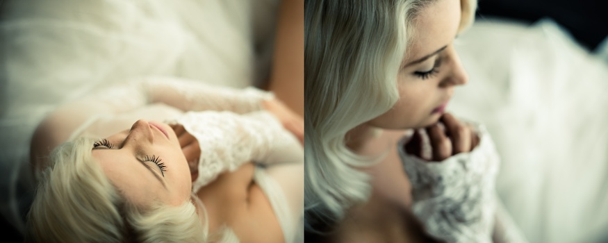
A simple change in angle and getting up close will add detail shots to your album layout.

Same wardrobe same set up but a simple posing change can also highlight the mood of the album as well.

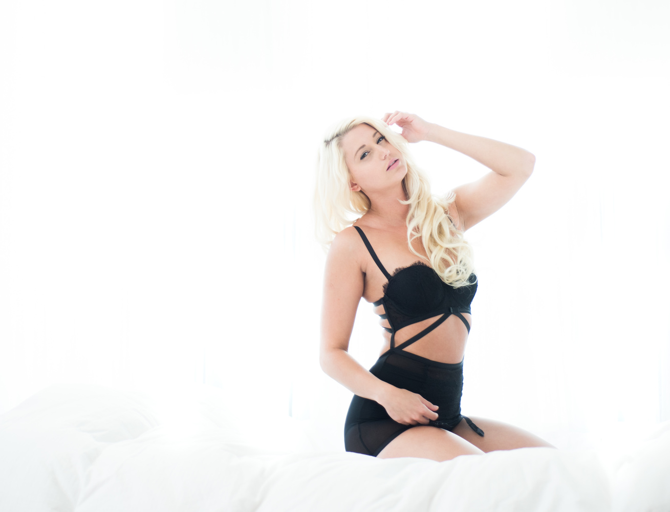
Another way to work in a variety of looks in a small space, is to just change the posing surface. I took out the chair, removed the black backdrop and put in a small air mattress in the same location, against the same window. This created an entirely different look, especially with the background staying out of focus. I did not have to move things around behind her, as it added to the bokeh. The only posing I asked of her was the play with her hair. This created movement in the rest of her body as well by the simple position changes in her hand and arm.


In the last setup, I moved my own position to face the window. We are still on the same mattress. The only change she had to do was sit up.
I wanted to add one look into her reveal that was more fun and what I call "Lazy Sunday" look. She only had lingerie with her, so of course, what any good photographer would do...
I gave her the shirt off my back. Well sweater actually.
But I was wearing something under it, so no no.. this isn't the start of some "girls gone wild" photography session. 
Right after this shot, I just took the air mattress and had her lay on the floor. Simple and nothing more needed. I have not moved or redecorated the area, but yet it looks like an entirely new setup. For this shot my camera was flush with the floor, to give a new angle into the room. It brought out the elongated legs that was missing in all the other images. This is an impact image that can work nicely into the center of the album, or even at the end for the wow factor.

These small changes in positions of the client and of the photographer can fill an entire album for a larger sale. All these images were done in a small section of the studio, in the same dimensions as my old home studio. There was only three outfit changes, but different angles in shooting created a completely different look. Many clients may show up with only the idea of a small session, two looks, and maybe a few prints. Pulling the most out of each set up, and being able to show them more options can lead to the upgrade.
Images below are for a 10X8 album spread from The Boudoir Album which I use Fundy Software to create the layouts. Showing a client the layout when they arrive will help them visualize their final album.


 So in the end, being able to take the absolute minimal shooting areas, the least amount of furniture, and zero props creates a focus on the client and her mood. You do not need to spend thousands of dollars in the latest and greatest gear. Spend time first learning your layout until it becomes part of you. Learn how the light comes in, how it floods your room. If you chose a hotel, show up 30 minutes early in order to open all the windows and truly get a sense of how the light melts over the room and where you can get the best shots. Learn to shoot with less, before you go buying more! It will not only save you money, but it will improve your ability to work in any situation that you come by.


Before I began shooting boudoir, I shot newborns which for me at the time, was essentially still life photography. The reliance on taking a quiet, relaxed, minimalist approach taught me to be a better photographer... You can actually learn to do more with less. Then, as more becomes available at your disposal you'll find yourself longing for that simplistic approach again !
great advise here, and lovely shots, thank you.
Great tips! Thank you
YOU HAD A 12 X 11 BEDROOM??? :O
The bedroom I was using for my boudoir studio in my house when I first started yes:)
I like how you textured the paper.. nice post
Great write up! I especially struggle with such a mindset so it's nice to know one can overcome it! PS I absolutely adore the image of her on the floor... great job!