Every four years during the summer, the sports world pauses to draw its attention to the top echelon of professional football. I decided to put together a World Cup inspired shoot, shoot some concepts I haven't done before, and give you a behind-the-scenes, education glimpse.
If you know me or have followed my endeavors, you may have noticed I'm a football nut (soccer to us in America). So much so that I've traveled abroad just to go to football matches. With the World Cup approaching, I knew I had to put together a project highlighting the beautiful game and in the meantime try some things you usually wouldn't see in my portfolio. But enough of that, let's get into the shoot.
Concept
After a good amount of jumbling ideas, anything from simple to overly ambitious, I decided to go with a Nike apparel inspired shoot. The basic idea was to illustrate a shoot for a team or brand that had a jersey reveal. In this case it was World Cup themed, which is very popular for brands like Nike, Adidas, and Puma. The focus of the shoot was the apparel first, models second; keep that in mind.
Where it gets a little different from what you'd usually see from my work is the lighting and composition. We'll dive into the lighting later on but one thing I wanted to try is composites. Not only would this be a great opportunity to challenge myself a little bit but it would also give me options in postproduction to compose my photos to taste, which is common in this corner of the photography industry.
The Shot List
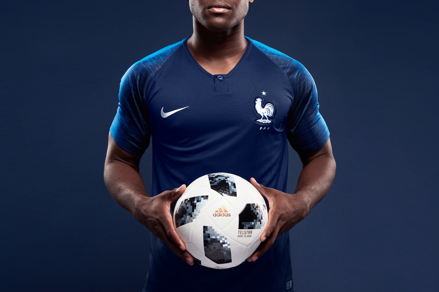
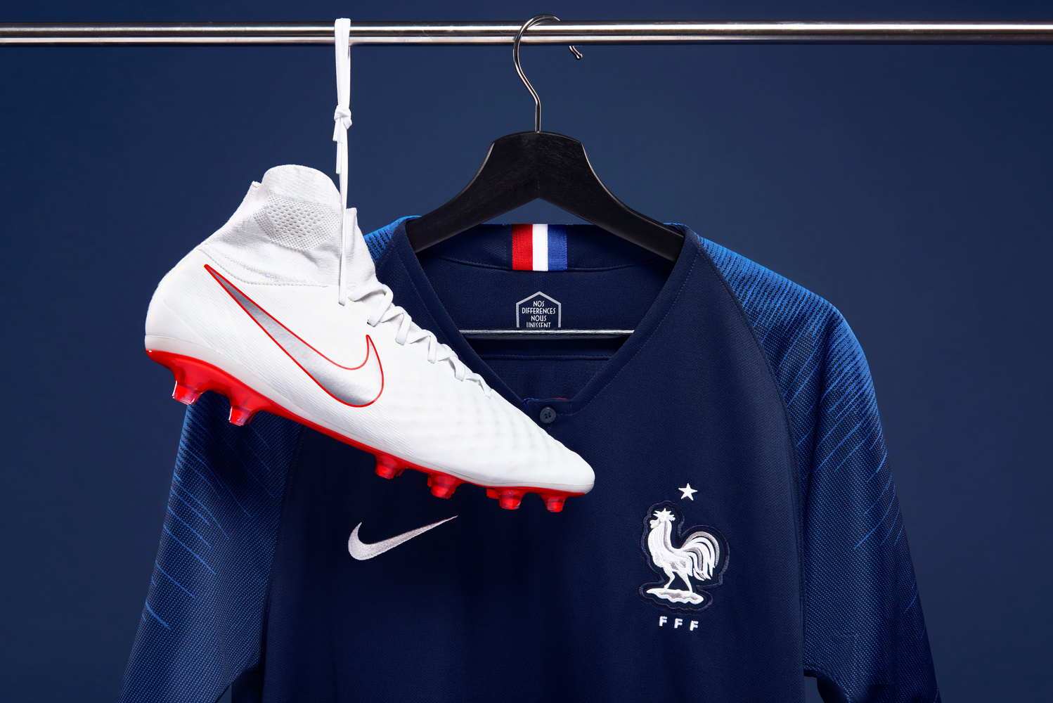
While there were some very interesting jerseys revealed for this World Cup, I decided to stick to countries that would resonate with most viewers: England, Brazil, and France. We planned three different segments of the shoot. First, we planned wide shots in full uniform from head to toe and walking towards the camera. Following would be up-close with the camera slightly upward to give it that powerful, tall look. With that angle, we would also create a darker, moodier light to make the jerseys really pop. Part three would be individual product shots highlighting the jerseys and other attire.
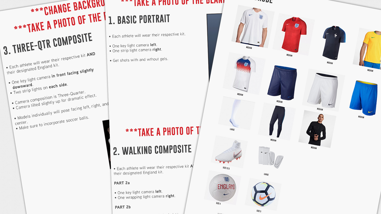
The shot list and wardrobe lists used for preparations for the photoshoot. Planning and putting it down on paper is always helpful to use as a guide throughout the production.
Lighting
For the first segment, the main goal was to grab a full-body shot that really featured the England home kit well. I used a navy backdrop to really make the whites and the red accents pop. We went for a large umbrella camera left to make a nice gradation. With that, we used a gridded strip light camera right to wrap the subject. While setting up the light, my friend helping out, Minh, accidentally left a red-gelled strip light to the side that we were planning to use later. During the test shots, I actually really liked how the light peeked into the frame and we went for it. Funny how unplanned things work out.
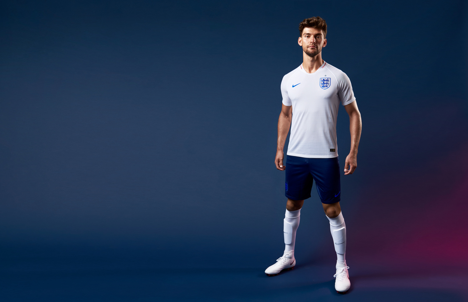
Accidentally leaving the red-gelled strip box actually worked in our favor. It created a nice shadow that accented the uniform colors well.
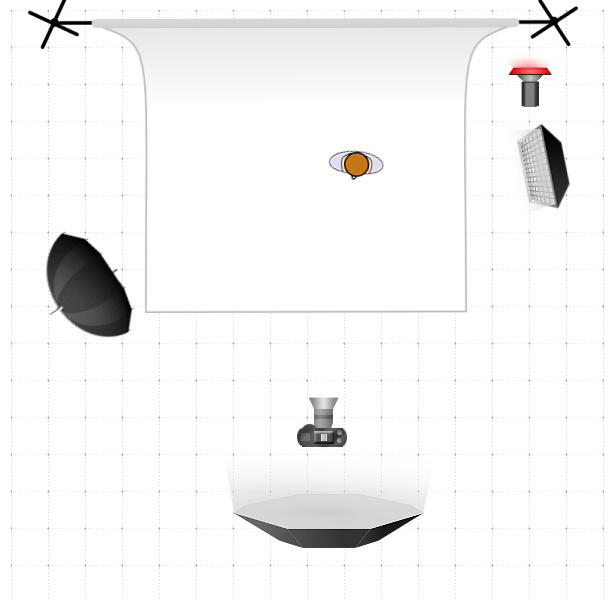
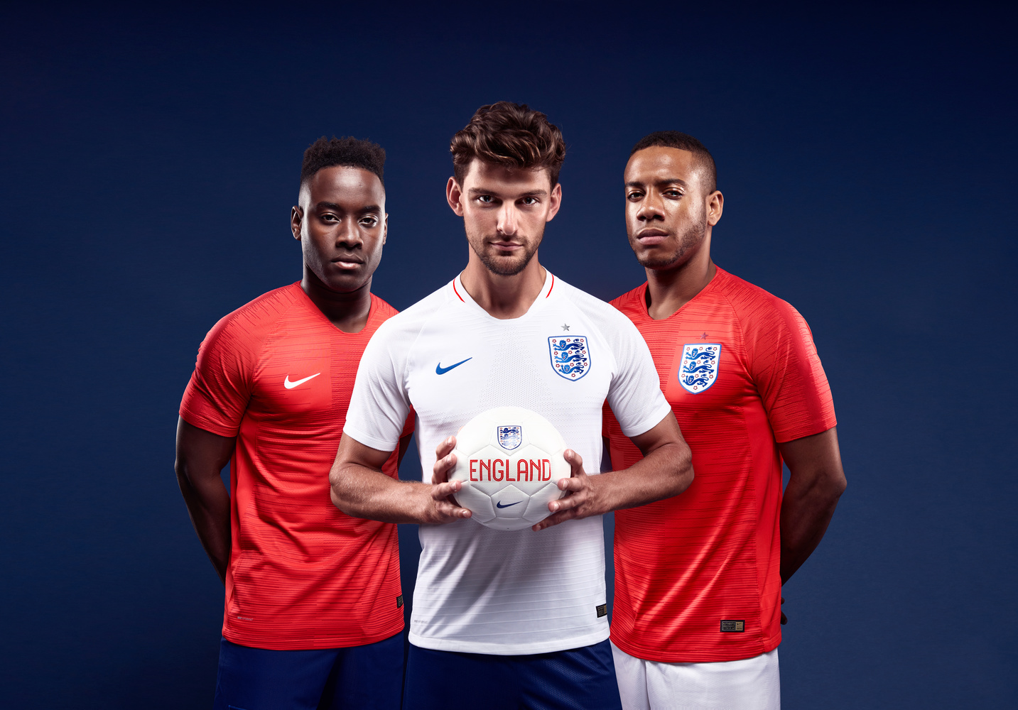
For the remaining shots, we used a very popular lighting setup used for composites. It was a three-light setup featuring a medium-sized octa bank overhead. Placing the octa bank was crucial, I wanted it high enough to really create shadows, but low enough to wrap the subjects well. I used a smaller octa bank than I usually do because I looked for a harder light source to create more shadows. We then wrapped the subject with octa banks on each side.
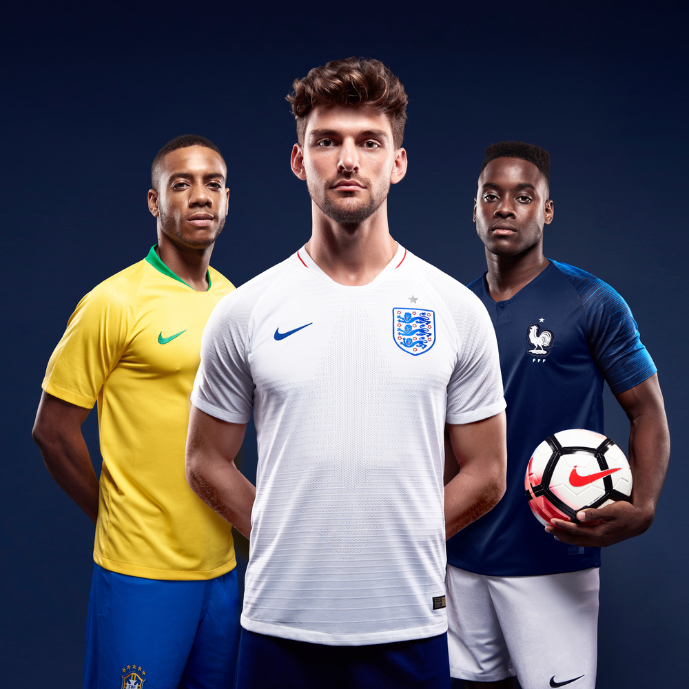
We used a simple three-light setup to create this composite image. Lighting, perspective, and shadows were the key components to create this image.

The octa bank shown here was angled downward to create shadow, but still retained a good coverage of the subject.
Postproduction
After the shoot, I was happy with what we captured. We ticked most, if not all the boxes we were looking for. I shot each model individually, giving us options for this part of the process. Quick disclaimer, this was my first time really doing any compositing, even a light composite like this one. After retouching each photo individually and making sure everything matched well, my main focus for the composition was perspective and creating shadows.
I did two different perspective styles for this shoot. One with two subjects close-up and behind the main subject (below), and another with two subjects distant behind (seen in Lighting section above).
I played with the shadows ad nauseam. I looked to make the shadows proper and realistic. I used some of the shadows present in the photo as a guide. I also took into consideration the light direction, color, and distance as a formula to create them. After experimenting, I'm very happy with how they came out, especially as a first go.
Final Thoughts, Tips, and Behind-the-Scenes Video
I'm my own worst critic but I'm actually very happy with the results. Yes, there will always be instances to learn from in every shoot, but we executed the idea we had in front of us, and that's all that matters. To see the full editorial spread of all images, they can be found on my website.
One big thing I learned from producing these composites is that Smart Objects are your friend. Using these Smart Objects in Photoshop allows you to lay everything out to go back and tweak individual photos if needed without compromising the final photo. Also, do not take shortcuts, the pen tool was used often. Using the pen tool before you start each of your edits is very important to save time and give you options later on. You'll thank yourself when changes need to be made even though it is a tedious process.
With that said, who do you have winning the World Cup? Brazil? France? England? Let us know below.




Awesome tips! Much appreciated the lighting section!