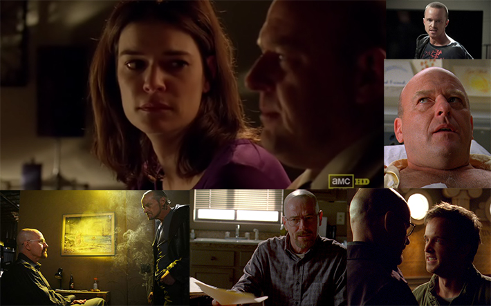
Recently, Julia Kuzmenko has been putting together a wonderful tutorial on how to read lighting in photography to help better understand different lighting concepts (Seriously, read Part 1 and Part 2). Applying these to photos, you can reverse engineer different lighting diagrams. However, using these concepts in your everyday life will allow you to give you a much better understanding of lighting techniques as well.
Different lighting techniques can provide entirely different experiences for the viewer. Using rim light in a dark scene, will often provide a bit of tension for the viewer, and add a lot of drama to the scene, especially when using narrow lighting. More often than not, the front light is very soft in nature, while the backlight is very harsh and a stop higher in power. A great example of this technique is used in the AMC drama, Breaking Bad. Virtually every indoor scene is very dark and backlit, to help generate the mood for the entire TV series.

Another lighting technique in the film industry is used when lighting scenes at night. Have you ever noticed in your favorite movies and TV shows that there is almost always two light sources when they're out at night? Typically, a rim light is needed to separate the subject from the background and acts as a “moon”. However, it always seems that there is a light off in the distance that is illuminating the subjects face as well. Also while night shooting, you'll often notice that a lot of films have wet pavement at night. No, not all the shots are filmed in Seattle, this is actually intentional. The shine brought by the pavement will allow studio lights to reflect off of it easier, providing some added moodiness by making people silhouettes and providing a very faint bounce light to the actors faces if need be.

Errors in Lighting
More often than not, when watching the lighting of different scenes in TV and film, you'll see some gross inaccuracies. Often, multiple light sources will come into play outdoors, and sometimes, lighting changes in the scenes one affect the subject at all. One famous example of this comes from the Tim Burton film Sleepy Hollow. In the scene, a small child lights a lamp with silhouettes cut out of it. This lamp is powerful enough to project the images onto the wall 10 feet away, but have no effects to the lighting hitting the child's face a mere foot or so away.
These are just a few examples how they're able to change different lighting dynamics to better change the mood and feeling in film. Next time you're watching your favorite shows, look for changes in the lighting to subconsciously move the feelings of the viewer in one way or another, and watch them show you how to properly light different scenes both on set and while on location.


Great post! My headshot and environmental portraits are heavily influenced from my love of cinema, it's a fantastic way to be inspired and and generate concepts.
I have to strongly disagree with the heading "Errors in Lighting" describing cinematographer Emmanuel Lubezski's work on "Sleepy Hollow". Himself, along with Burton, made an artistic decision, while not being entirely naturalistic, was used to create a certain effect and make the audience feel a certain way. Not every film has to be perfectly in line with real world lighting, sometimes a more theatrical approach is what is necessary to tell the story.
Right! And not necessarily just to tell the story, but also to give your work a distinct look.
I've actually been paying a lot of attention to the lighting in movies for about 2 years now. It's real good training for myself to understand how subjects are lit.
There are probably already a lot of photographers doing this, but for those who aren't i recommend to try and do this as well while watching a movie.