
There are a bunch of different ways to make your photos stand out: great light, gorgeous model, amazing locations, idealized retouching, but one that is often overlooked in favor of these less subtle approaches is color. We photographers tend to schedule a shoot, show up, capture what's there, and pat ourselves on the back for our genius, but what goes into the shoot before we schedule it can be just as important to the end result as what we do with our lights or our camera. Let's look at an example from my work for Lifetime. No lights. No reflectors. Just color.
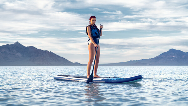
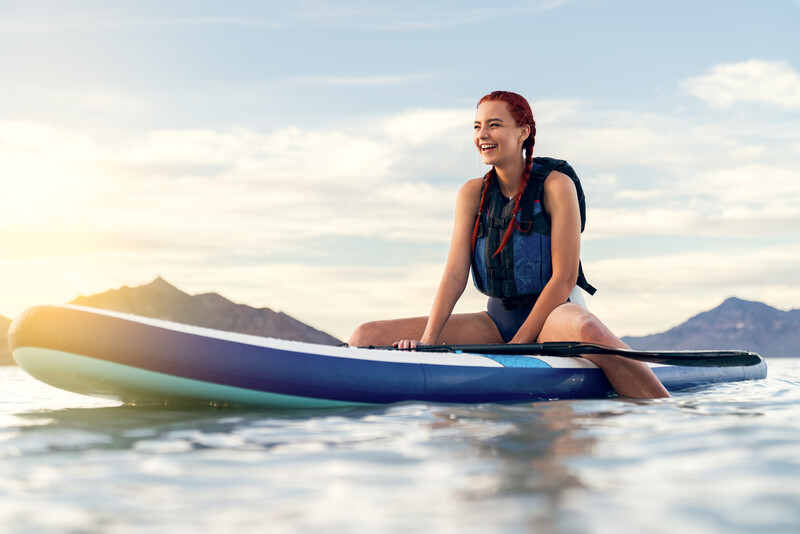
This was a shoot I did for the company's inflatable stand-up paddleboard (SUP). A typical shoot for them, up to this point, would have involved getting a local mom (whoever they could get) to come with whatever clothes they had to whatever location was nearby and shooting whatever they could shoot once they got there. It works. I mean, they would have gotten images of their product in use, and they still would have sold the product, but we can do better than that. I wanted to show the company what is possible with a little intentionality. So, here's what went into making this one a little bit special.
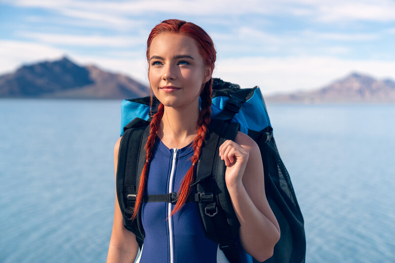
I knew the product was white and blue. I also knew I wanted a location that was special. I've been to the Bonneville Salt Flats many times, so I know it's as beautiful when it's covered in water as it is when it's a dry wasteland, and I know the colors of the salt flats are blue and white. I got Bella to model because her look is consistent with Lifetime's family-oriented brand, and she has red hair, which I thought would make her stand out against all the cool colors in the image. I asked if she had a blue and white swimsuit choice, which she did. We were required to have her wearing a life vest, so I made sure we used the blue one.
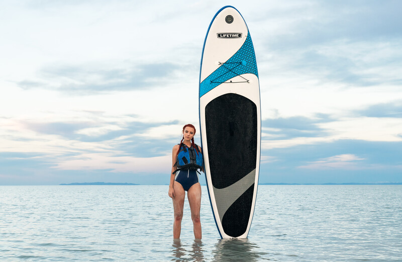
By unifying the colors like this, I was able to create a result that felt elevated and deliberate without using any lights nor extraordinary retouching, and I created a focal point with the red in her hair that gave the images life. If you've never considered using color this way in your images, I highly recommend you give this a try, just like you would try out a new piece of lighting gear or a new lens. There is a whole world of color possibilities to experiment with. What I've done here is largely a monochromatic color scheme, with the exception of the hair. There are also analogous, triadic, complementary, and many more color schemes you can experiment with.
Here is another monochromatic example from a shoot I did about 10 years ago when I was just learning.
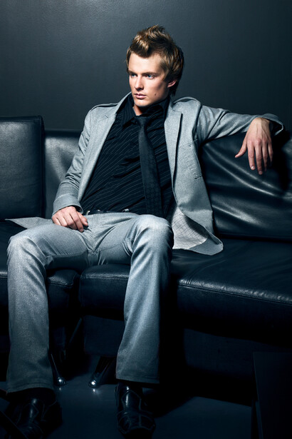
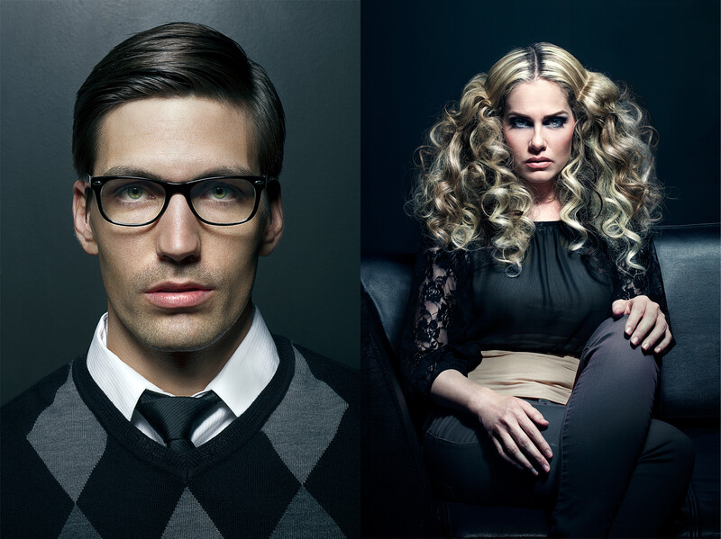
In this example, I was using a strobe for some off-camera lighting. The background was a lighter, more vivid blue. The couch was black. In post, I changed the background to remove distracting elements, and while I was at it, I darkened and de-saturated it to make it more consistent with the rest of the shot. I did an overall color adjustment in curves that brought some blue into the shadows, making the black couch blue. The image became unified, deliberate. It suddenly felt like something from a magazine. Here are two other shots from the same day.
In this case, I was using light as a differentiator. By combining the magic of the lighting, great models, and a good location with the extra consideration given to color, the images suddenly felt like something shot by all those photographers I admired at the time. I was on to something. And now you are too. Try it! Show me what you create. If you've been doing this for years already, post examples in the comments for those who are new to this idea.

Join the Fstoppers community for free
-
Post comments and join in the discussions
-
Browse the site ad-free
-
Share your work and get featured in the community
-
Compete in the photo contests for fun and prizes
1 Comment
These are good examples that intention and execution beats gear any day. Thanks for the article!