
Nail white balance in Lightroom every time with these simple steps and techniques you can use on any photograph.
Capturing photographs with an accurate white balance can be quite tricky. A mixture of light conditions, weather, and colors of other surrounding environments all impact how the white balance is perceived in a shot. Short of taking out a gray card or a color swatch every time you head out to shoot, it can be almost impossible to nail the perfect white balance every time. However, if there's a will, there's a way. Luckily, if you have Lightroom Classic, you can nail the colors quickly every time. You may not even need any color theory knowledge at all; just a couple of clicks, and you could be done. So, let's take a look at some of the simplest and quickest ways to get perfect white balance in your photos for excellent results in every shot.
Auto White Balance
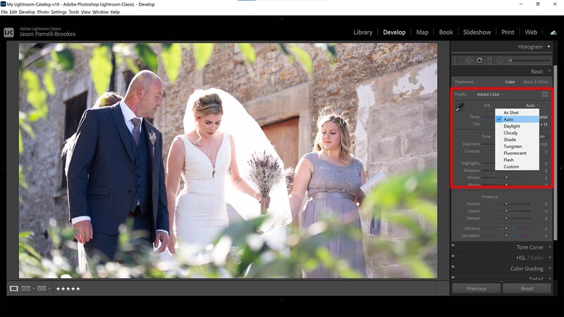
There was a time you'd hit the auto button on your image-editing software, and it would "correct" the photo to within an inch of its life, spoiling delicate lighting or ramping up colors. Luckily, Adobe has done a great job in Lightroom Classic, where auto settings now intelligently read the scene and make more appropriate changes.
Head to the Develop module and find the white balance section in the top-right toolbar pane, and use the white balance (WB) drop-down menu to select Auto. The Auto option in the white balance options does a surprisingly good job at getting accurate results. It's perfect for editors that aren't sure how to balance the colors in a photo and makes a good jumping-off point for those that want an almost neutral look without having to spend too long pushing the sliders back and forth. But it's a rough approximation of what Lightroom thinks the white balance should be and shouldn't be relied upon if you're trying to develop your own style.
Daylight White Balance

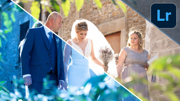
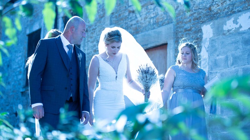
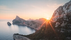
Move to another preset that matches the lighting conditions from the scene, and you might be surprised how often the white balance doesn't quite match up. In my portrait photograph, I have an outdoor scene with all my subjects backlit as they walk down the cobbled limestone alley. Light fills the bride's dress and veil from behind, and the foreground foliage is brightly lit. The sunlight is also bouncing around the warm stone and reflecting into their faces and clothes.
Naturally, putting this shot into a daylight white balance might seem like the best option because the scene is lit with daylight. But in this case, because the lighting is quite extreme and the scene so complex, it actually feels a little too cool. The lower color temperature of the white balance preset takes a lot of the mood from the shot, even though it's technically correct in theory. So, what do you do when the presets don't work out?
Eyedropper Tool
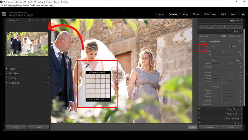
If you're struggling to get a white balance that looks right in your photo, it might be time to take matters into your own hands. The quickest and easiest way to get the color balance you want is to use the eyedropper tool (known in Lightroom Classic as the White Balance Selector, keyboard shortcut W). With the eyedropper selected, run the cursor over the image. The end of the eyedropper is the spot the tool will select from. It will also display a useful window with a 5x5 grid that shows a zoomed-in look at the pixels on and immediately surrounding where the eyedropper rests.
The trick with this technique is to find a patch of pure gray or white that hasn't been clipped from which to sample. View how the tool will affect the white balance by looking at the navigator in the top left of the window before committing. Once you're happy, click on the area you want to set as the target neutral, and let Lightroom take care of the rest. Within an instant, the white balance should correct. However, even with this method, it's difficult to get the look right, as the sample area may be slightly in shade or influenced by reflected light from other areas in the environment. For a more refined approach, you may have to use the sliders.
Refine White Balance
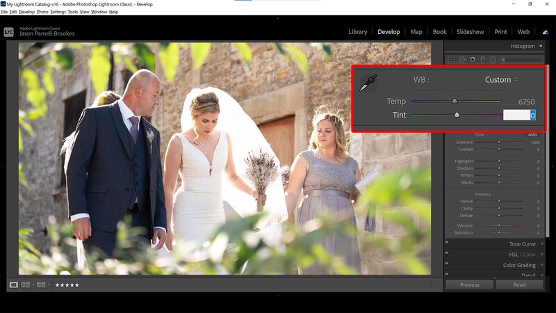
After using a preset or the white balance selector, it's a good idea to take things one last step further and customize the white balance with incremental adjustments using the temperature and tint sliders. Usefully, the sliders are colored and demonstrate the type of effect they'll be making to the image. For those who are colorblind, the temp slider goes from blue to yellow (left to right) and the tint slider is green to magenta (left to right also).
As you can see in my example, the temperature slider is way up at 6,750, which I would argue is normally far too high for an outdoor portrait such as this. But due to the warm stone surrounding the subjects, the green foliage in the foreground, and the placement of the sun, this is actually the most accurate setting that matches the scene when I was there. However, the white balance selector I used in the previous step did add a little too much magenta, so I turned the tint slider down from +4 to 0. This introduced more green in the shot and gave everything a more natural tone.
Before and After
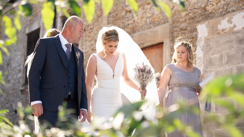
As you can see from the before and after above, getting the right white balance is crucial to making or breaking a photograph. It could be as simple as using a preset, letting Lightroom automatically adjust things for you, or using a few simple steps to manually adjust the colors so that everything looks just right. Remember, white balance is both about being accurate and stylistic, so don't head for a specific setting just because it's theoretically correct. Be aware of the mood in the photo, and if you took the shot, try to recall how it felt when you were there and match the emotion with the colors.
If you'd like to learn how to use Adobe Lightroom more efficiently on any device, make sure to check out our Mastering Adobe Lightroom course with Pye Jirsa. The content Pye covers will appeal to every level of photographer and will save you an incredible amount of time on your image editing. Save 15% by using "ARTICLE" at checkout.

Join the Fstoppers community for free
-
Post comments and join in the discussions
-
Browse the site ad-free
-
Share your work and get featured in the community
-
Compete in the photo contests for fun and prizes
16 Comments
So this article is not about nailing accurate white balance at all. It's about winging it. The general instructions appear to be to use Auto WB. If you don't like the result, use your judgement and jiggle the WB until it looks right for the what you had in mind's eye when you shot it. And if you don't like that result either, move over to the eyedropper tool.
That's all very subjective and far from nailing it.
And there's even, very considerately, instructions for those of us who may be colour blind, '. . . For those who are colorblind (sic), the temp slider goes from blue to yellow (left to right) and the tint slider is green to magenta (left to right also). . . '
Tell me, if one's unable to determine certain colour frequencies, how much adjustment one should apply, and in which direction!
I've had my suspicions for some time, but now I'm convinced he's taking the proverbial piss. We've all been had.
This does not give correct WB - there is no such thing (unless you are in the studio shooting products). Choosing where to sample merely pegs that tone/ colour as neutral - which maybe or may not be the case. Shoot raw and adjust WB to what ever looks pleasing.
In this case the dress might have been a warm white - choosing it to define white would make the photo too blue. You can't 'know' what is actually white or neutral unless you use a grey card and as the author correctly points out, that's hardly practical.
Obtaining the proper white balance is too easy, just click in the Degrees Kelvin box and hit the up and down arrows, Shift up and down arrows if the white balance is way off.
Do you like a hot bath or a cold shower?
Anyone knows how to get the temperature they like when taking a shower, you can do the same thing in Lightroom and no one can say your result is wrong.
I take always take pictures with auto white balance because my D600 does it pretty well. That said, if I see anything below 5000°K in a picture taken outside during the day, that's suspect and I look to see what happens when I bump up the temperature…
This was awesome! I just use Auto WB or the sun picture or the cloud picture or P. What editing program was this?
This is Lightroom but all raw (and most others) editing programs have this option. If you select the right balance in-camera - you're already halfway there.
just wonder is it now unusual to read the LR manual instead of such articles?
In fairness to the author, these videos/articles are intended as useful pointers, tips and tricks - whereas a manual is intended to guide the user through basic processes, not technique.
Other than a visual interpretation of WB, does anyone use the histogram as a guideline?
Not for white balance, no! It doesn't give that information.
For those NOT sucked into the overwritten, underperforming Lightroom, these recommendations also work in Adobe Camera Raw.
If it is too challenging to get the ideal white balance, it can always be edited later. Basic edit job, no big deal.
If that ridiculously blue image is your "before" image as a wedding photographer then you really have no idea what you are doing with your camera settings.
My thoughts entirely. Looks like the camera has been manually set for incandescent light in the church and not set back to daylight, or auto WB when coming outside.
I agree w/Mathew (awesome wedding photos BTW) and Gordon. Who takes a cyan photo like that as the before?
Hi more then editing in light room works then comes properly image correction adjust highlights shadows lighting
https://www.pexels.com/@naresh99
You've lost me there, Bud!