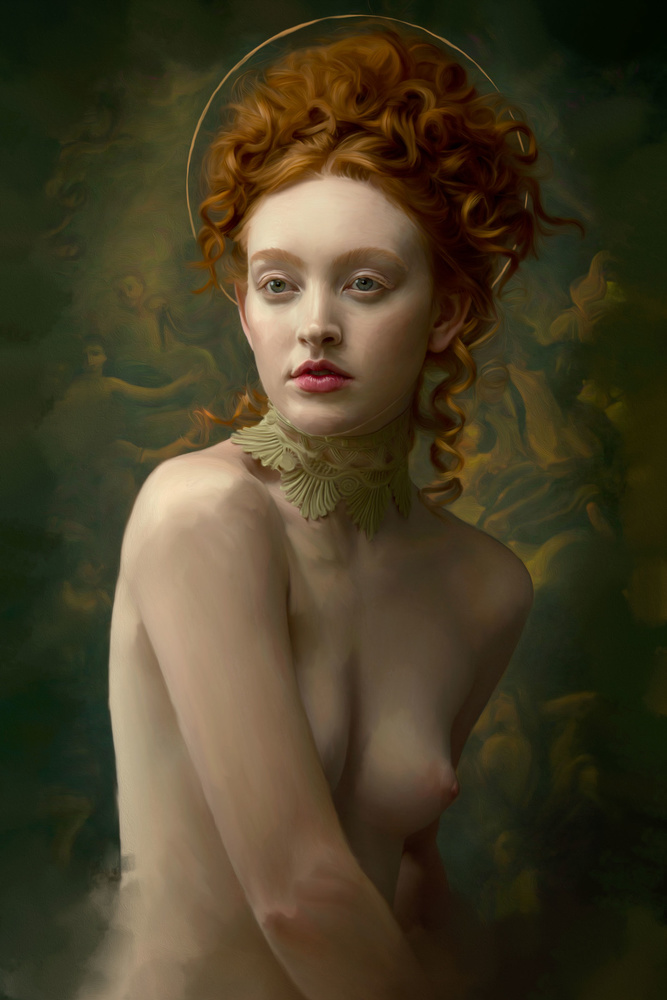
You’ve heard of hand-painted backdrops, and you’ve probably heard of digital backdrops, but The Backdrop Studio is offering something different: backdrops that look like pieces of art all by themselves.
Hand-painted backdrops are classic and timeless and a wonderful asset for any portrait photographer to own. Unlike seamless paper, they have painterly texture and subtle shifts in hue or color intensity that add visual interest without distracting from the portrait. Unfortunately, they can also be an expense some photographers can’t afford, especially if the photographer wants to capture different looks. I have a hand-painted backdrop in blue gray that I absolutely love, but it doesn’t work for every shoot. This makes digital backdrops a fantastic option. They look like hand-painted backdrops, and you can drop them into your image while editing and get a huge combination of looks using different backdrops and blending modes. The only caveat is that the digital backdrops still have the look of a hand-painted backdrop, making them similar to every other photographer who uses one. The Backdrop Studio offers a great selection of these, but it’s their creative backdrops that are different than anything else I’ve seen. They’re a blend of photography and post-processing with a classical, painterly aesthetic that leaves the result looking like a piece of artwork all on its own.
When I was approached to test these creative backdrops, I remember having two distinct thoughts: one was that I wasn’t sure these backdrops would be suitable for a large market, because they have a very niche look, and the other was that I wanted to print them and hang them on my wall. They’re that gorgeous. But how were they going to look behind a photograph, and how difficult would they be to use?
After taking a long time to test and try these out, I can safely say they’re now my first choice of backdrop and far simpler to use than I first suspected. As with any digital backdrop, there are a few ways you can go about working with them. One way is to mask the subject and drop them atop the backdrop. This is probably the most traditional way, but it’s also the most potentially time-consuming, especially if you have to mask fine details like moving hair. You can shoot the subject on a neutral backdrop, like a seamless gray paper and then drop them right on top of the digital backdrop and play with blending modes to see if you can eliminate the physical backdrop. You can also place the digital backdrop right on top of the photograph and play with blending modes and opacity or use them as overlays to give interesting color and texture to your photo.
Here are some examples of the ways I've used these digital backdrops so far, and I'll follow them with an example of my workflow.

Backdrop layer blending mode set to hard light and lowered in opacity.
Model Jessica H. Thomas

Backdrop used as a traditional backdrop and digitally painted.

Digital backdrop used to add a sense of place and set to low opacity.

Digital backdrop used as a composite.

Used as a traditional backdrop to add a sense of place and depth.
Workflow
After seeing the results and different ways I've used some of the digital backdrops from The Creative Collection, here is an example of what my workflow might look like for specific images.
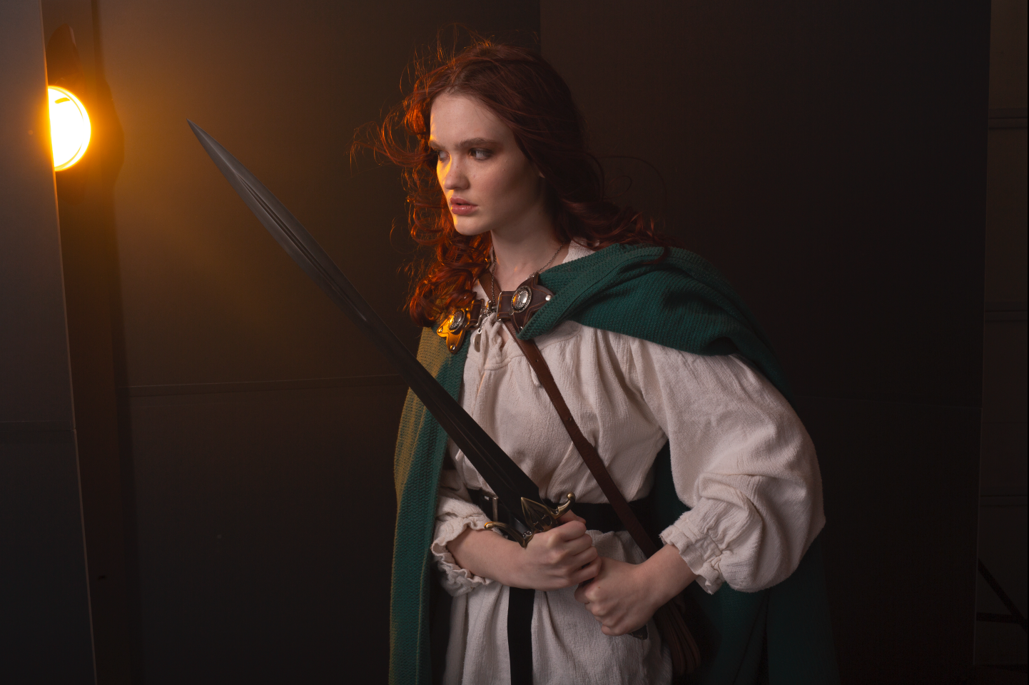
1. Unedited Image Lit to Mimic the Backdrop "Mossy Grove"

Original, unedited image featuring model Charlee Johnsen.
2. Background Clean-Up With Heal, Clone, and Transform

3. Color-Grade Portrait to Suit the Backdrop

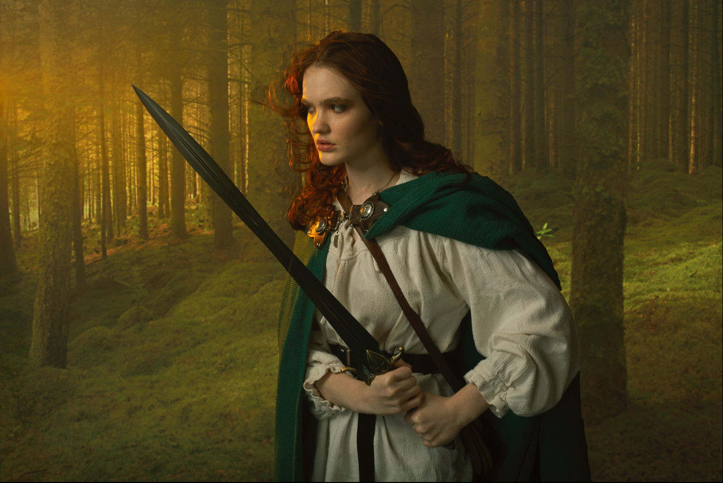
4. Bring in the Backdrop

5. Transform the Backdrop to Mimic Light Direction, Set the Blending Mode to Linear Dodge, and Mask in the Subject Roughly


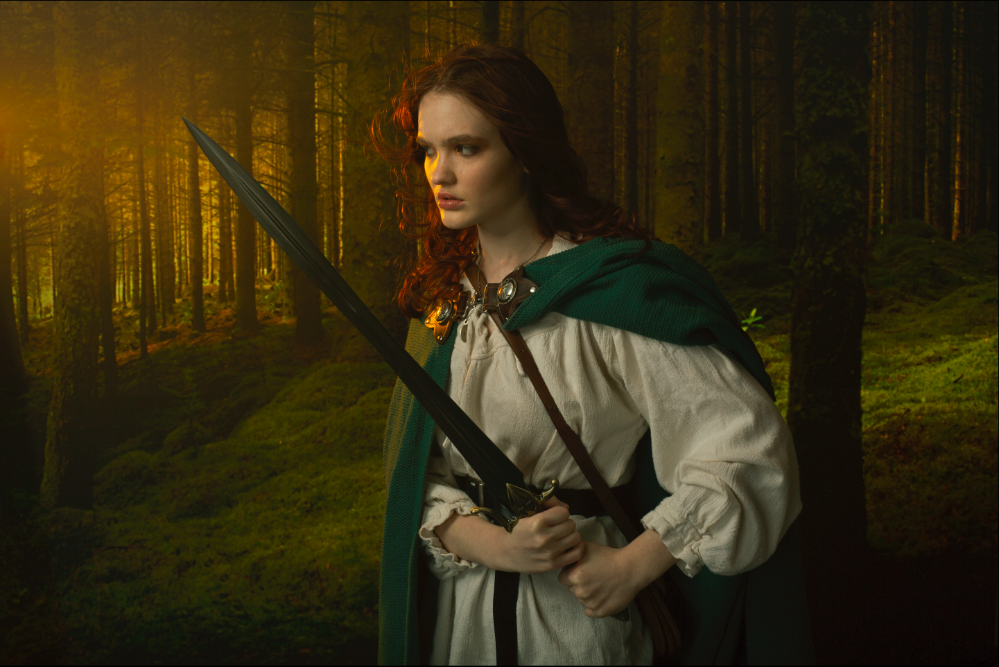
6. Add a Curves Clipping Mask to the Backdrop, Set the Blending Mode to Luminosity, Darken the Backdrop

7. Add Foreground Elements to Place the Subject in the Scene and Finesse the Rough Mask Around the Subject

8. Tweak the Color, Darken the Backdrop and Add Contrast With a Levels Clipping Mask
After getting to know these backdrops really well, I’m surprised at how versatile they are. When you see them in use by multiple photographers with different styles, it’s clear that these are not nearly as niche as I first suspected. They add a powerful narrative element to the photographs, both as backdrops and as composites. And while each backdrop has a strong voice, they’ve been carefully designed to complement the photographer’s work rather than overpower it, which is impressive given how highly stylized they are.
Here are a few examples of the way photographers Kate Woodman, Gemmy Woud-Binnengijk, and Bekka Bjorke have used the backdrops. You'll see them used as overlays, as strong graphic elements, as traditional backdrops, and as foundations for composites.
Unlike hand-painted backdrops or clean color washes, I don’t believe The Backdrop Studio’s Creative Collection will work for every photographer. They certainly lean heavily toward photographers whose work is more stylized, who want to tell a story or make their portraits look like fine art pieces. Headshot photographers with a very clean style will probably find these digital backdrops don’t suit their work or their client’s needs.
Photographers may also find things like blowing hair or complex clothing, such as opaque fabric or fur, a bit tricky to composite in, so there certainly is a learning curve depending on usage and the post-production skill of the photographer. But, personally, I’ve found so much value in these backdrops, and they’ve had such a positive effect on the look and feel of my work that I’m more than happy to put in the effort.
Here are a few things I’ve found helpful when working with these backdrops.
As a Composite
- Matching light direction and color helps the backdrop blend seamlessly with the portrait.
- Play with blending modes to see different options and find ways to make compositing easier.
As a Backdrop
- Works best if the mood of the portrait matches the mood of the backdrop.
- Complementary or contrasting color palettes tend to look best.
In General
While I've been able to experiment by trying different backdrops on photographs I've already taken and getting pretty great results, I've found that shooting with a specific background in mind results in the most cohesive and eye-catching images. That way I can match light direction and overall quality and color and style the model appropriately. I've also found that trying different layer blending modes also gives me new ideas and unexpected results and can often help in masking. I would also suggest playing with clipping masks to find out how they affect the backdrop and the way that, in turn, affects the look of the overall image.
As a TL;DR, here are the simple pros and cons of The Creative Collection from The Backdrop Studio.
Pros
- Will give your work an additional unique touch
- Flexible in application
- Beautifully crafted
- Helps with mood and storytelling
Cons
- Not for all markets
- Requires a moderate level of post-processing skill depending on the subject and intended use
So, the Creative Collection from The Backdrop Studio isn’t for everyone, but then neither is any product or tool in photography. What I’ve discovered is that they are for me, and I’ll continue to happily use these as long as they exist. If you want to find out whether these creative digital backdrops are for you, The Backdrop Studio is offering Fstoppers readers 20% off for one week only using the code FSTOPPERS20 at checkout. If you're hesitant to commit, you can sign up for their newsletter and get a free digital backdrop to play with. If you've used digital backdrops in the past, we'd love to hear your thoughts! Sound off in the comments section below.
Images used with permission from Kate Woodman, Bekka Bjorke, and Gemmy Woud-Bennendijk.
![Fstoppers Reviews the Backdrop Studios Creative Digital Backdrops [NSFW]](https://cdn.fstoppers.com/styles/large-16-9/s3/lead/2020/03/04d4d6e983392552a565c04d087714c8.jpg)


If you're going to use these like in the example, make them out of focus. Looks super fake with the model and the trees all in focus. Looks like a cut out.
"The Backdrop Studio is offering something different: backdrops that look like pieces of art all by themselves. "
Some of them actually are real pieces of art. One prominent one is a piece by Sir James Thornhill. I'm not sure ,personally, these are worth the price given paintings such as these are now public domain. But for those less inclined to do the leg work, it may be worth it.
These are all fantastic and I just got kinda stoked because I have some composites I haven’t touched but now I have a reason or some motivation. Awesome backdrops Kate and great photographs Nicole
Something new? I've been seeing similar digital background packs for years. So this is just another ad masquerading as an article.
Nothing so satisfying as sticking the boot in, eh.
I mean it would be much more satisfying to have the author disclose it's nothing but an advertisement instead of something new and revolutionary .... in 2003
You realize we have to disclose that, right? This is not a paid review. I genuinely think these are incredible. I use them all the time. You can see them on my website and in my portfolio because they've made a difference to my work.
And while there might be other backdrops out there that have imagery in them, these are highly specific to the creator and have been edited with a specific, painterly style. I don't think there is anything else out there like them.
I find it ridiculous that this is classified as NSFW. Because there's a drawing of a nipple?? Really!
Oh dear god, the Victorian prudes have finally won. I can't believe it. Worse! We used to have paintings like these in public spaces ... but now... PUT THAT AWAY now ... LOL
I wish that weren't the case but nipples are very dangerous, you know :/
Lovely article Nicole! Kate has made some really gorgeous backdrops!
Agreed! And thank you <3
On a related note… now that we're all working remotely from home, it puts a new spin on NSFW. No more dread that we will click on the wrong link and freak out a co-worker.
Ha! This is true. Maybe we will be able to get rid of that pesky modifier!
The Covid 19 version - SFWITANPA - Safe For "Work" If There Are No Prudes Around